Content
9 Best Essential Features of E-Commerce Websites

The Internet has transformed the face of shopping, as more and more people buy online rather than in stores. In the US, over half the population buys something online at least once a month, and Statista reports that the total cash spent on E-Commerce sites could double by 2021.
That's why every business needs to think about custom ecommerce website development. Success in the current market means having an online store. But what makes an e-commerce website successful?
Lets talk about itHave a project in mind?
A great many factors, it turns out. Keep reading to find extensive information about what makes an e-commerce website effective, how to measure that success, and the specific features of eCommerce website that your online store needs to have.
The primary metric of success for an e-commerce website is conversion rate. This number refers to the percentage of visitors who "convert" into customers by making a purchase. The factors that contribute to a high conversion rate primarily relate to the user experience, including things like a well-designed user experience, and convenient, sales-driving features in the ecommerce software.
The Best eCommerce Website Features List
- SEO Friendly website
- Simple Messaging
- Mobile Website
- Product Navigation
- Search Box
- Product Cart
- Payment Methods
- Security
Let's look at each of key features of an eCommerce website individually. We'll also show you real-world examples of how these features were implemented by other companies.

№1 SEO Friendly Website
Ensuring your site is search engine optimized is one of the most important things you can do for e-commerce success. Otherwise, it will be very difficult for new clients to find you.
Simply put, SEO is what lets your website appear above other sites in search engines like Google. The 10 sites on the first page of any given Google search receive 92% of the hits, and the number one spot receives 33% more hits than the 2nd through 10th.
In e-commerce, bad SEO directly translates to lost business. If a prospective customer isn't clicking on your site, then chances are that they're clicking on a competitor's.
Any custom ecommerce website development should prioritize SEO throughout the entire design process.
№2 Simple Messaging
Another of the most important features of an ecommerce website is clear, simple message on the home page. Once a shopper is on your page, your goal is to guide them quickly and smoothly towards a purchase. The home page is where this process begins.
The accepted correct way to accomplish this is by sharing a short, personal message that gets across your company values, and why customers should make a purchase. This doesn't necessarily need to be entire conveyed in text. Photos, artwork, and videos can be just as or more effective.
A huge wall of text should be avoided, as most visitors won't read it, especially on the first page they visit. It can be counterproductive, in fact, driving some visitors to close the page and visit a competitor instead. If you'd like to go into more detail about your company's history and values, then an "About Us" page is an appropriate place.
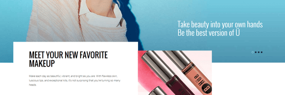
BHue Beauty, a retailer of beauty products, has a fantastic home page that demonstrates clear, simple messaging. The site offers a brief but emotional description of their values. Their buyers resonate with that description, and are enticed to keep exploring the site, and eventually make a purchase.

№3 Mobile Website
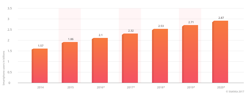
The only thing more convenient than ordering products online is doing it with a mobile device. According to Statista, the number of mobile device users worldwide will reach nearly 3 billion. More and more people are eschewing desktops and laptop computers entirely, doing the majority of their online shopping and other interactions on mobile.
That's why it is essential for any ecommerce site to be mobile friendly. Adaptive design, the ability for a website to seamlessly switch between mobile and desktop version of a site depending on the visitor's needs, should be on any ecommerce website redesign checklist.
Want to see more projects built by our company? More projects
Please click the link below and view our full portfolio.
If you're looking to build a website or a mobile app,
don't hesitate to contact us!
Some business owners prefer to create a mobile app for their business, rather than implementing responsive design. This is a viable alternative, but it can be difficult to decide which is best for your particular business. We have plenty of experience with this question at Dinarys. Click the link to read our article on the pros and cons of each strategy.
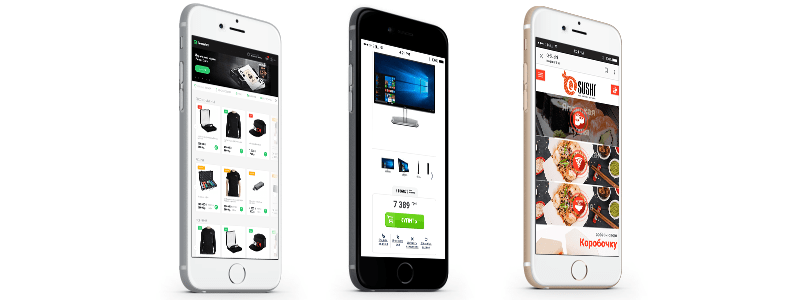
Here is an example of a mobile-optimized site, developed by Dinarys specialists.
If your eCommerce site does not accommodate mobile users, either through responsive design or an app, then you are missing out on sales. This is a simple fact, not a guess or conjecture.
Failure to implement a mobile-friendly layout or simple features for eCommerce websites like zooming in on products will affect your conversion rate and your bottom line. Nothing will drive a mobile user away from a website than having it render poorly on their device, and those users are unlikely to return later from a desktop or laptop.

№4 Product Navigation
Another important consideration in custom eCommerce website is convenient product navigation.
If a first-time visitor to your site can't find the product they need, then they will probably leave and not return. Why should they? In the modern world, users expect simple, clear, easy-to-process information.
Product navigation should be intuitive and obvious. Ideally, it should be smooth to the point where the interface fades away from the user's consciousness, so they can navigate the site without any effort at all.
Here are some of our favorite examples of great product navigation.
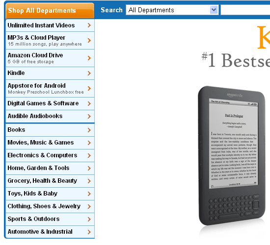
Amazon
Amazon is the undisputed master of e-commerce. We can all learn a great deal from them, but as shown in this example, they make excellent use of vertical product navigation. This allows them to fit more product links on a page without the appearance of clutter.

Via Snella
Via Snella is at the opposite end of the spectrum. The men's clothing company is a small company with a limited amount of goods and a small number of product categories. Their size allows them to leverage a more eye-catching horizontal menu, since they have less products to feature.
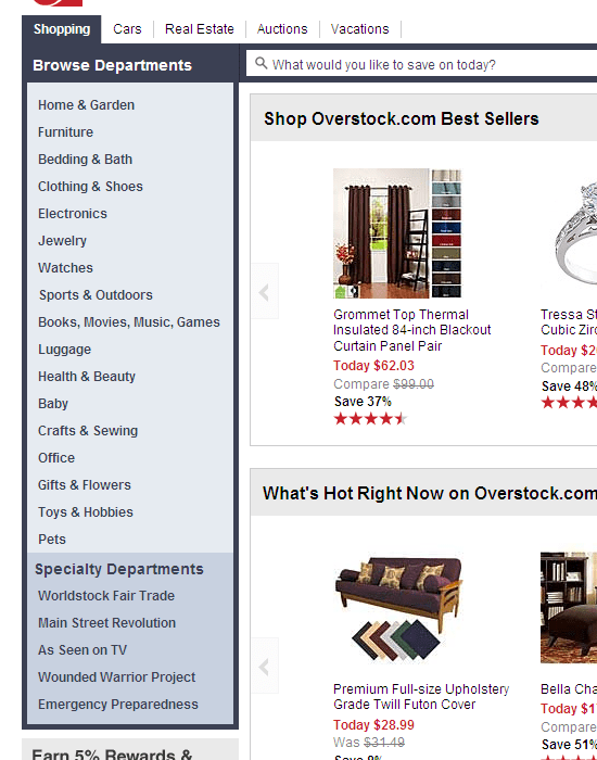
Overstock
Overstock chose to use a vertical layout, and added a simple navigation menu in their site footer. Giving users multiple ways to effectively navigate product collections is one of the keys to eCommerce success.
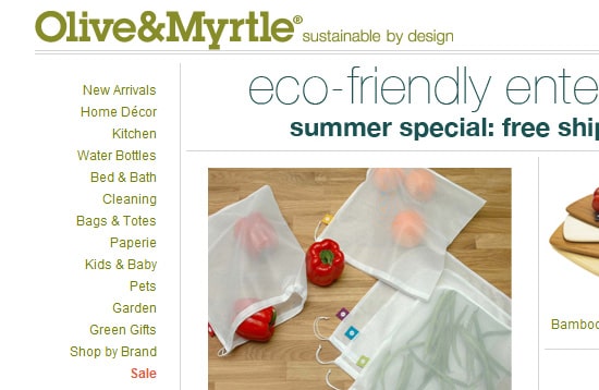
Olive & Myrtle
This retailer specializing in eco-friendly goods placed a vertical menu on the left side of their site. It's worth noting their use of color to highlight sales and discounts. Just like in a brick-and-mortar store, color attracts the customer's eye and encourages them to visit that section of the site.
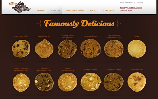
4th Street Cookie Company
When this brick-and-mortar store added e-commerce to their business model, they realized they only had a few unique products to sell in relatively small quantities. With fewer products to navigate, they implemented a very simple navigation system, emphasizing thumbnail images of the cookies.
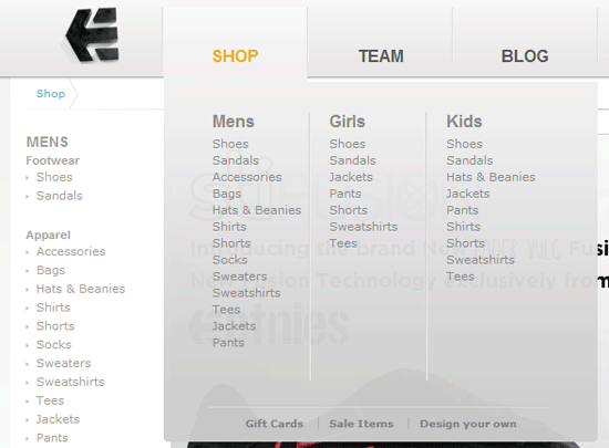
Etnies
To serve every visitor's style, this online store offers two ways for buyers to find the right product. Etnies has a vertical menu bar, and a horizontal one with dropdown lists.
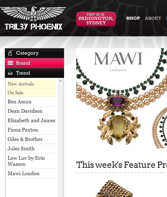
Trilby Phoenix
This e-commerce website features a vertical product menu that divides goods into three main categories. Clicking a category shows links to the individual products within it.
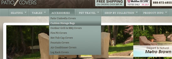
Empire Patio Covers
Empire Patio Covers organizes product categories along a horizontal bar. To avoid clutter, the navigation bar features a system of submenus in dropdowns.
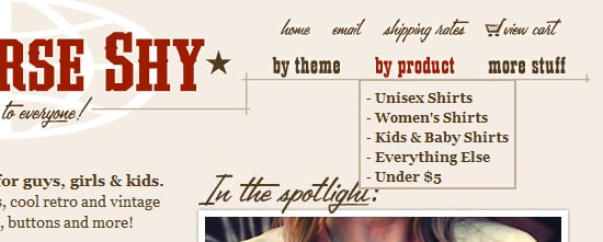
OneHorseShy
This online store keeps their navigation simple, clear, and easy to understand. They even offer a search box for finding goods by name or category.

№5 Search Box
The search box, like the one offered by OneHorseShy, is one of the most important functions for any eCommerce website. It allows buyers to save time and quickly find the product they need, skipping over the pages and products that don't interest them.
Lets talk about itHave a project in mind?
To maximize its benefits to website navigation and usability, a search box should be prominently placed. Users should see it almost immediately, letting them get straight down to business.
Let's look at some of the best examples of one of the best features any e-commerce website can have.

Etsy
Etsy places their search box right at the top of the homepage. It includes a filtering option, allowing users to search specific categories.

TasteBook
On this eCommerce website, the search box is placed in a high-value location on the home page. The placeholder text gives users inspiration on what to search, potentially leading to product discovery and more sales.
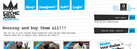
Cosmicsoda
Cosmicsoda places its search box on the right sidebar, highly visible but unobtrusive. To ensure that it's seen, the box features an eye-catching design and an unusual shape.
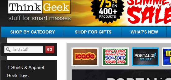
ThinkGeek
This retailer of novelty goods features a search box at the top of their vertical product navigation menu. Combining features in this way helps guide the customer through their journey, making sure they always have the right tool at hand to find their product.
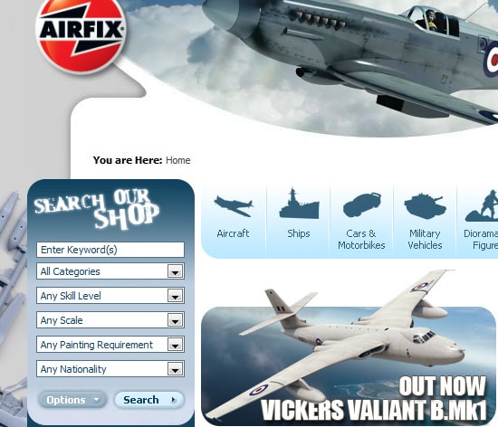
Airfix
Airfix uses a search box widget that can filter by categories. The compact design coupled with advanced functionality is one of the best implementations of this e-commerce website feature.

№ 6 Call to Action
A call to action (CTA) is what motivates visitors to take action on a website, whether it is signing up for a newsletter, visiting a special collection, or making a purchase.
Every e-commerce website needs a clear, understandable CTA. The right call to action will significantly increase conversions and sales, and most importantly, keep visitors returning to your site again and again.
A key component of an effective CTA is showing the user the value of clicking. You should explain to the user why they should click, and it should be a "fair trade". If you are collecting their email address so you can market to them, then you should provide a valuable piece of content like an eBook or coupon in exchange.

One great example of a good CTA is on the Bowlmore website. Their call to action is located at the top of the horizontal menu, attracting attention by sitting where users will look regardless.
The specific message of your CTA can vary depending on your e-commerce website needs. Common messages are "Buy Now"," Get a Quote", or "Book Now", depending on your industry. Implemented correctly, a CTA can raise sales and customer loyalty.

№7 Shopping Cart
A well-designed shopping cart is a must-have for all online shops. The cart is the first screen of checkout on most eCommerce website. In most cases, the cart is displayed in a list or matrix format. The purpose is to quickly and efficiently remind the customer the products they have selected, give them a chance to make changes, and let them know about any additional products they might like.
Most carts have a few common elements.
- Product names
- Product descriptions
- Product price
- Total cost of all goods in the cart
- Product thumbnails
- Quantity box, allowing customers to quickly and easily revise quantities.
Here are a few examples of the best designed ecommerce shopping carts.
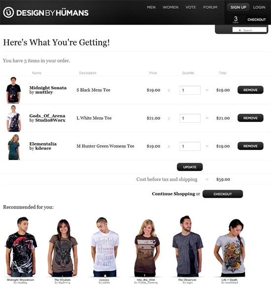
DesignByHumans
This site features a simple, easily understandable shopping cart with a functional design.
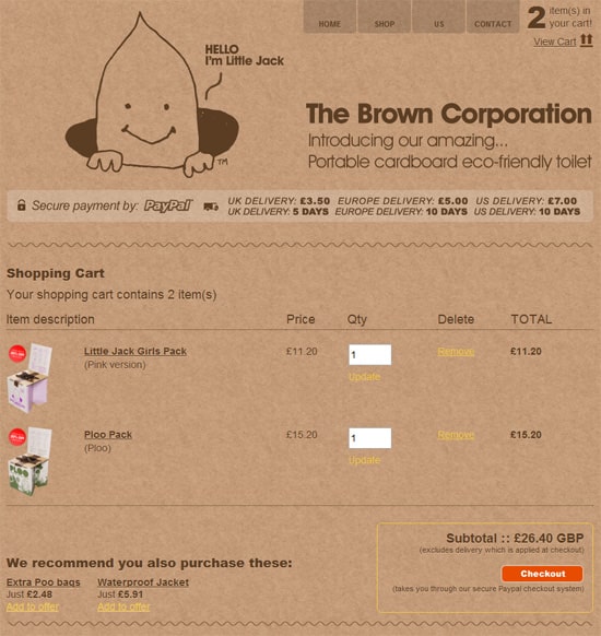
The Brown Corporation
This company shows us the basic elements of a shopping cart. It shows the total number of products, the total cost of goods, and helpfully features the ability to modify product quantities.
BustedTees
BustedTees added a product suggestion feature to their shopping cart. It analyzes the current contents of the cart, and shows the user items similar items that they might wish to add as "impulse buys".
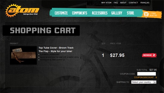
Atom Bicycles
On Atom Bicycles, the shopping cart is aimed at saving time for users. Customers can quickly check the items they've placed in the cart, without even waiting for the page to fully load. Atom placed an icon at the top of the site that displays the contents of the cart.

№8 Payment gateway
Obviously, any e-commerce website needs to be able to process payments, unless you plan to give away your merchandise for free.
When planning custom development, picking the right payment platform is vital. There are a large number of factors that go into this, including the payment methods supported, the fees, and the geographical location of your customers.
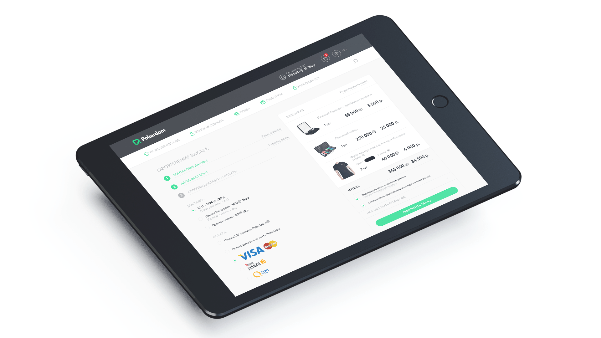
Dinarys has extensive experience in implementing the best ecommerce website features, including payment gateways, in ready-built online stores. The infographic shows several options for payment gateways integrated into our projects.

№9 Site Security
Especially in the wake of recent news, ecommerce website security is of critical importance. Customers must feel secure handing over their payment information, and that information must be effectively and vigilantly protected.
If your site looks unsecure, or if you have a major breach, customers will not wish to do business with you. At a minimum, your site should be PCI compliant, meaning it meets the security standards of the Payment Card Industry.
Conclusions
We've found that our clients aren't always sure about the current trends in custom ecommerce website development. That's why we gathered the best ecommerce features in one article.
Ecommerce websites should feature simple messaging, a search box, a shopping cart, a viable payment gateway, and strong website security.
Equally important, your website should provide a smooth customer journey through simple, effective design and convenient features. Otherwise, you risk losing customers to your competitors.
We hope that this article was helpful to you. If you would like to investigate possibilities for your own website, please fill out the form below. The team at Dinarys would be happy to help you increase conversions and sales, and realize your business goals.
Let professionals meet your challenge
Our certified specialists will find the most optimal solution for your business.

