Content
E-Commerce

Responsive vs Adaptive Web Design: What Is Better For Your Website Flexibility?


Why static design isn’t relevant anymore? Firstly, mobile devices have been used as a leading platform to access the internet for a long time. Moreover, Google has introduced mobile-first indexing on 1 July 2019. So from now on, the SEO optimization of a mobile website version is more important than the desktop one. In case you don’t have a mobile version your website may not appear in the Google search results at all.
There are two solutions: responsive vs adaptive web design to make it look good on any screen size. Both types can prepare your e-commerce website for mobile use. Still, there is a difference between them. They suit different website needs. Also, they differ regarding costs.
Lets talk about itHave a project in mind?
It is vital for businesses to make their website easily viewed on smartphones and tablets. Otherwise, you will drive less traffic and lose visitors.
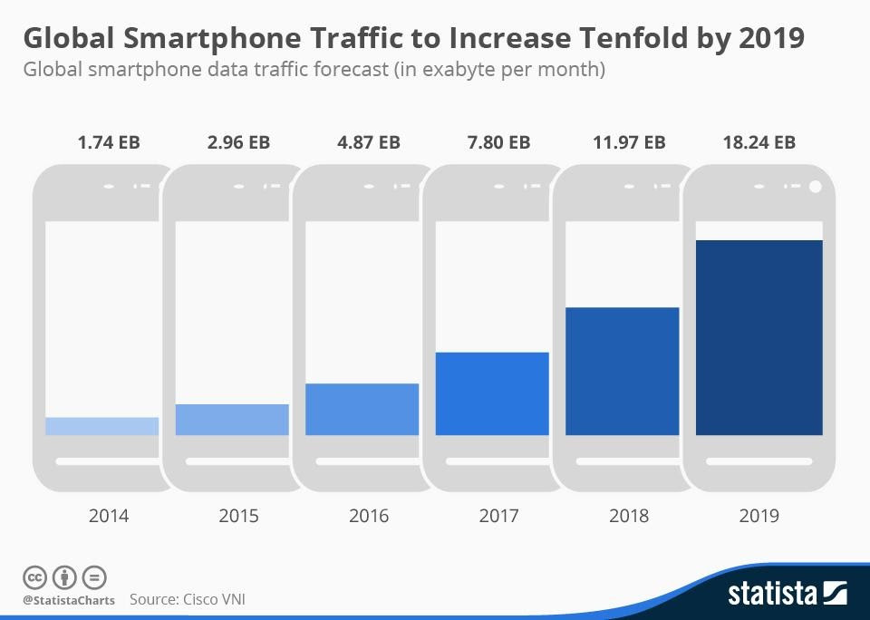
Source: Statista
From this article, you can find out:
- What is a responsive web design;
- What is an adaptive web design;
- Adaptive vs responsive web design examples;
- What design to choose for your website: adaptive or responsive.
What Is Responsive Web Design?
Source: weidert.com
The responsive layout adjusts accordingly to the various screen sizes.
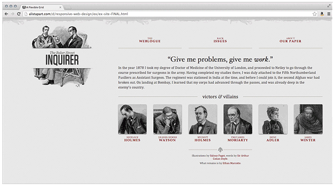
In 2010, the designer and developer Ethan Marcotte used the term Responsive Design for the first time in his book of the same name "Responsive Web Design".
Responsive web design responds to the size of any target device screen size. Websites with such design adjust the layout and functionality equally well to browsers 300px or 30 000px wide. This adjustment is possible because of the ‘fluid’ layout, CSS media, and ‘fluid’ grid. Responsive design allows the page to resize its height and width and show correctly on any screen.
For what reason do web designers use responsive web design techniques? Our team claims this type is straightforward to develop and takes less work to implement. The responsive design allows less control over the design of each screen size. It uses percentage-based CSS rules for changing the style based on the size of the screen.
Today it is a preferred method for developing new websites. Most ready-made templates for CMS like Magento or Shopware have a responsive design by default.
Read further our guide: Best Magento and Shopware Electronics Themes For E-commerce Websites
Our team creates a single look of a website that will be used for all screens. The first thing they produce is the middle of the resolution. Then, they determine the adjustment for the lower and higher end of the resolution scale. Then such design translates to any device’s screen. From the point of user experience, such uniform design provides customers and website visitors with a seamless and smooth journey.
Read also: BigCommerce theme development
Why use responsive design?
It's important to admit that responsive design is simpler and requires less work to implement. It provides less control over your design on each screen size. Nevertheless, currently, it's the method of choice for building new websites. It might also have something to do with a great number of cheap templates which are accessible for most Content Management Systems.
When to use responsive design?
In case you hesitate, we'll provide you final consideration when deciding to choose responsive design:
- For small to medium-sized companies that need to upgrade their existing sites, responsive design is an ideal option;
- For businesses that need to create a new website, a responsive design is also a perfect choice;
- It is recommended to use responsive design for service-based industries as they mainly consist of text and images;
- Finally, an important point is that responsive design is budget-friendly. That means it is possible to get a fully functioning website at an affordable cost.
Advantages and disadvantages of responsive design
In dependence on the browser space available, responsive design allows the designers to show content. It provides coherence between what a site displays on a desktop and what it displays on a portable device. Responsive design is a more popular approach today and is considered a “traditional” variant.
Among the advantages of responsive design our experts define the following points:
- It is seamless and uniform, which means having good UX;
- Multiplicity templates for use;
- Being SEO friendly;
- It is commonly easier to implement.
And now let’s take a look at the disadvantages of responsive design. Among its drawbacks we note:
- It provides less control of screen size design;
- It becomes possible for elements to relocate;
- Commercials lost on screen;
- It takes more time to be downloaded on mobile.
What Is Adaptive Web Design?
Source: weidert.com
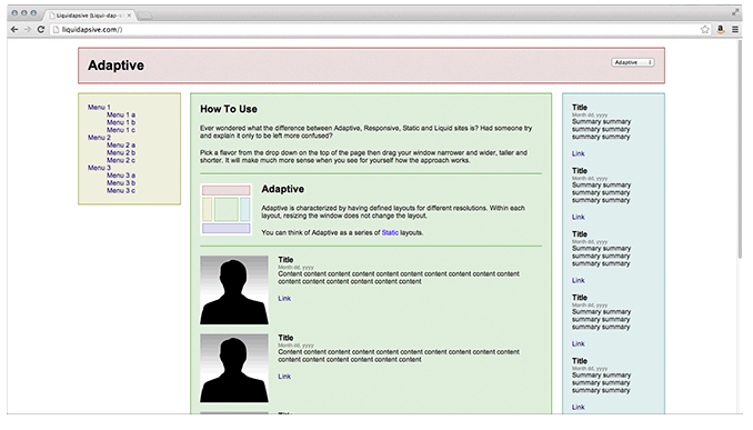
Adaptive design uses several layouts to adapt to different screen sizes.
The main difference between adaptive and responsive web design is that adaptive web pages have several layouts that suit particular screen sizes of different devices. In other words, a web designer should develop specific plans for mobile phones, tablets, and desktop computers.
How does it work? The website detects the device being used and delivers the pre-set layout for this particular type of device.
Lets talk about itHave a project in mind?
This way, the adaptive design provides website visitors with the best experience since all the website elements suit a particular interface. While responsive websites screens “flow” from one screen size to another, the adaptive design offers tailor-made solutions. The animation below demonstrates that the adaptive design snaps when it switches between predefined layouts as the screen size changes.

The top block is responsive and the lower is adaptive.
Source: css-tricks.com
For us, as a development team, it is important to show users that we understand their needs for usability. Therefore, we do our best to make each screen touch responsive. We develop several stand-alone designs of your future website to make sure that every element of the layout is in the right place. Adaptive design differs from responsive one, which requires using percentage-based CSS rules. While the adaptive design uses one static layout per each anchor point. When the anchor point has been detected, it adjusts to the screen size.
We start the development process of adaptive design from the lowest resolution version of your website. Then, we move to the highest and create multiple renditions of the same design. The current standard is six adaptive designs for different devices’ widths: 320px, 480px, 760px, 960px, 1200px, and 1600px. However, depending on the data of your website visitors, you might need fewer designs.
While the responsive design works great for simple websites, we highly recommend using the adaptive model for mobile versions of online shops and sites with a layout consisting of many elements. Moreover, adaptive sites work 2-3 faster, compared to responsive websites, which might be useful for conversion increase.
For more details on e-commerce website design: 5 Tips for Magnificent E-commerce Website Design
Why use adaptive design?
Theoretically, the adaptive design will be able to provide the best user experience depending on the device the user is utilizing to the interface. The adaptive design proposes tailor-made solutions and that is the difference from the responsive design where a screen “flows” from desktop design into a smaller device.
A substantial advantage of adaptive design is being more relevant for the contemporary user experience. In turn, responsive design has a more desktop-oriented approach (with the requirements of other devices taking a secondary, almost passive place).
When to use adaptive design
If you are determined to select an adaptive design, we provide you with some final points you should remember. Among them are:
- Adaptive design is considered an ideal choice for existing websites that need a mobile version;
- It is advised to select an adaptive design for speed-dependent sites;
- Adaptive design is a perfect choice for a highly targeted experience that can be adapted to somebody's location, connection speed, and more;
- Adaptive design is a perfect solution for people who are looking to have more control over how their site is delivered to various users on various devices.
Advantages and disadvantages of adaptive design
Adaptive Design was coined in 2011 and it is more adapted to that the designer has a few fixed layout sizes. This type of design is an alternative to the “one-size-stretches-to-all” approach.
So, let’s talk about the advantages of adaptive design. Among its strengths are:
- It lets designers build the best UX for the relevant device;
- It becomes possible for mobile devices to define their user’s environment;
- It becomes possible for designers to optimize advertisements based on user data from smart devices.
And are there disadvantages of adaptive design? Certainly. Among the cons of adaptive design the Dinarys experts define the following:
- It is time-intensive in creating as the majority of adaptive designs are upgrading traditional sites to give them more accessibility;
- There may emerge trouble in netbooks and netbooks with site configuration as it's the smartphone- or desktop-targeted;
- It's a challenge for SEO. The reason is the complexity for Search engines to recognize identical content on several sites.
How Do Responsive And Adaptive Design Compare?
Well, in case you are looking for a cost-effective, handy option to create a highly functional and convenient user experience, responsive web design is the best to choose. Moreover, it is required to provide less maintenance and upkeep for responsive sites.
Nevertheless, there are also many advantages you get from choosing an adaptive design. Among them are a more personalized and target user experience.
So, to make an ultimate choice, you should understand and plan your goals, needs, and budget and as now, as in the future.
Adaptive vs Responsive Web Design Examples
Let us move further because we are going to show you some excellent illustrations of responsive and adaptive websites.
Responsive design examples
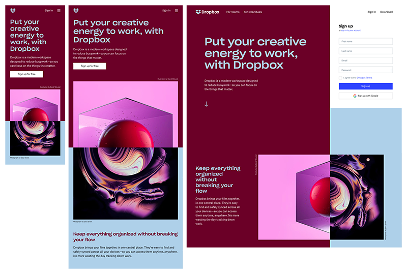
Image source: Dropbox
1. Dropbox Dropbox has a great responsive website. In addition to flexible visuals and fluid grid, the site changes the front color version to accommodate the background color and image orientation. Users can enter the website by using the signup form, hidden behind a call-to-action button. Thus, Dropbox offers users a convenient experience across each device.
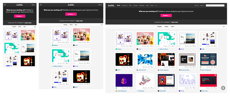
Image source: Dribble
2. Dribbble The responsive web design of Dribbble's website has become one of the company’s hallmarks. Apart from a flexible grid, the responsive design of this website changes the navigation menu from five columns on desktop computers to two columns on mobile devices and tablets. The company, to make the responsive version even more user-friendly, removed the search bar and hid a menu behind a hamburger icon.
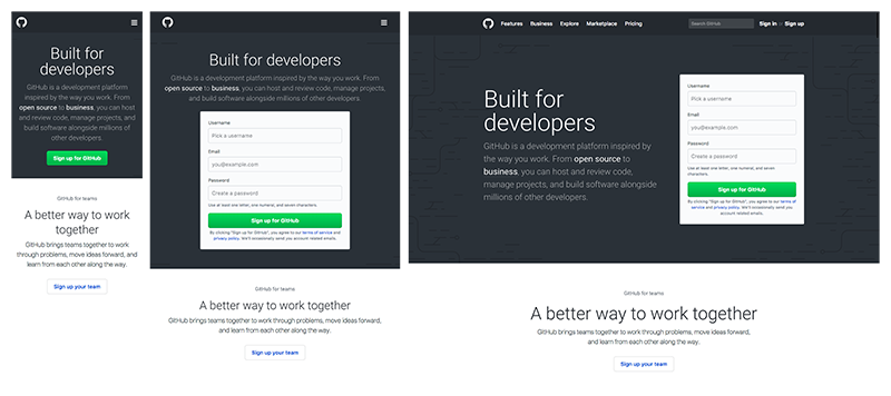
Image source: GitHub
3. GitHub GitHub is another company that uses responsive design for mobile website versions. To offer a consistent experience across all devices, they changed the area above the fold from two columns to a single-column layout. To reduce clutter on mobile devices, GitHub removed the search bar and hid the menu behind a hamburger icon.
Adaptive design examples
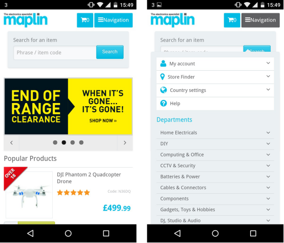
Image source: Maplin
1. Maplin
The first example is UK-based retailer Maplin. The company chose to use the adaptive website without a unique URL for the mobile version. The Maplin website detects the visitor’s mobile device and serves a different version of the site. As you can see, the website design allows shoppers to browse products and make purchases in a comfortable and user-friendly way.
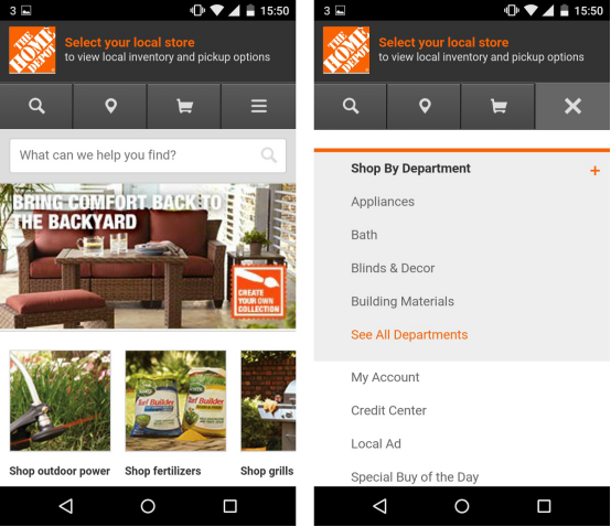
Image source: Home Depot
2. Home Depot
Home Depot, a home appliances retailer, provides a smooth journey on its use adaptive website version. Such a feature, as location sharing, shows mobile shoppers the nearest store. The adaptive website design also includes product details and access to real-time store inventory.
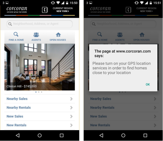
Image source: Corcoran
3. Corcoran
The Corcoran company also chose to use adaptive website design. The website of this real estate firm shows potential renters and home-buyers a list of amenities near the searched apartments and houses.
Lets talk about itHave a project in mind?
How do choose between responsive vs adaptive web design?
Both responsive and adaptive web design is aimed at providing mobile device users with simple interactions. However, it takes less effort to create a responsive design, compared to an adaptive website version. So, which should you choose? Is responsive better than adaptive? Consider some facts mentioned below, and you will be able to find the answer.
- If your website is developed with a popular CMS (Content Management System), like Magento or Shopware, you can buy a theme with a built-in responsive web design;
- If your website is a custom-made solution with multiple features, then you need to hire the development team to create the adaptive design for various devices and screens;
- If you want to rank higher in search engine results, you can go with the responsive design. This way your content will be perfectly visible on mobile phones and templates, which results in high mobile traffic;
- If your website includes much content, many buttons, and other design elements, your option is an adaptive design. To implement it, you need to hire a development team. They will develop a fixed set of templates for displaying on different screen sizes across many devices.
The responsive web design appears to be a safer option since it functions well with all screen sizes. Moreover, it improves loading website time and costs less than adaptive design.
Still, in some cases, adaptive web design is a better option. This type of plan requires developing a smaller version of a website with different layouts to fit different devices.
Another factor to consider is mobile website visitor intention. If it is different from desktop visitors (they book a service rather than view a product catalog), you should choose adaptive web design.
Final Thoughts
Mobile users use their devices to visit websites and buy online. Mobile traffic cannot be ignored. Your site should have a responsive or adaptive design, to keep the visitor’s journey seamless and straightforward. Both of these options help your customers and visitors easily navigate your website or an online shop.
We recommend developing the responsive design in case of limited time and budget and if there is no difference in viewing and interacting with the website on a desktop or mobile device.
At the same time, adaptive design wins when the loading speed is crucial, and users use desktop and mobile website versions for different purposes.
Still, there is no single answer on what to choose responsive vs adaptive website design. We think that each case should be considered individually.
If you need additional consultation on what design version to use for your website, or you are in search of a web development and design agency, we are here to help, just contact us with your project description.


Let professionals meet your challenge
Our certified specialists will find the most optimal solution for your business.
Related articles

Other related searches
- Ecommerce pharmacy website design services
- Magento website maintenance services
- Is BigCommerce better than Shopify?
- Key ecommerce conversion metrics
- Ecommerce warehouse management
- Magento theme developers for hire
- Software development in automotive industry
- MVP app development company
- Laravel app development services
- Move from WooCommerce to Shopify