Content
E-Commerce


E-commerce UX Design Tips
Time to read: 15 minutes

One of the most significant portions of enjoyment and convenience from using an online store comes from UX design. Bad UX can sufficiently discourage a person even from checking out a website or an application, not to mention purchasing any items from it. Yet, only half of companies actually focus on making a great e-commerce UX design by doing preliminary testing and research.
But how to design an online store so that customers would be delighted to buy something and definitely come back? Our team at Dinarys compiled a comprehensive list of essential components of a superior e-commerce UX, along with some tips to help you make your store more appealing to customers. Let’s start with what makes up both mobile and desktop e-commerce stores.
Lets talk about itHave a project in mind?
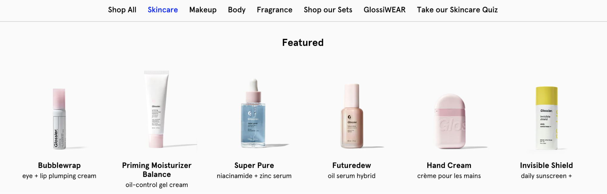
Essential E-commerce UX Components

Source: qubstudio.com
Both mobile and desktop versions of e-commerce share basic elements. They, however, sometimes require slightly different approaches.
User Interface
To make customers focus on the products you offer and not on figuring out how your e-store works, make your shopping interface design as familiar as possible. Users should be able to intuitively navigate through all UI elements or at least learn quickly along the way, so try not to experiment too much with common button placements and the product page’s structure.
An effective user interface e-commerce design should have unobtrusive yet visible branding across all platforms and advertising options. This will help future clients to associate your design with your product and will aid in memorability and brand awareness. The best ways to incorporate brand-specific elements would be to put them in headers, footers, a welcome screen in mobile apps, and product pictures.
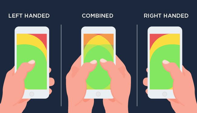
The mobile interface has a few rules as well. The main one is a “thumb rule” that suggests you put all your essential design elements close to the thumb reaching area on the screen for easier access (you can see how it works for different people in the picture below).
Second, resist the temptation to incorporate every feature you have on your website into your mobile application. The space on a mobile screen is limited and requires only necessary items.
Source: lollypop.design
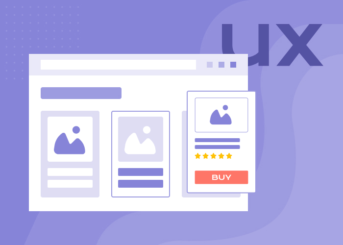
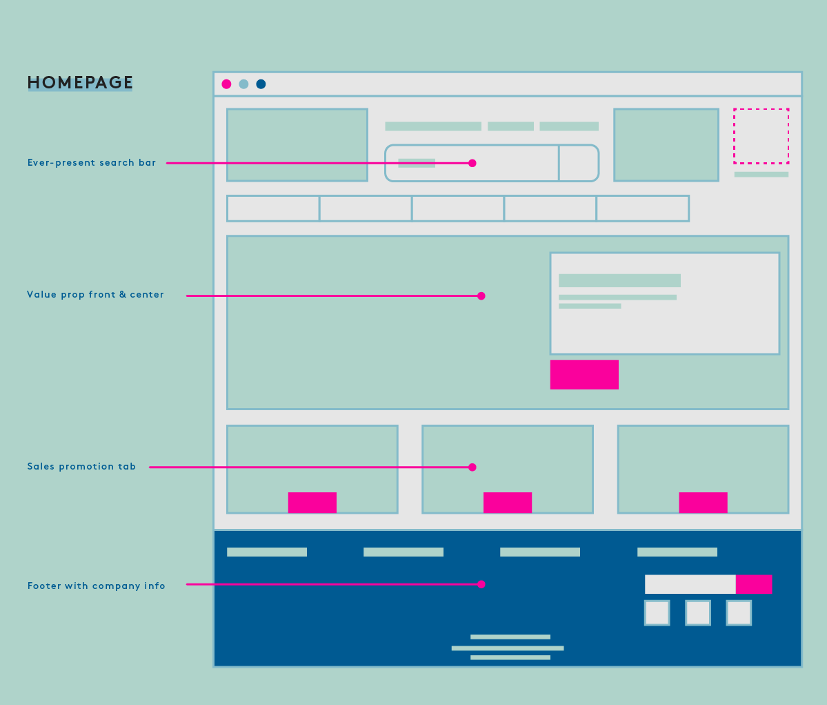
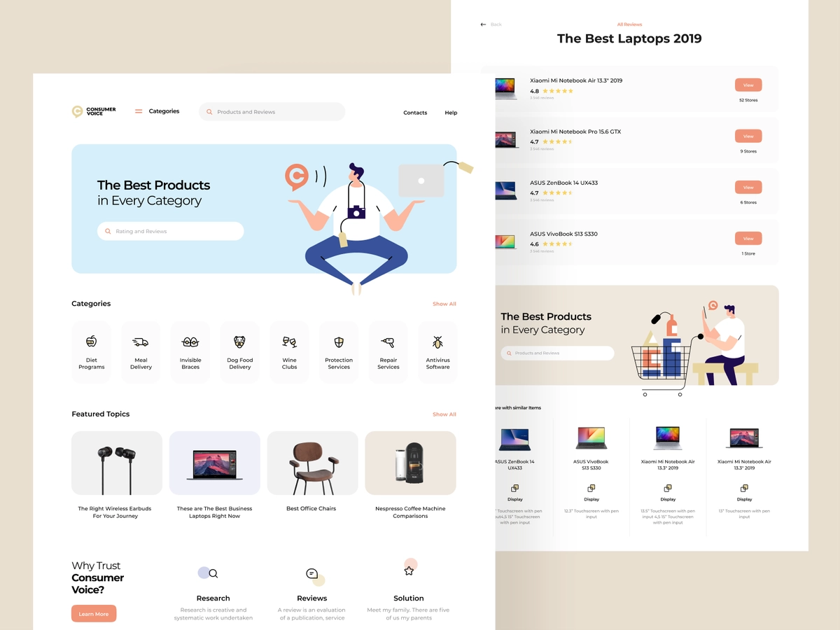
Homepage
Since the homepage is most likely the first one your clients are going to see, make sure it’s interesting and informative. Have it thoroughly structured to render it more comfortable for users as a starting point in your e-store. The homepage usually contains a visible search bar, a value proposition right in the middle, a few promotions, and a footer with links and useful information (see picture below).
Source: coredna.com
This sort of basic homepage structure can be called an inverted pyramid. The term comes from journalism and means placing the most newsworthy information at the top of the page (the broadest section of the pyramid), following by principal details at the center. Other less essential information at the moment is placed at the bottom.
Also, an excellent idea for the bottom half of the page is to include customer testimonials, product reviews, or multiple different social media endorsements. It will encourage new and quite hesitant customers to trust you and hopefully alleviate any doubts regarding the new store’s integrity.
Navigation
Source: dynamicyield.com
As we’ve mentioned earlier, e-commerce navigation UX should, above all, be intuitive and consistent. This means clearly stating:
- What page users are at and how to go back to the previous page or the homepage;
- The location of the main menu;
- Where is the search field - the icon should be visible at the top of the page;
- Where to find all the filters - usually on the left;
- Where to click for more information about the product;
- How to choose different item options;
- How to save an item in the Wishlist or buy it straight away.
While designing e-commerce navigation, label everything with well-known words. For example, when you add an option to save a product for later, call that list “Favorites”, “Wishlist”, or ask a customer to manually name their lists. Avoid vague or brand-specific names that may confuse new customers.
All navigation buttons on mobile applications should be easily located, wide enough to accommodate a tap of a finger, and scarce enough to not miss the needed button and clutter the space. Sometimes an item or a button may be so vaguely presented that users don’t know where to tap. This Baymard UX research has shown that 28% of websites failed to have clear hit areas.
Search and Catalogs
The e-commerce search usability depends on whether users have a smooth experience using the search bar on your website or app. This comes down to the search itself and the results page. The more products your e-store has, the more prominent should your search be - you may even transfer it from the footer into the center of the page. Also, don’t hide a search field behind an icon, make a long wide space for it, next to a magnifying glass.
For the results of your e-commerce search UX, make the layout appropriate to the search. Standard details should be shown in lists, while pictures look better in grids. It’s also quite thoughtful to keep the initial text of the search still in the field to allow users to make changes without re-typing.
While designing search UX strategies for e-commerce success, don’t forget about catalog and category pages. They should have a clear organization based on product type - display them in rows and highlight promotions and discounts with banners at the top of the catalog. If you have multiple products fitting in more than one category, consider incorporating navigational subcategories and polyhierarchy into your information architecture.
Source: dribbble.com
Filters
Useless or incorrect product filters can drive visitors away from your store for good. To make your e-commerce filters UX enjoyable and convenient, placement is essential.
This study has revealed the employment of horizontal filter design is better in terms of performance since users are more inclined to search for filters right above the product list and may mistake sorting for filtering as it’s usually located in that place. However, a sidebar, generally on the left, is where 80% of online stores usually place their filtering tool, so customers are used to finding it there.
Whether you apply horizontal filters UX to your e-store or a more predictable sidebar, the filter type also plays a significant role. Depending on your merchandise, filters can be:
- Category-specific to filter attributes that belong to a particular category of products;
- Theme-related - may be practical on clothing websites to filter collections;
- Product attributes - size, material, color, type, price, brand, etc.
To increase the convenience of the filter UX design, pin the applied filters to the top with the possibility of further adjustments. If your filters lists are too extensive to fit them all throughout the page, add the “view more” button and make it sufficiently visible.
Lets talk about itHave a project in mind?
Product Page
In UX, the product page is where you get your merchandise to shine using your thoughtful design and high-quality presentation. Avoid using ordinary stock images as they certainly do not inspire confidence in your products. Splurge on a photoshoot taken by industry professionals and showcase it in a small gallery with a title photo and a couple of pictures showing more product details. You can include how-to and introduction videos as well.
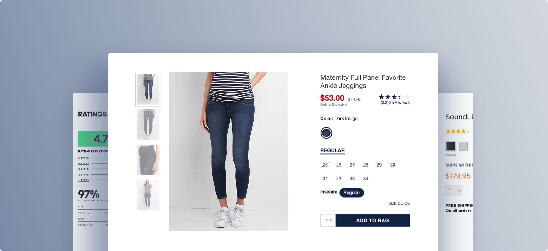
Source: baymard.com
Show related products on each item’s page to also increase discoverability. Place the recommendation right below the current item’s description for much faster browsing. Just make sure the algorithm really works and doesn’t show random products pretending to be related. Make sure each product page has a clearly defined and contrasted “add to cart” button and a pop-up indicator for the user that the chosen product has indeed been added.
Additionally, the product page UX design should have easily accessible customer ratings and reviews that open up on the same page (not a link leading to another page). You can also include shipping and returns information on each product page as well without customers having to search for it somewhere in the footer.
Signup and Checkout
Any previous UX choice you made for your store could be in vain if the checkout process is too elaborate. First of all, each step should have clear descriptions, follow a coherent structure, and don’t fish out information not related to the current order. The checkout should ideally comprise one or two pages, which will also be helpful later with mobile apps since all the steps are likely to double due to sizing differences.
Signup shouldn’t create unnecessary hassle either. To ease up the process, add as many automatic checkup options as you can, including Google and social media authentication. Make sure to include numerous payment options and make them visible, much like in the picture below.

Source: factorypattern.co.uk
Keep in mind that not everyone wishes to create an account - perhaps users just stumbled across your store and decided to make a purchase as a guest. Allow for uninterrupted browsing without signup and only ask for required information pertaining to the order at the checkout page. For those logged in, add automatic cart saving.
For both signup and checkout, include the option of saving information your customers put in form fields for future orders, especially if the form requires loads of typing. Highlight errors in red and add autofill and dropdowns for standard information, such as country, state, city, and zip code.
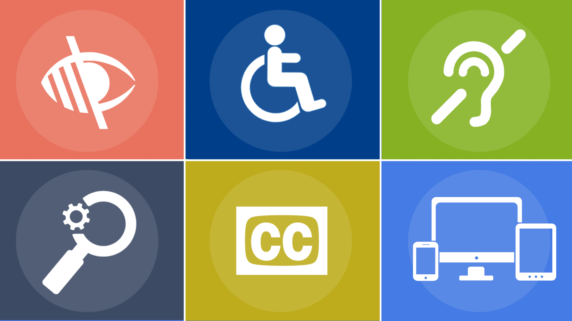
Accessibility
Accessibility was, for the longest time, the least talked about subject when designing for e-commerce, despite the fact that people with disabilities make up 15% of the world population, which is more than one billion. Thankfully, things are now changing, and e-commerce UX has started to become more accommodating and accessible to everyone.
To study in more detail how you can make any website more accessible, here’s a link to a collection of thorough guidelines compiled by the Web Accessibility Initiative. But for now, let us offer you some fundamental tips:
- Take the average contrast ratio of your store’s color palette and text up a notch to better adapt to users with visual impairments. A recommended ratio is 4.5:1 for normal-sized texts on products. Start with the contrast of your call-to-action buttons and links compared to background colors.
- Reduce your use of flashy graphics and make sure your store’s UX supports the latest browser versions to help customers that use screen readers regularly.
- To help colorblind individuals, try to use colors that are diametrically opposed on a color wheel to make them more recognizable. Alternatively, you can add multiple different textures or shapes to achieve the same effect.
- Add subtitles and captions to product videos.
Source: martech.org
UX Research in E-commerce
If you have time and some extra money, doing UX research (either on your own or with the help of a professional development company) is always recommended. Our team, having many years of experience with Magento and Shopware e-commerce, always starts any UX design process, regardless of the project’s size, with user research.
Each e-commerce business is different, even those in the same industry. The only way to fully grasp what your customers require is to perform user and market research and tailor your UX to their needs.
The research can be both generative and evaluative. Generative research is vital and represents the important discovery period, where you study and analyze user behavior by applying different tools and techniques. First, you need to define a problem you found in your design and then compile a solution. To find these problems, researchers usually perform online or offline user interviews, behavioral, ethnographic, or demographic studies.
Evaluative research helps you assess ready design choices through testing. Based on goals and requirements, this user experience research process consists of A/B testing, qualitative and quantitative research, guerrilla research, usability testing, and various surveys.
The benefits of any type of UX research come down to better user engagement and conversion rates, improvements in customer retention, and helps the overall growth of your business.
UX E-commerce Tips
A great e-commerce UX design should, by and large, be easily understandable by people of all sorts of backgrounds. This can be done by following our further recommendations.
Focus on functionality, not trends. Nearly all design trends that occasionally pop up on Dribbble or social media have either been displayed to show off the author’s creativity or influence a craze. However, that doesn’t mean any of those trends are suitable for e-stores. They tend to get in the way of usability by distracting the customer and overcomplicating things.

Source: awwwards.com
Here are some of those trends to avoid:
- Slideshows or carousels on the homepage. This Nielsen Norman Group study in the UK had shown they don’t usually get enough interaction and visibility beyond the first slide.
- Video and audio autoplay. Customers may feel it’s a little presumptuous to automatically play any media files without asking for permission first. It affects loading time as well.
- Countless pop-ups, especially full-page ones. One way to make them even more annoying is to make the closing button extra complicated or vague.
- Endless dropdowns. If a dropdown requires scrolling, it’s better to change it to a search bar or an entry field with autocomplete feature.
- Parallax effect. It takes away from the product by providing an unnecessary spectacle and may even slow down the website. It can also be quite jarring if not executed properly.
- Too much animation. Same problem as the last one. Too overwhelming and needs some extra optimization.
Label your functionality. Regardless of icon types, and even with their conventional placements, it’s quite useful to provide context by putting small, but informative text alongside them. Every so often, visible confusion may ensue, especially if a customer is not particularly tech-savvy or well-versed in design elements.
Avoid mysterious navigation. Unclear navigation that doesn’t show you where the link is supposed to send you is highly undesirable. Use anchor text or unambiguous labels to show what to expect. Minimalism is excellent, but not at the expense of a customer’s comfort.
Don’t treat your store’s mobile app the same way you treat your website. It’s arguably one of the biggest mistakes online retailers make. Your application being responsive isn’t enough. It should also be optimized for different screens and operating systems.
Every feature should look and perform the same way it does on other apps, not how it’s done on websites. That means, for example, that zooming in requires familiar pinching and dragging with two fingers, while the desktop version calls for pressing a few keys.
And last, but not least - be consistent. Internal inconsistency in design in the form of incompatible fonts, colors, etc. can be extremely confusing. While it doesn’t mean that every bit of detail should match to the point of absolute dullness, following the same congruent patterns in all of the e-commerce components - from login to checkout - will provide a more comfortable atmosphere for your users.
Explore some more practical tips on how to improve UI/UX design skills in this video.
Best User Experience E-commerce Websites
To offer a bit of “show” and not just “tell”, here’s our list of best user experience e-commerce websites at the moment.
Our UX compilation opens with an American online home improvement retailer Build with Ferguson. Having more than 50 thousand bathrooms, kitchen, and lighting hardware, and supplies, they provide a website with practical navigation that lets you rummage through all that variety without a hitch. Their UX is quite simple yet successful.
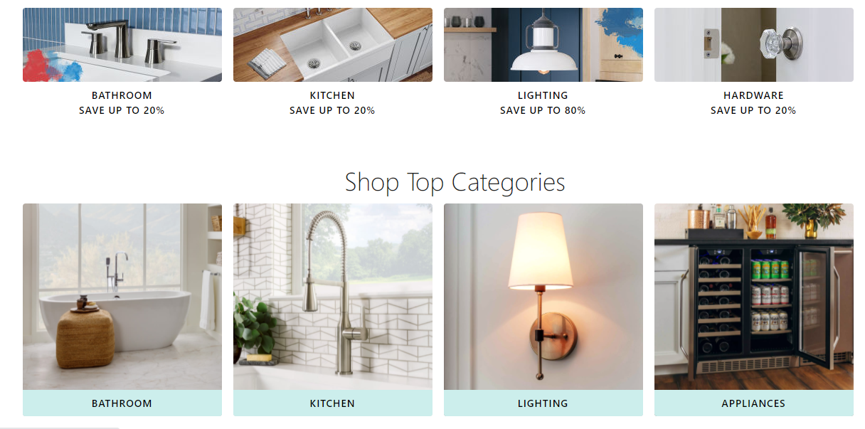
Source: build.com
Lets talk about itHave a project in mind?
The next website following the UX best practices for e-commerce is Solo Stove, the fire pit and grill manufacturer. They made custom icons for each category on their website. However, the experimentation did not detract from the website’s convenience, since it’s fun looking and accompanied by text explanations.
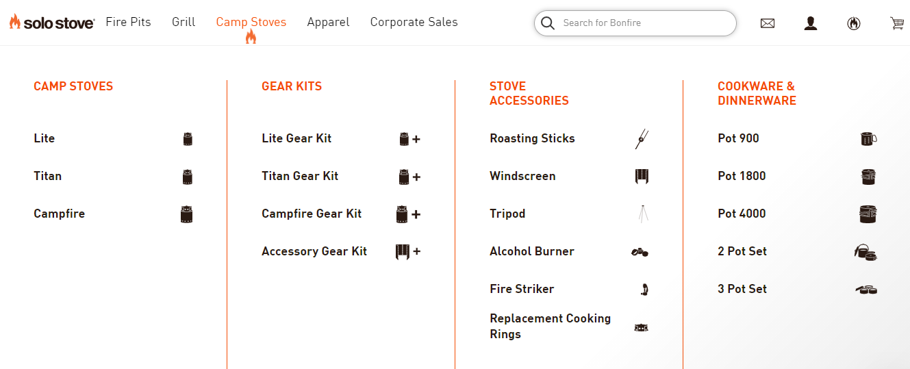
Source: solostove.com
Next comes Home Depot, the largest homeware retailer in the United States, selling numerous tools, construction products, and services. They implemented an excellent comparing feature for practical or indecisive individuals. You can compare both standard and specific product characteristics.
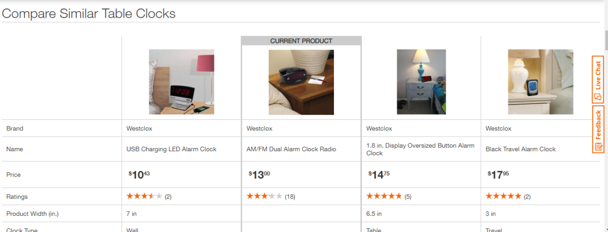
Source: homedepot.com
Closing up our list of the best website UX for e-commerce is Hebe, a clothing retailer located in Masterton, New Zealand. Their laconic typography choices and high-quality pictures for each item make this website a particular eye-candy and an inspiration for other UX designers.
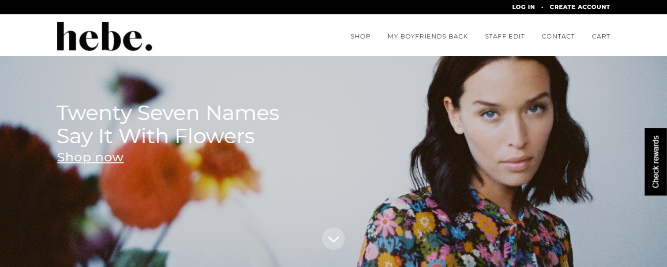
Source: hebeboutique.com
Examples of Mobile E-commerce UX Best Practices
Now’s the time for the examples of mobile e-commerce UX best practices. This selection kicks off with Nixon Watches, Californian watches, accessories, and audio brands. The mobile version of their website is just as elegant and colorful, with the added layer of responsiveness.
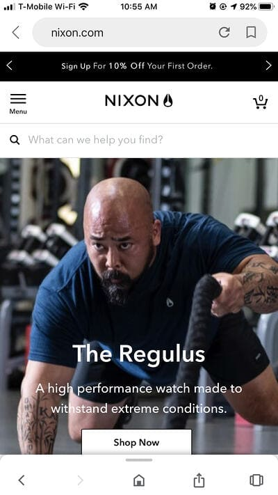
Source: groovecommerce.com
Next comes Shutterfly's mobile website. It’s an online service for personalized cards and photo books. The two best things about their mobile version are their use of gorgeous photography and the easiest possible navigation that complements their design without overwhelming the user.
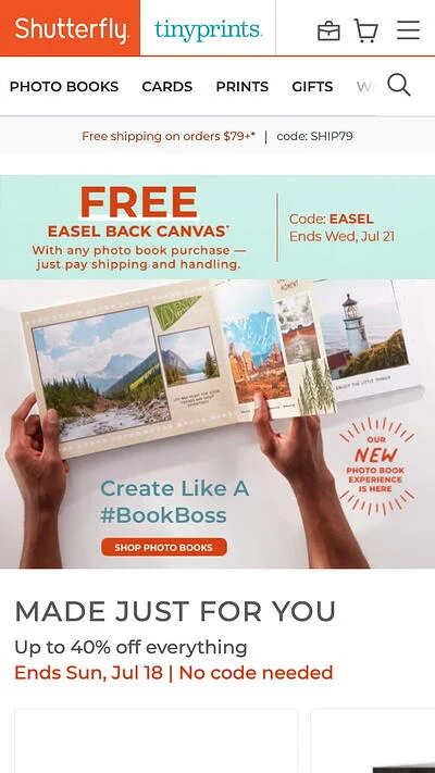
Source: hubspot.com
Among the best e-commerce app UX is also Etsy, the online vintage and handmade clothing, gift, homeware, and accessories shop. The mobile version of their website is highly organized with a superb filtering system that works just as well as on their website. Their search follows all the rules of exceptional mobile UX as well by being visible and responsive.
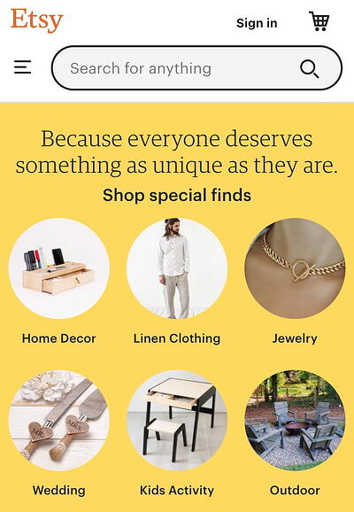
Source: hubspot.com
The last on our list is an online cosmetics store Lush. Their product’s visual representation on the mobile version of their website proves that you can fit all the imagery just as well on a smaller screen. Their style resembles popular Instagram feed, and their well-executed search and filter system alone places them on many “best UX” lists.
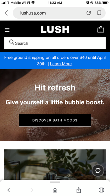
Source: groovecommerce.com
Read more in our blog Web Design Trends on the Rise in 2022 | What to Look Out For?.
Conclusion
In online shopping, UX serves as the consumer’s first impression of your company. Therefore, it has to be nearly flawless and show people that you care about their experience in your e-store. There are tons of various research and already established guidelines for e-commerce UX. Also, we would recommend to check our Checklist for eCommerce Website Redesign
We picked some of the most important ones in this article based on our team’s experience in electronic commerce development. If there are any questions left or you have a project in mind, go ahead and let us know. We always welcome feedback and new challenges.


Let professionals meet your challenge
Our certified specialists will find the most optimal solution for your business.