Accessing websites on multiple devices was once a problem. There was a time when everyone was only comfortable accessing the internet on their desktop computer.
Portable mobile devices have become a popular method not only for communicating but also for accessing the internet while on the go;
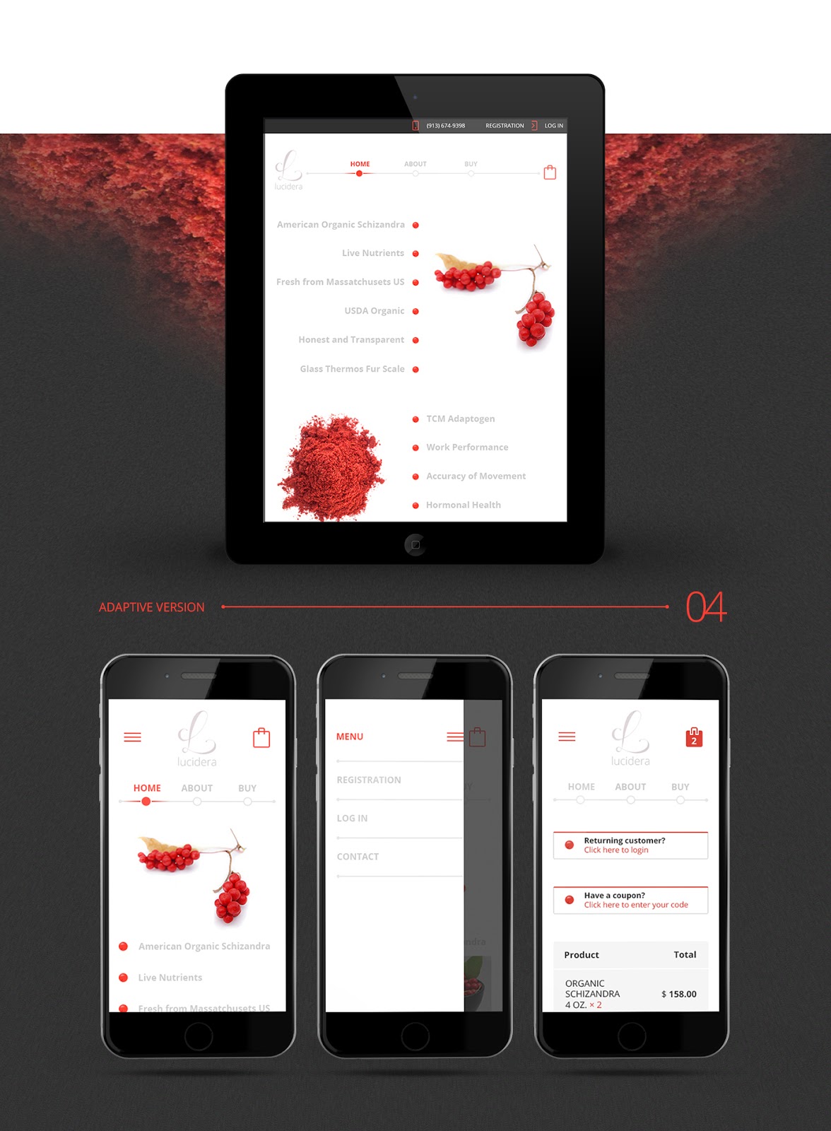
Because of this popularity, the demand for mobile devices is on the rise and it is only natural to assume that website owners make it their priority to incorporate website optimization for mobile devices into their site design.
How does the popularity of mobile devices affect website owners? The answer to this question is pretty straightforward. The probability of a site attracting a bigger audience is much higher if it is accessible on multiple devices.
This is the best part, as you can gain many benefits by embracing the mobile strategy. One of the best advantages of optimizing your site for mobile-friendly versions is the ability to build a wider target audience online. In this article, we cover the main ways of how to optimize your website for mobile.
One of the crucial points for your website is to make it work smoothly on mobile devices. If you still haven't made a website mobile-friendly, it's high time to think it seriously. And before we delve deeper into how to optimize a website for mobile devices, let us give you some reasons why the presence of mobile is crucial for business. Among them we define the following:
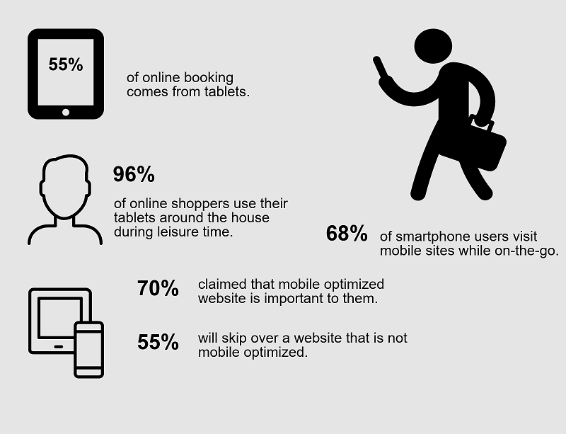
Search results positions gained by mobile-friendly websites are significantly higher;
The half of searches on Google.com are consists of mobile searches;
A large part of the traffic that get the majority of the advertisers is gained from mobile phones;
The potential customers are 5 times more likely to leave your website if it isn't mobile-friendly.
How to Define if Your Website Is Mobile-Friendly or Not?
To define if your website is mobile-friendly or not, imagine yourself as a potential user and open your website on your phone. Then answer the following questions: Is it loading quickly and is it easy to find what you are searching for?
In case, the website isn't quick to load and it isn't easy to find what you are looking for, you need to know how to optimize a site for mobile.
When people are loading the website from a mobile phone, they are waiting to get the answers immediately. The main thing for users is to quickly learn about the services or products you offer and define if they're interested. The experience of users on the website will affect their impression of your business and the probability that they'll become clients.
Website development for mobile means concentrating on simple, understandable navigation that will let people find what they're searching for.
You may answer some questions to define if your mobile website is effective:
Is your website quickly loading?
Is the website simple in navigation?
Is the action easy to be taken?
11 Best Ways of How to Optimize a Website for Mobile
It is very important to understand the concept of website optimization for mobile and what it can do for your business before you can proceed to adopt it. A lot of research has to be done, as well.
Research usually covers the best techniques and methods for optimization. A very important part of the research is the mobile devices themselves.
Looking at the top trending mobile devices and working to optimize specifically for them is another thing that should be taken into account during the initial stages of planning. Therefore, let’s look at some of the best ways which help you to optimize websites for mobile devices.
1. Make simplicity your priority
The first step in website creation is:
Figuring out what your content will be. You have to pay great attention when it comes to your content fulfillment and further optimization.
After this, when the stage has been successfully set, you have to proceed to look at the amount of screen space your website will cover.
A website developer is supposed to be able to identify or predict the major information a typical user would be looking for on the site.
This will further enable them to work toward making the website very easy to navigate. This simple concept can also be easily incorporated into many devices.
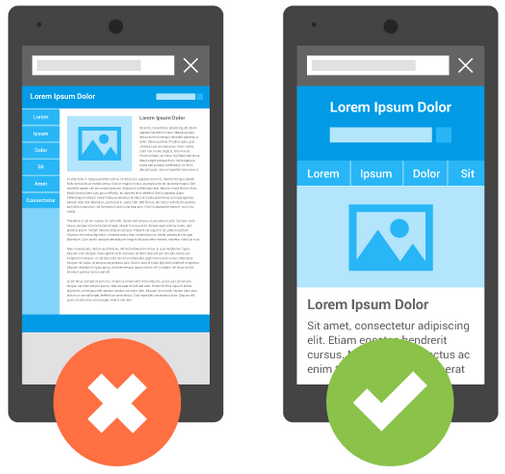
2. Make a plan for your website’s layout
Every website developer understands that mobile pages generally load slower than on a standard desktop. Therefore, mobile pages should be kept to a minimum.
Additionally, your website layout should be streamlined. This always translates to a better user experience for internet users. The bottom line is to keep your website layout as simple as possible by putting yourself in the users’ shoes.
3. Focus on touch, making navigation responsive
Smartphones have, indeed, made touch screens very popular and it is virtually impossible to think of getting through the day without any interaction with them.
When designing your website for touch screens, make sure your navigation will be well adapted for fingers of different sizes. Users will feel uncomfortable if they always have to carry out certain maneuvers like pinching to zoom.
Another problem usually encountered when trying to optimize a website for touch screens is inaccurate tapping. Add the best-sized touch inputs to your web design to avoid most of these complications.
4. Use compression tools in the design
Nowadays, finding a tool that can do what you want, instead of a website designer, is pretty simple. At the same time, you may be faced with some difficulties and issues. Some of the more popular compression tools out there include HTML compressors.
Tools like that help to delete any code, white spaces, or content that are unnecessary for design. They usually perform this function automatically.
Other tools like CSS minifier and CSS compressor are specifically designed to help you link your CSS code in chains or series, which can always improve the performance of your website.
5. Make sure all the branding features on your standard site are also added to your mobile version
a
Your standard website will always remain the most important asset to reach your users. This does not mean your mobile site should be neglected.
Users should be able to link your mobile site and the desktop version. They can only do this if certain features present on the standard site are incorporated into the mobile one.
As a developer, remember that key branding features need to be transferred to the mobile site. A similar color scheme is a very good example of this. Therefore, make your users identify your business and its primary product by this feature as many companies have done.
6. Make sure you use white space
A very common mistake in web designing is overcrowding the screen with too much content. This does not always have to be the case and can be easily addressed. Remember that you are trying to make users stay on your website and an untidy webpage will not cut it for most target audiences.
The best way to solve this problem is not only to limit the amount of content you add to your website but also to make use of white space.
Users will see the typed content, important buttons (a checkout button in an online shop), etc. when they’re surrounded by a white background. This comes in handy, especially, when optimizing for small-screen devices.
7. Use an appropriate solution: Flash or Java is not the best tools for optimization
When optimizing your websites for mobile devices, it is important to look at the types of devices on the market. Nowadays, this market is dominated by Android and iOS-based devices.
You should be able to optimize for both of these operating systems. For example, using Flash is not ideal for optimizing mobile websites because iOS does not support it.
We have to remember that about 30% of the mobile phone market is covered by iOS. In the same vein, many mobile devices do not support Java or those solutions that usually have slow webpage loading times.
8. Check: the overall quantity of text entry must be lowered
Typing on smaller screens can be a hustle for some individuals. This problem is irritating because it takes time to search for a particular subject that the user is interested in.
The solution to this is making sure that mobile websites become independent of keyboards to carry out a function for the users. A good way of doing this is designing drop-down menus or checklists, which will act as a means of data entry.
The advantage of this is a remarkable reduction in the problems faced by individuals typing on smartphones.
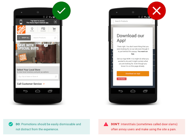
9. Try to stay away from pop-up windows
Users don’t like when they have to navigate through many different tabs and browser windows on their mobile devices. Adding pop-up windows to such devices will harm the general loading time for the website.
The best way to avoid this problem is to incorporate an alert system into the design of your website. In short, make sure your user knows how to go back to the original page when you need them to open a pop-up window. This is a great way of making the site mobile-friendly.
10. Apply mobile redirects
The last step for your website creation process should involve applying mobile redirects. This simply means that, when a user is on your traditional website, they can be redirected to your mobile-optimized site by clicking on a specific link you add to it.
11. Give users the ability to visit the full website
It is very natural to think that you have checked off every point on your list when you finally have your website ready. You are certain that your users will have a great experience with it and everything they will be looking for on the mobile-optimized site is in place.
In many cases, that may seem enough; however, certain users will always want more information about your business. The only way to make sure such individuals don’t feel left out is by giving them the ability to access the full site.
Certain creative features of your business can only be included on the standard website. The only way users will be able to see them is if you make sure they have an avenue to get to the complete site pages.
What's More?
A lot of businesses are turning to mobile sites as their go-to form of e-commerce. This has encouraged an increase in the search for knowledge to be able to build and optimize e-commerce websites for mobile devices.
Mobile sites have presented new opportunities for making sales worldwide. They work well for both established and start-up businesses by enabling them to express who they are and what they are capable of offering to potential customers.
It might take some time to get to your destination but, in most cases, all it takes is carefully following some great tips as accurately as possible.
You can contact us at Dinarys to have your website project fulfilled. Our clear understanding of the role of mobile devices on the success of websites will help us work with you and create a profitable and professional product to carry on a very successful business.
You may share this article
Let professionals meet your challenge
Our certified specialists will find the most optimal solution for your business.