Content
E-Commerce

E-commerce Website Architecture: Experience All the Benefits
Time to read: 20 minutes

E-commerce is an efficient, results-oriented solution sector that has become increasingly popular over the years, attracting the focus of more and more companies worldwide. Furthermore, the development of an e-commerce platform architecture is the starting point and one of the most critical stages of creating an e-commerce website. Website architecture development is a block of work in which the external and internal structure of an online resource is fully thought out. The connections between all the elements in this structure should follow the requirements of search engines, usability rules, and the expectations of the consumer target audience.
Whether you are creating a new site or optimizing or redesigning an existing one, this article will help you keep an eye on critical points of this process and create an exemplary e-commerce website architecture for the success of your e-commerce solution.
E-commerce Website Architecture: Why Is It Important?
Website architecture is the way information is laid out on a website. It includes organizing content so that users can quickly find what they are looking for.
There are two essential things to keep in mind:
- A good e-commerce site architecture serves both humans and machines (sounds technical, but we will describe it in a more detailed and understandable way below).
- A good site structure makes browsing intuitive. It thinks for users and predicts their further actions.
A poor e-commerce platform architecture is not intuitive. This makes it difficult for people to use your website and impossible for search engines to understand it.
On the other hand, a good site structure makes finding information simple and intuitive and thus does not require too much thought from users. Such content is also available for indexing by search engines, which deliver the content to users.
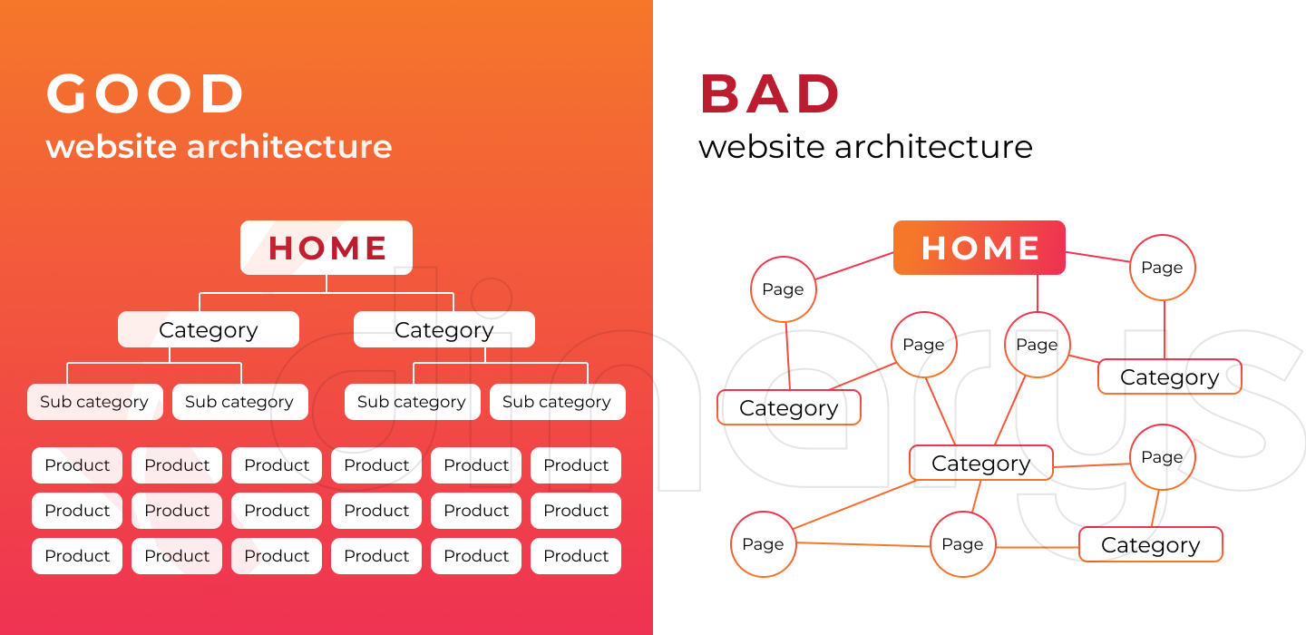
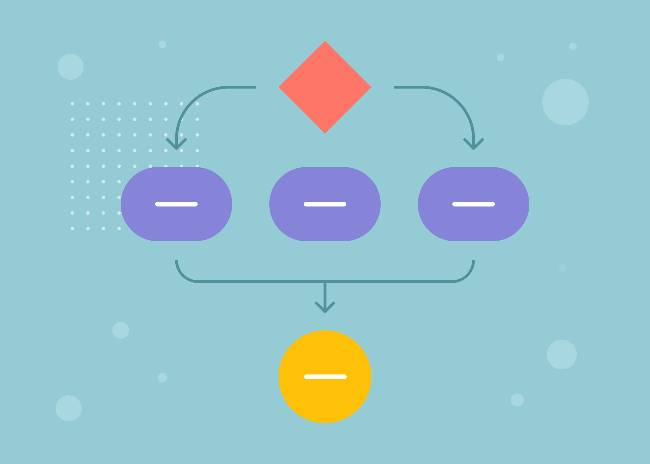
The picture above shows two e-commerce architecture diagrams. One represents a good site architecture that organizes pages into ordered structures. The second illustrates a poor site architecture consisting of disorganized, disparate pages.
What is the importance of a good website structure?
Building the website structure is an indispensable step in the internal technical optimization of a website. The site structure affects:
- The behavioral factor of SEO. The convenience and understandability of the site’s structure for users are indicated by their behavior on the site and the bounce rate.
- Conversion. Site structure is directly related to the site’s usability, which plays a nearly decisive role in e-commerce purchasing.
- Transfer of reference weight. Good site structure will help correctly distribute the link weight by priority.
- Indexing speed. A transparent, straightforward site structure simplifies the route for search robots and contributes to faster and more extensive site indexing.
- Site links. Proper site structure affects how your site’s additional internal links appear in search results.
Lets talk about itHave a project in mind?
Types of E-commerce Architecture
Creating an e-commerce architecture allows you to make your website more interesting to visitors. Furthermore, resources with a well-thought-out structure are easier to promote, as they are better indexed and ranked. That is, a high-quality, logical website architecture not only allows you to effectively promote your project in the Internet space but also contributes to the influx of new customers, thus increasing your profits. We will describe several types of e-commerce website architecture, as well as their advantages and features.
Two-tier architecture
Two-tier e-commerce website architecture involves the separation of information placement into two different spaces: the presentation (or interface) layer on the client side and the data layer on the server side. Dividing these components into two separate locations represents a two-tier architecture, as opposed to a single-tier architecture.
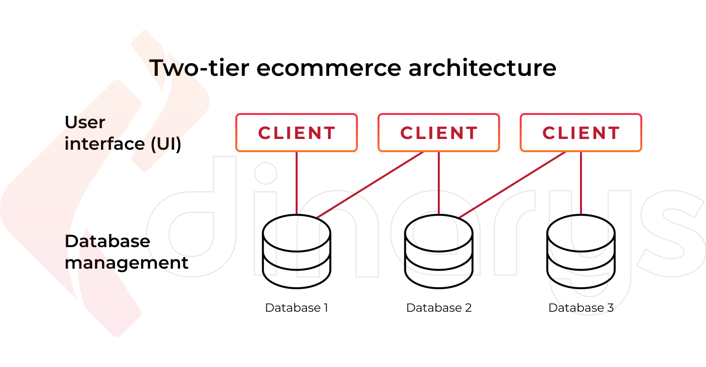
The client application typically runs on the client’s computer to collect data from the client and pass it back to the database server, thus creating consistent interaction between the two tiers.
Advantages of a two-tier architecture:
- Reduces the load on both server and client machines.
- Reduces network traffic and increases the efficiency of data processing through input-output optimization and buffering.
- Protects data using a database management system (DBMS), which can block actions permitted to the user.
- The server implements transaction control and can block attempts to modify identical records simultaneously.
Disadvantages of a two-tier architecture:
- The business logic of functional processing and data presentation can be the same for several client applications, increasing the need for resources (repetition of program code and queries).
- Since the client beholds most of the application logic, problems arise in controlling the current software version and redistributing new software versions.
- Lacks scalability, as it supports only a limited number of users. When simultaneous client requests increase, application performance degrades rapidly because clients require separate connections and CPU memory to proceed.
Three-tier architecture
While two-tier website architecture is sufficient for many businesses, you may need three-tier e-commerce website architecture if you handle many processes and require more functionality.
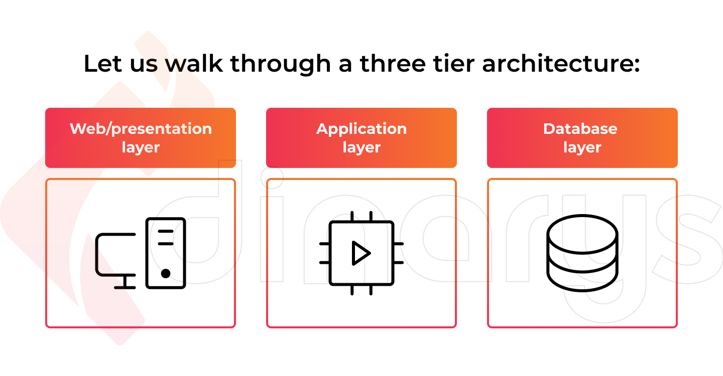
A three-tier architecture is a well-established software application architecture that groups applications into three logical, physical computing layers:
- The presentation layer or user interface.
- The application layer, in which data is processed.
- The data layer, where the information is related to the application.
Three-tier architecture offers greater flexibility than two-tier architecture in terms of platform configuration and deployment. This improves data integrity and provides a higher level of security, as the client lacks direct access to the database.
The main advantage of three-tier architecture is that each layer has its own infrastructure, meaning each layer can be developed by a separate development team. Therefore, each layer can be updated and scaled as needed without affecting the other layers.
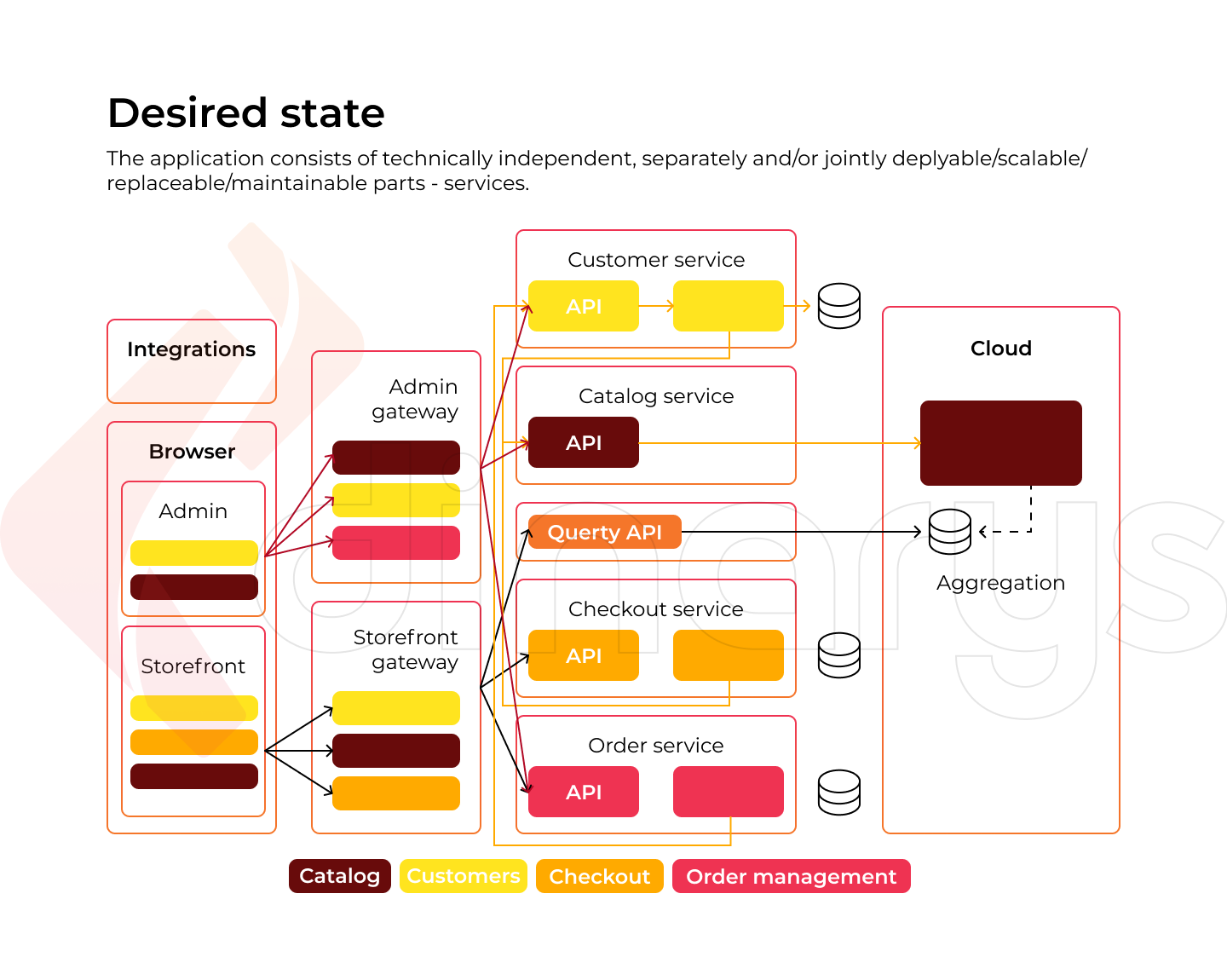
For decades, three-tier architecture has been the most common architecture for e-commerce websites. Today, most three-tier architectures must be upgraded to cloud technologies, such as containers and microservices, and require cloud migration.
Once again, let us visualize these two types of e-commerce architecture:
Microservices architecture
Due to the abundance of third-party solutions that can improve the user experience within the e-commerce sector, more and more platform developers are moving away from the monolithic approach (where everything is in one codebase) and toward the microservices approach. In this respect, microservice e-commerce architecture means building an application/website by organizing multiple services with less dependency on each other.
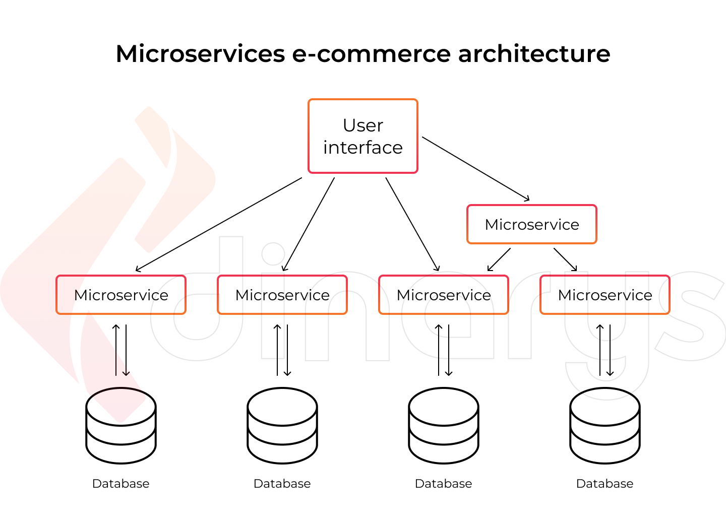
Microservices separate large business-specific tasks into several independent codebases. Monolithic application architecture is the opposite of microservices. A monolith is a single codebase that combines all business tasks. Monoliths are helpful in the early stages of projects, as they reduce the mental effort of code management and ease deployment. In addition, everything in a monolithic application can be released at the same time.
Read also: Composable commerce migration: MACH as a main principle
Many projects start as monoliths and then move to a microservices architecture as they mature. As new features are added to a monolithic project, difficulties eventually arise. Conflicts in the code become more frequent, and the risk that an update will introduce bugs in another unrelated feature increases. When these undesirable situations arise, it may be time to discuss migrating to microservices.
Lets talk about itHave a project in mind?
Magento is currently in the process of redesigning its architecture and moving away from a monolithic approach. The introduction of service contracts in Magento 2.0 is the first step toward this isolation.
This is a microservices-based architecture diagram for a Magento e-commerce website:
Read more: Microservices: Is Your E-commerce Company Ready to Follow This Architectural Style?
E-commerce Architecture: Tips to Boost Your Website
We have compiled the best tactics to consider when creating an e-commerce architecture. This is a complex, multi-stage process involving the following aspects.
Be mindful of keywords
The content of your e-commerce platform attracts not only potential buyers but also search engines. Search engines may show your website in their search results when a user is looking for your site or the product/service you sell. Therefore, it is essential that you help search engines discover, index, and rank your e-commerce website quickly. Keywords do the job. Keyword research is the analysis of queries entered or voiced by search engines, which can help you understand how users search for information in your niche.
External tools such as Semrush, Ahrefs, and KWFinder differentiate keywords based on metrics such as popularity, search volume, and competitiveness. This is useful in evaluating the value of certain queries and pages.
sdwweed.png)
Exemplary keyword practices:
- Create a spreadsheet with columns to represent website pages.
- Match keywords with relevant pages, URLs, titles, and content to select the most relevant keywords.
- Optimize your HTML elements, content, and links with your chosen keywords. Make sure they fit correctly and organically.
Take advantage of internal links
One stage of search engine promotion is the creation of internal linking (i.e., connecting pages to each other through hyperlinks). This method improves the customer experience and introduces more search-related products without interrupting the buying process.
It is impossible to effectively optimize an online store without proper linking of the site pages.
For an online store to take a high position in search engine results, it often helps to:
- Increase the viewing depth and page duration to reduce the bounce rate.
- Evenly distribute the static weight of links.
- Give more weight to essential pages for mid-frequency (MF) and low-frequency (LF) queries.
- Speed up page indexing by 2–3 times, leading to traffic growth.
- Increase the relevance of pages to a query.
- Save money on the purchase of reference mass.
More competitive niches demand better internal linking of pages.
Important! Remember the basic principle of internal linking: no harm. Links should only be placed where needed. Pointless random links to empty random pages that no one will ever click on is a poor linking scenario that can cause problems related to resource indexing.
Reflect content organization with site navigation
The implementation of convenient site navigation allows customers to save time when choosing the right products and not get lost in the “wilds” of the online store. How can site navigation be made as clear and functional as possible for visitors while also benefiting SEO?
The site navigation system can be compared to a geographic map containing various menus, icons, links, and control buttons. With the help of these features, it is easy to flip through the pages of a resource, find necessary information about products, and make purchases.
Suppose that the search functionality of an online store is more suitable for buyers who can formulate requests. In this case, all visitors to the trading platform require a convenient site navigation system. First, it should become clear what and how one can buy in the online market. Second, it should be easy to highlight previously viewed pages and determine one’s current position within the website.
The more competently the navigation structure is built, the more competently the user will be able to find what they need and place an order; thus, the conversion will increase. Conversely, underdeveloped navigation will lead to lower conversion.
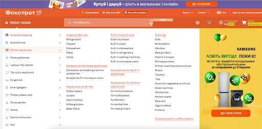
Next, we will offer some tips on how to make your website navigation more intuitive and smooth, using examples from one of our projects on the Magento platform for the Foxtrot e-commerce store.
Use the habit principle
When arranging site navigation elements on a page, do not try to experiment. On the contrary, leave these elements in familiar areas, where they are typically placed in most online stores/marketplaces.
Make the location of the menu standard, in the header of the page, or just below. The menu should be visually distinct from the general background of the content so that users will immediately pay attention to it. The same applies to the placement of the authorization form.
It is desirable to place the Shopping Cart on the right, not the left. Buyers automatically look for it on the right side of the screen and may become confused if they do not find it. Instead of a "Buy it" click, they will first need to look around the screen for the cart icon and add the product.
Do not always follow the three clicks rule
It is essential to understand that the well-known principle of three clicks does not always apply and thus should not be the basis of a website hierarchy. One study analyzed more than 8,000 clicks and showed that most purchases (approximately 80%) were made after 15 clicks. The respondents flipped through up to 20–25 web pages, and this procedure did not annoy them. Statistically, a buyer’s probability of leaving a site is nearly the same after three or twelve clicks. Therefore, the positive outcome of a completed task is not directly proportional to the number of clicks required.
There is no direct relationship between the number of clicks and the degree of user satisfaction. A visitor is unlikely to complain that they had to “walk” through too many web pages if their issue is resolved positively and the desired product is found. Even when there are complaints about excessive clicks, the essence of these complaints is typical that the user’s issue was not resolved.
We recommend maintaining an optimal balance by not blindly following the theory of three clicks but taking into account its logic and striving for the minimum number of clicks. In addition, the product search scheme should be as simple as possible. All available tools should be employed to meet the basic rules of usability.
Get your CTA buttons right
Call-to-action (CTA) buttons should be visible on the page. Make them prominent and contrasting in color. The text should motivate (“Buy”) or explain (“Go”) action. Here is an example from our work for the Azerbaijani electronics store Kontakt Home. See how contrasting CTA buttons clearly show where the user needs to click and what will happen after clicking.
sdsc.png)
For proper UX, the first-order action button should not be stylistically identical to the lower-level action button. It is necessary to build a logical chain of sequential actions and develop an individual style for each level. The ideal option is a bright accent on the first-order button and more subdued colors on the secondary buttons. In this case, the buyer will immediately receive a visual hint and determine the priority of actions.
Another example of a well-designed CTA button on the Kontakt Home webpage is the “Add to cart” button, which appears brighter, more voluminous, and more contrasting than the compare and favorite buttons.
Don’t forget the bread crumbs
Breadcrumbs are navigation in the form of a chain of links tracing the path to the current page from the root of the site.
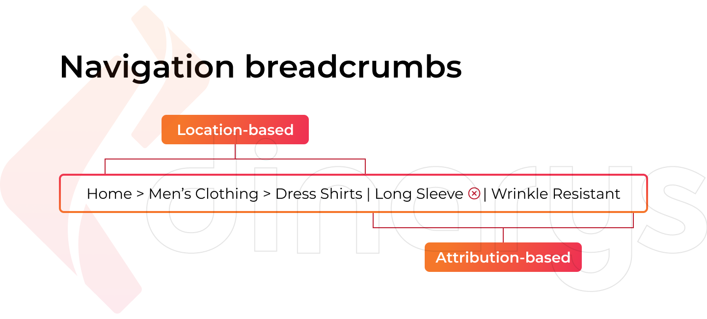
This tool is not a novelty. In fact, it has demonstrated its importance and usefulness for e-commerce website architecture over the course of many years.
From a usability perspective, breadcrumbs solve three problems:
- Inform the user of their current location on the site.
- Visually demonstrate the structure of the resource.
- Allow the user to quickly move to a higher nesting level, bypassing the browser’s "Back" button.
In addition to its positive impact on usability, duplicate navigation also has an effect on SEO:
- It is a natural element of page linking.
- It improves behavioral metrics (time on site and browsing depth) by simplifying navigation.
- Provided that the micro-markup is configured, it improves the appearance and increases the clickability of the snippet in Google searches, forming a readable navigation chain.
Lets talk about itHave a project in mind?
Optimize product and category pages
The main page of an e-commerce website has only a couple of seconds to convince the buyer to go to other pages and not leave the resource. Therefore, careful attention must be paid to its design.
Each menu is divided into several sections. For example, the administrative menu contains news, useful links, and information about the company. The main menu includes product categories, payment, delivery, and reviews. However, you should not create too many sections, or else the page will become overloaded and the information will not be comfortable for the visitor to view.
If the buyer is interested, they will navigate to the product categories page from the main page. Nothing on this page should distract the client from the target action of the purchase. Brief product cards, prices, product ratings, and various filters should be placed here so that the buyer can quickly and comfortably find what they came for. By clicking on the appropriate product card, they will find details regarding the product’s price, availability, guarantees, colors, and so on. The same page should also contain reviews and information about a similar or recommended assortment of products.
Consider the two most popular structures for online stores: tree-like and tagged structures.
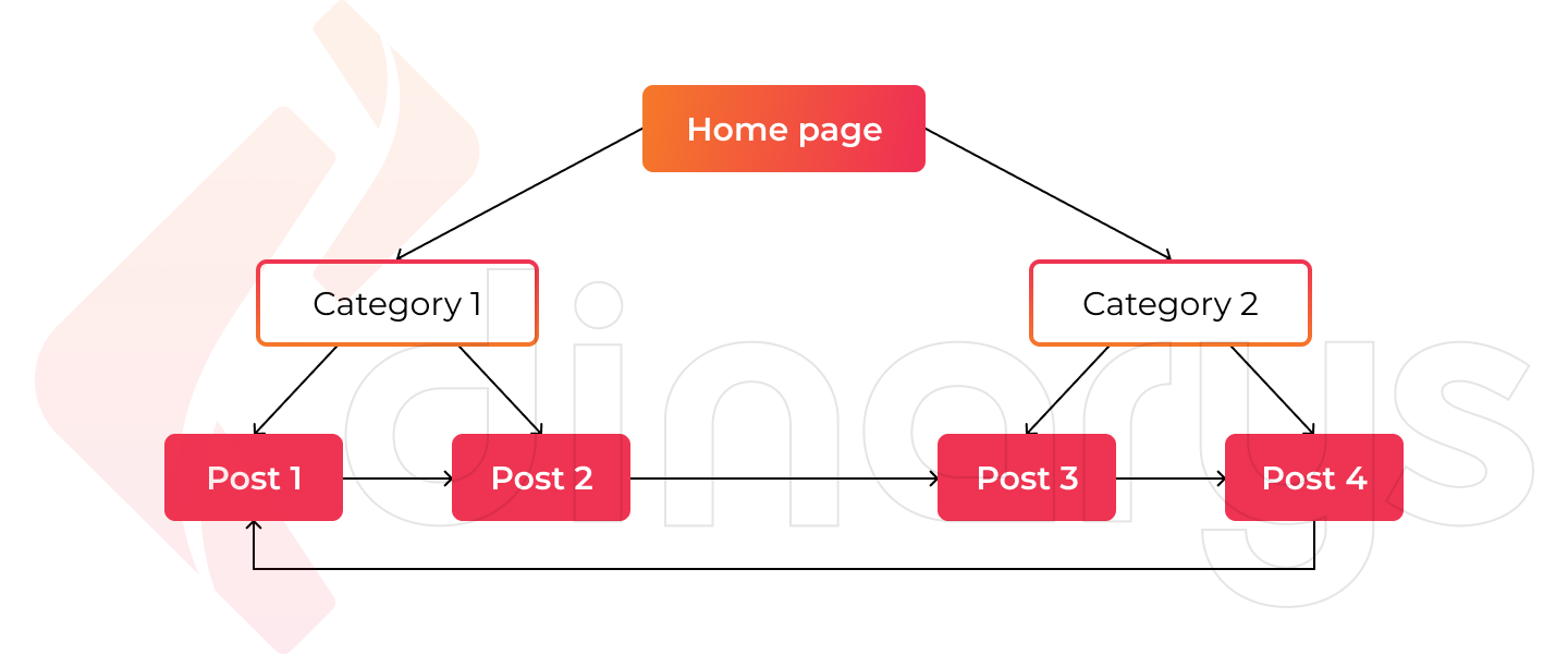
Tree-like structure
This site structure resembles a tree. Using this structure, the owner of an online store can segment the assortment of products in detail. Simply put, a set of categories is created for the customer to find a product. This structure works best for narrow-profile resources with a small semantic core. However, if used carelessly, this structure can exaggerate the directory of an e-commerce technical architecture. Therefore, before deciding on a tree-like structure, you must consider the volume and number of product categories.
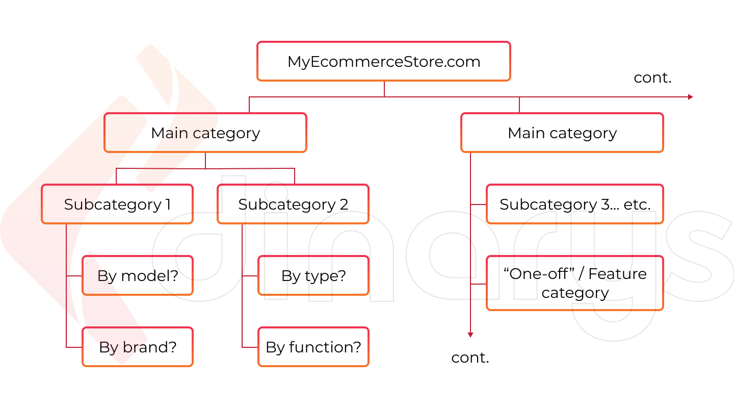
The advantages of this structure include versatility, the comfort of perception, and flexibility. At the same time, this structure should be handled with care, as it is easy to get carried away. The client should not wander absently through categories searching for the desired item.
Tagged structure
A tagged structure involves specific criteria or sorting options (tags). Tagged structure and semantic expansion help more pages attract traffic.
A tagged structure can be combined with a tree-like structure. This makes it easier to find the right product without overcomplicating the overall structure of the resource. To do this, tags for product properties can be added in the development of an online store. Externally, it should look something like this: tags located at the top, with categories and subcategories familiar to users on the sidebar.
We also recommend this article: How to Create the Best E-commerce Product Page
To Sum Up
Creating an e-commerce architecture is necessary for even the smallest online store development. A clear structure will make your resource more user-friendly and thus increase conversion. However, you must approach this task responsibly because an e-commerce architecture can produce the exact opposite result if built incorrectly.
To avoid mistakes, it is best to entrust the detailed structuring of your resource to specialists. With many years of experience optimizing e-commerce stores of all scales and levels of complexity, Dinarys knows exactly how to create a solution that will not only produce the right architecture but also consider and solve all the difficulties commonly faced by users. We can accomplish this by developing the most efficient, convenient product for your potential buyers. Leave us a request, and our specialists will contact you to discuss potential projects and tasks.


Let professionals meet your challenge
Our certified specialists will find the most optimal solution for your business.