Content
E-Commerce


The Leading Web Design Trends and Anti-Trends to Look Out for in 2022

Users visit many websites every day. To gain their attention, it is crucial that the websites they visit should be visually exceptional. The digital experience and user expectations change every day; some trends become outdated, others get stronger, and new ones emerge. Designers and entrepreneurs should consider recent trends and incorporate them into their designs as a means to stand out from the crowd.
Lets talk about itHave a project in mind?
Are you looking for ways to modernize your business website? Do you want to learn the latest web design trends to help you attract visitors and convert them into clients? What does 2022 have in store for us in terms of these trends? Our experts have chosen the most dizzying of these trends and are ready to tell you about them!
What Does Web Design Mean for an E-commerce Business?
Did you know that 94% of users’ first impressions are related to website design? This means that having a successful design will positively affect a company’s image and directly impact conversion. Why is this?
We will demonstrate this through international industry findings since plenty of authoritative case studies are widely available.
For a start, the longstanding McKinsey conducted a study that identified how and where the value of design is expressed for businesses.
After researching 300 different companies over five years, McKinsey concluded: “Design helps you stand out from the competition and ultimately increase your bottom line.” A comprehensive data analysis showed exactly how different design approaches led to strong financial results in the companies McKinsey surveyed. The management consultant divided these approaches into four groups and compiled a single index to demonstrate the economic effect of design. It found that the financial results of companies with the highest MDI value significantly exceed the results of companies with a lower index value.
What aspects of web design affect e-commerce sales?
Research shows that there is a strong connection between attractive modern design and sales growth. Of course, visual design impacts a company’s income to varying degrees and across different areas. But the relationship is observed regardless of the type of activity and business size.
This can be demonstrated by the example of the 10-second rule, which reflects the time it takes for your resource to gain a visitor’s attention.
What aspects of web design deserve the most attention?
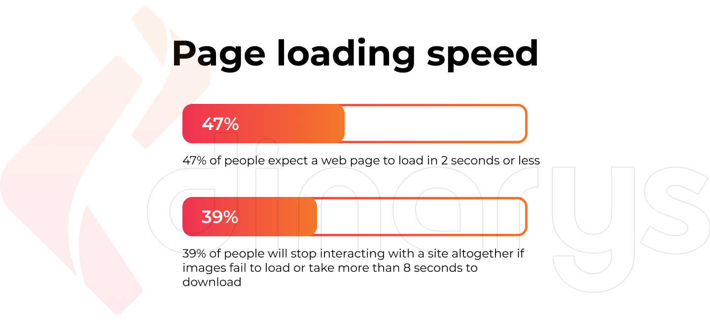
Page loading speed
Many users form an opinion of a website based on the speed that it loads, and it takes them just half a second to form a conclusion.
- 47% of people expect a web page to load in 2 seconds or less.
- 39% of people will stop interacting with a site altogether if images fail to load or take more than 8 seconds to download.
Key points
Users are becoming more advanced every day. They want their needs to be met instantly and know that most sites will load quickly. So if a page takes too long, they will just leave it and move on to the next one listed by the search engine.
Read also in our blog: Tips on Picking a Site Speed Test Tool
Contact information
The user should be able to contact the company if they have any questions or problems. The availability of contact information plays possibly the most crucial role in doing this.
- 47% of site visitors check a company’s product/service page before viewing other sections of the site.
- 64% of users want to see contact information after visiting a company’s home page.
- 44% of site visitors will leave the site if they do not find a feedback form, email address, phone number, or other contact information.
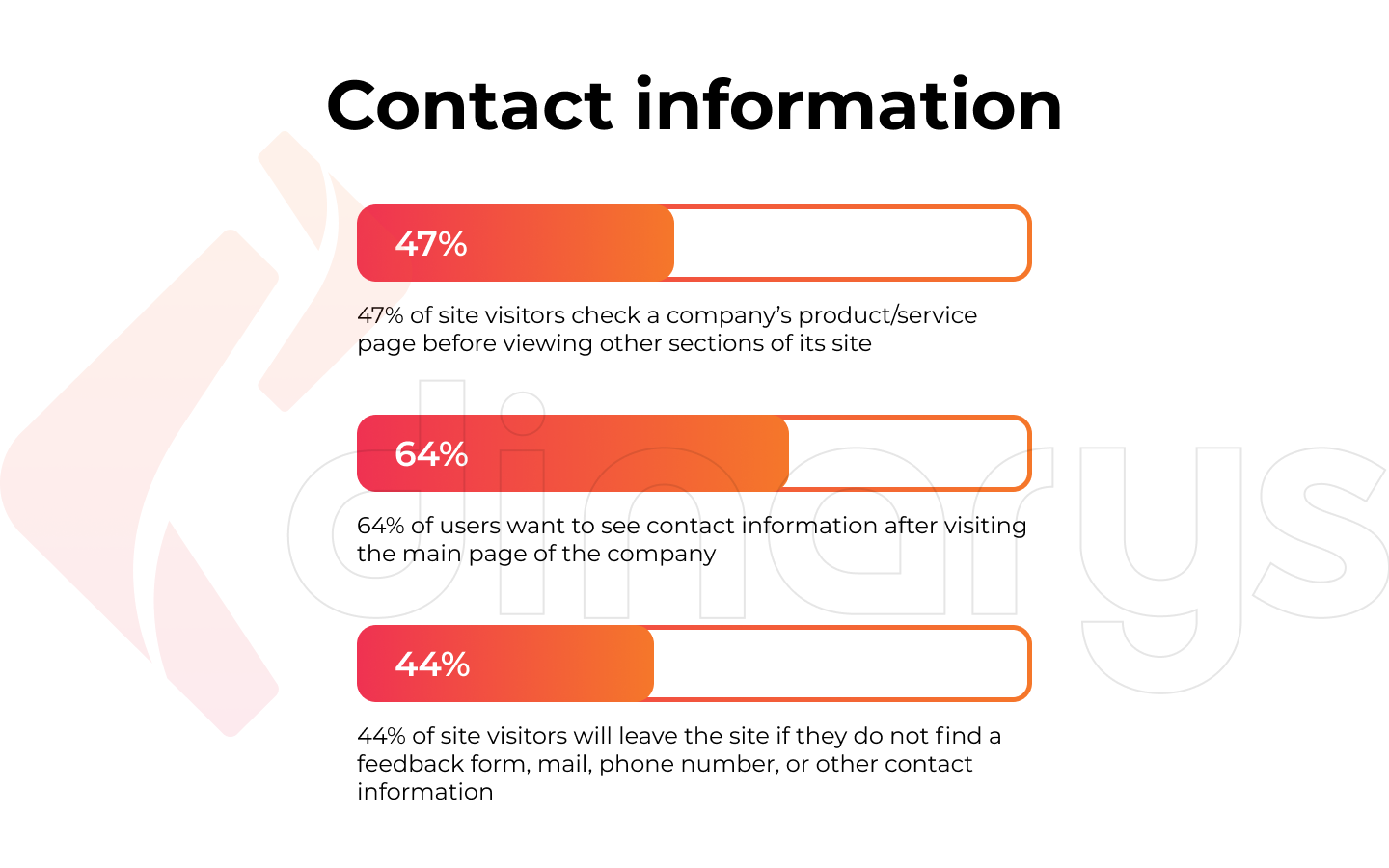
Key points
Your contact information is of the utmost importance to your users. They want to be able to find the information they need quickly and easily. Do not use “reams” of text; instead, divide it into paragraphs or semantic blocks. Add visual accents, use lists, quotes, tables, or other formatting attributes. You need to separate your content into small sections and label each one clearly. This will give users a sense of control over the browsing process and significantly save their time.
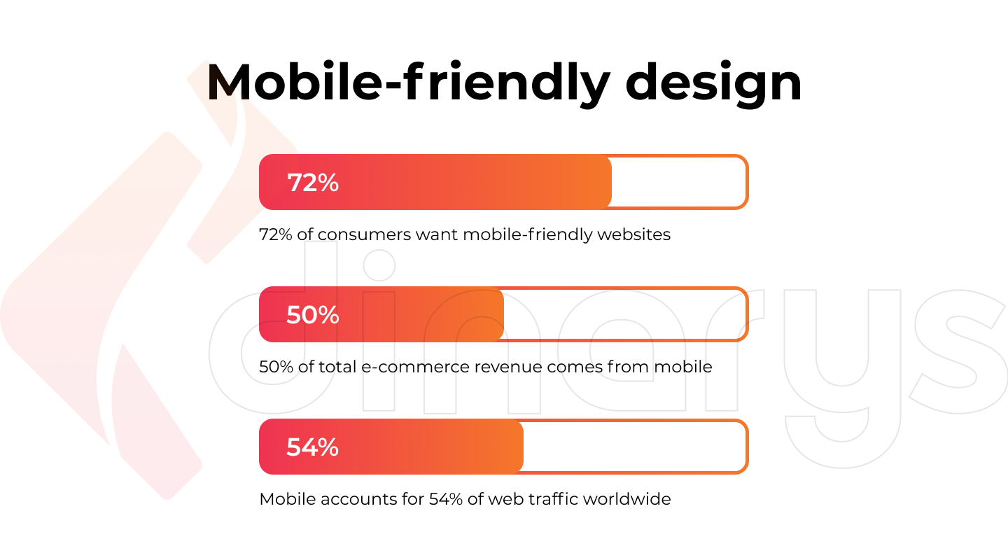
Mobile-friendly design
With the growing number of tablet and mobile users, the importance of mobile-friendly design has also grown. Visitors prefer services with the most convenient content and fast navigation.
- 72% of consumers want mobile-friendly websites.
- 50% of e-commerce revenue comes from mobile.
- Mobile accounts for 54% of web traffic worldwide.
Key points
As mobile technology advances, users are increasingly interacting with mobile sites. Although laptops/desktops are still in demand, smartphones are catching up quickly and outperforming them in some segments.
Read also: Responsive vs Adaptive Web Design. What Is Better for Your Website Flexibility?
Steps to a Great Web Design
The right web design will solve several problems. For example, it will help people understand your product/service better, create more emotional connections, and improve interaction. However, the success of a web page design depends entirely on how you combine elements such as color, font, and texture. Therefore, it’s essential to have a clear understanding of each of these in detail. The following introduces you to the step-by-step web design flow of Dinarys.
Goal definition
An essential element of creating a web resource is defining its goal since it is vital to understand why and for whom you are developing it. In addition, web designers should understand what customers expect from the future company's website.
Before you create a site plan, you should find answers to the following questions:
- What is the purpose of this website?
- What content will be published on it?
- What methods of interaction with the audience should be anticipated?
A clear understanding of the answers to these questions will allow you to design the web page’s structure and appearance.
Scope identification
Scope-finding is one of the most challenging steps in the entire website creation process. The scale and scope of work for the project may be fluid and change depending on different factors during the creation of a website.
Determine the scope of your work:
- Project timeline
- Total number of web pages
- Functions to be used on the website
This information will help you achieve your website goals without any issues.
Advice! To meet deadlines and conceive a realistic timeline for a project, we advise you to use the Gantt chart. This is a tool that will help you illustrate the plan and schedule for your project.
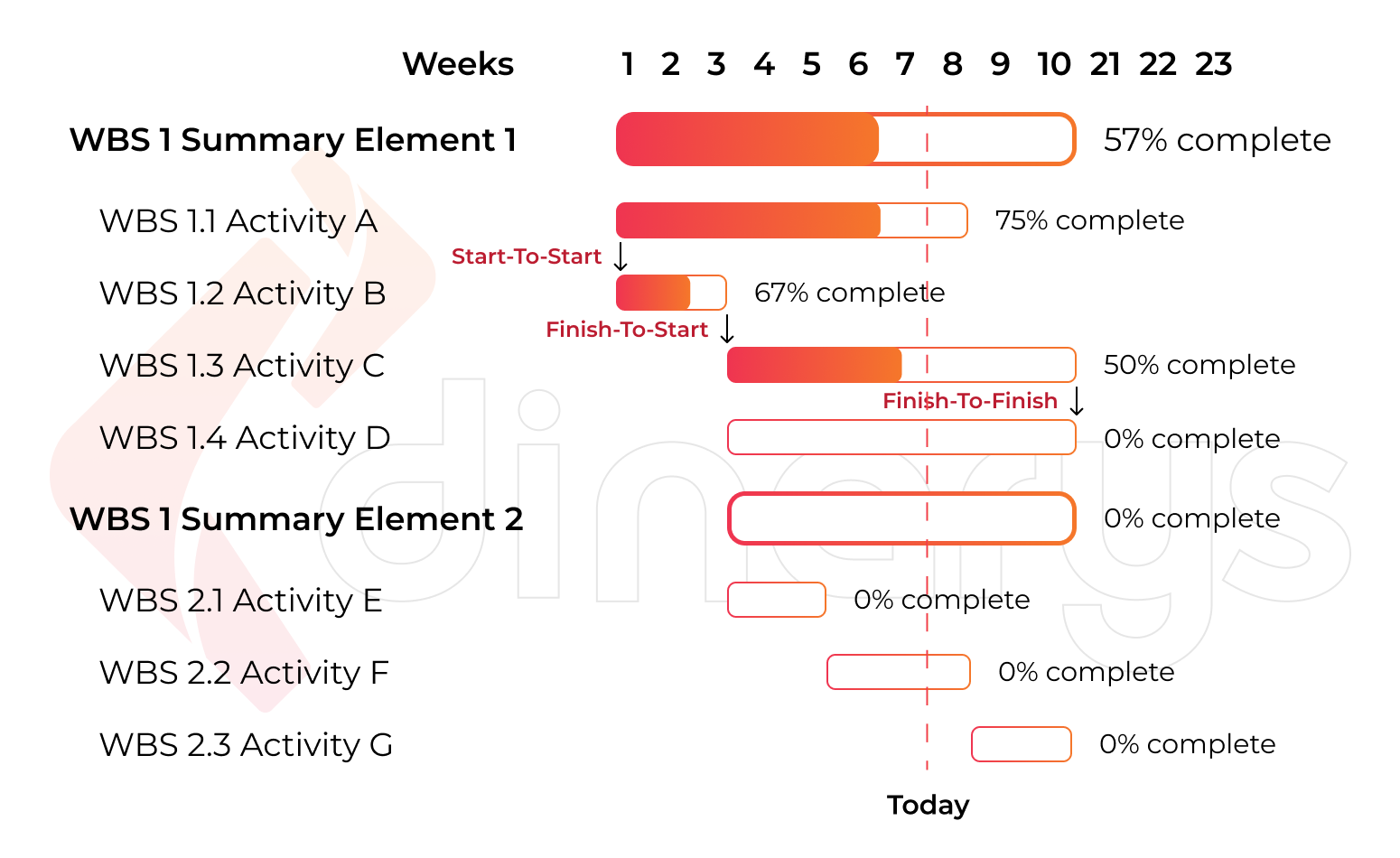
The Gantt diagram details a realistic project schedule and helps you set boundaries and achievable timelines. This is used as a reference not only for the development team but also for the clients themselves.
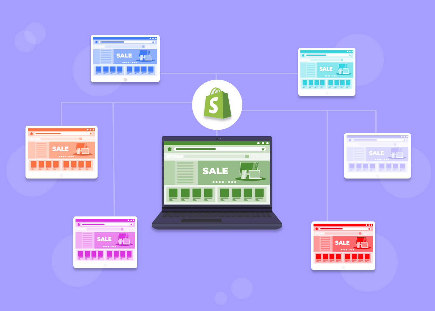
Choosing a platform
When the idea of creating a quality website arises, the question of which platform to choose should be asked. There are many CMS varieties. Based on our extensive experience in e-commerce development, we can recommend the best options for building your website: Magento or Shopware.
Magento and Shopware are renowned for being robust and highly scalable software solutions that enable entrepreneurs to create and effectively manage their e-business. In short, Shopware is ideal for small and medium-sized businesses, as it is easier and cheaper to work with. On the other hand, Magento is better suited to the needs of medium and large enterprises that are not afraid of making financial investments.
To understand this topic in more detail, read: Shopware 6 vs Magento 2: Can the New Player Dethrone the Leading CMS?
Sitemap/wireframe/mockup/prototype creation
A sitemap forms the backbone of any (well-designed) website. It helps web designers understand the information architecture and explains the relationship between different pages and content elements. Building a website without a sitemap is like building a house without a blueprint, and it is unlikely to succeed.
The next step after the sitemap is to create a wireframe, which is a detailed, black-and-white page plan for the site. Here the arrangement of elements is outlined, including buttons, images, and text. It does not perform any fundamental function in the site; rather, it is needed to determine what content will be located. The wireframe, and discussion over it, can serve as preparation for the toolkit (TK). While the wireframe does not contain any final design elements, it guides how the site will ultimately look.
Next comes a mockup, which is a visual version of the wireframe. With it, colors appear, images are selected, typography is considered, and it evolves into an appealing picture of the actual website. A mockup is needed to create the style and mood of the project. Think over visual details and agree on them with the customer.
After the mockup, a prototype is created. This is an interactive version of the wireframe that is also black and white. For the prototype, there is no longer a need for notes on how it works. To understand it, you just need to click on the area that you wish to query. The prototype is used to coordinate with the customer the location of the blocks and buttons and conduct usability testing. Moreover, it is more convenient to write the TK according to the prototype than the wireframe.
After completing each of these stages, we can go directly to the development stage:
- Layout and programming: Our specialists will translate the original product into an HTML page to achieve the site’s layout. This procedure allows the site to adapt to any screen extension and browser that opens it. Next, website programming follows the layout, combining the results of all stages of creating a web page and bringing the developed project to life. Then our programmers will finally put the system into action. They ensure that all the buttons on the page are clicked, the links are active, and the user can click to go where they need to.
- Testing: All stages of website development are subject to mandatory testing. This is done to determine how stable the project is and how well it works. We provide two types of design testing: functional and UI testing. During this stage, all inaccuracies and errors are detected and eliminated, including lost links, violation of navigation, and incorrect text. After final testing and eliminating all faults, the website is transferred to the server and is accessible via the corresponding address link. Even after that, however, the web pages continue to be tested. Thanks to this, our products are high quality and easy to use.
Upcoming Web Design Trends for 2022
The success of an entire website depends on the quality of its design. Therefore, it’s essential to follow the prevailing trends to understand which tools have become fashionable for site-building and which are already considered outdated and have even become anti-trends. E-commerce web design trends are constantly changing, improving, and modernizing. What was in fashion in 2016–2017 is now slowing down and yielding to completely new trends. This should be taken into account so that the new website is practical and creates the right impression of the company that owns it.
So which of these trends are gaining importance in 2022, and which ones should be forgotten?
Lets talk about itHave a project in mind?
Best new web design trends of 2022
Let's start with some completely new trends in visual and functional website design. This is a list of innovative must-haves on your website for the next couple of years.
Dynamic content
Users expect next-level personalization in 2022. You should add dynamic content (also known as responsive content) to your website to achieve this. In this way, all your content changes depending on demographic data, behavior, preference, and user interests. For example, if a person changes location and travels from Washington, DC to Madrid, the content that they view on your website will be different.
Thanks to this personalization, you can deliver exciting and relevant content to users. With dynamic content, you can also provide them with precisely the kind of experience that motivates them to take the next step in the buying process.
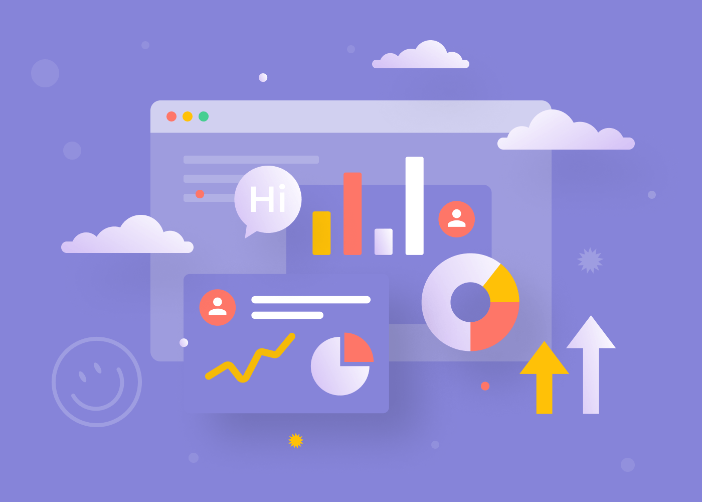
Data visualization
People respond better to visual content than to words and numbers. For example, 95% of B2B buyers say they want shorter and more visual content. While most of us care about statistical information, we often don’t understand it if we cannot visualize it. Of course, showing is better than telling, so the most effective solution would be if you could both show and tell.
Data visualization is not only about charts and graphs. Depending on the user’s essential information, we can select data sources and present them in a fascinating visualized story format.
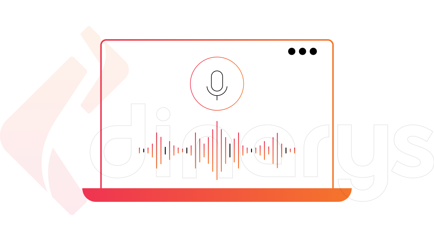
Voice interface
The global voice technology market is growing by 17.2% annually and will reach nearly $27 billion by 2025. This means that more and more people are using voice assistants to find information on the Internet instead of manually entering search terms into Google or other search engines. Over the past two years, voice typing has become a growing trend, so introducing a voice interface into a website is becoming a necessity. In addition, conversational technologies will evolve to become increasingly used in communication between the client and the business.
Dark mode
Twitter was the first social network to introduce this trend into its design, and then almost all its peers decided to hop on the dark mode train, followed by Apple, which has incorporated dark mode into iOS. We can thus conclude that dark mode is a web trend that more companies should embrace for their websites.
Read also: B2B E-commerce Trends in 2021-2025.
Continuing web design trends
New trends appear all the time. But what about the trends that are deeply rooted in web design and have not changed for several years? Here are some web design trends that have been around for a long time and are not going anywhere soon.
Lead generation forms
Your email list is one of your most important business assets. A successful website in 2022 needs to have a well-thought-out lead generation form that grows your list of customers.
Keep the form simple if you want users to fill it out and submit it to you. Ask for the minimum information about the client – a name and email address would be enough; only in some cases will you need age, gender, or other specific information. The main thing is not to overdo it with the requested info.
Chatbots
It is essential to use chatbots for websites, especially when you are running an e-commerce business. According to one study, 68% of consumers like chatbots because they provide quick answers. They have been a web design trend for quite some time now and are not likely to go anywhere soon. However, if you want to stay competitive, you need to make your chatbots more “alive.” Try connecting AI-powered chatbots for a more personalized conversation.
Consider reading: E-commerce Chatbots. Why Do You Need Them for an Online Store?
Virtual reality
Of course, virtual reality (VR) is not a new web design trend, but its importance is only growing in any case. The VR boom started back in 2017 and will continue through 2022 and beyond. This trend is an undeniable accelerator of user experience. It creates a powerful emotional interaction that can be used to connect more reliably with the audience. Moving the background or main menu elements of your website using VR is still relevant and adds flavor.
Minimalism
Since 2017, developers have actively created flat, functional interfaces that are not overloaded with detail. Lightweight websites invariably attract audiences and will remain on-trend for a long time to come. Resources with no unnecessary elements will always attract a high level of loyalty among users. The reason for this is psychological: The clearer and more straightforward a design is, the more room users have for mental activity, leading to a greater desire to explore your products or services.
3D interactive
3D has been used on different websites for a long time and is of great interest. The use of three-dimensional graphics will help make a site fashionable and exciting, and users will want to get a better look at the images. That means they will spend more time on your resource, ultimately improving its position in the search results.
To delve into the topic of trends and popular introductions on your site, we recommend reading: E-commerce UX Design Tips and Best Practices.
Web Design Anti-Trends
Fashion trends are infiltrating the digital world at lightning speed. However, unfortunately, the propagation mechanism is a bit like the domino principle: As soon as one piece falls, the rest will follow. The situation is similar in web design.
The problem is that not all fashion trends provide an excellent user experience. Companies cannot recklessly chase trends and adapt their products to follow them simply because they are in demand now. There must be a deep analysis behind every decision. Now it is time to talk about what is outdated and will be considered an anti-trend in the future. Here is a list of things to avoid in your web design.
Neomorphism
Neomorphism is one of the most controversial trends in design, combining elements of skeuomorphism and flat style. The result is an interface that resemble aspects of the real world but still look a little different. In 2019, there was an enthusiasm for the use of neomorphism in web design. However, it turned out to be an impractical style because the cost of translating designers’ ideas into software was high. Moreover, the subtle shading of non-amorphous designs makes them unfriendly to the user.
Reasons to avoid neomorphism in web design are
- Low functionality.
- Unsuitability in bright sunlight.
- Complicated programming implementation.
Extra brightness and contrast
Bright colors shout to our brains: “Attention! Danger!" What’s more, bright colors distract from the information on the site, even if there is not much of it. Naturalness is in fashion, including in colors. Accents should be set using contrasting but not flashy shades.
Reasons to avoid using bright colors:
- Visual clutter
- Increased eye fatigue
- Enhanced sense of danger and anxiety
Endless scrolling
Endless scrolling annoys visitors by not allowing them to see the “basement” of the site, where important information such as contacts, links to social networks, and addresses may be placed.
Undoubtedly, scrolling has its benefits, but you should do without it on the home page, leaving it only in the content section (for example, in a blog).
Scrolling disorientates visitors who want to take action, which is an annoying factor. When browsing the web, the user mentally makes “bookmarks,” intending, for example, to purchase a product or contact the owner of the site. Still, endless scrolling does not allow you to return to the information you have already viewed quickly.
Reasons to avoid endless scrolling are
- Decreased performance.
- Useless footer.
- Problematic bookmarks and returning.
Parallax
The phenomenon of parallax scrolling emerged about four years ago as a fashionable design technique. The essence of the method is elementary: With parallax scrolling, different layers of content move at different speeds as they scroll. Sometimes it can help increase traffic to the site – but that increase would be short-lived.
Parallax scrolling can harm website promotion since many designers now design endless pages in this way. Just like the disadvantages of pages with infinite scrolling that have been mentioned above, pages with parallax scrolling can load poorly and be just as poorly indexed. Search bots just don’t always index this lengthy content.
Reasons to avoid parallax:
- Taking away from the product
- Providing an unnecessary spectacle
- Slowing down the website
Autoplaying videos and audio
Autoplaying videos can be cool, no doubt about it. But if your video has audio, it will automatically play when the user would probably prefer it not to. Whether it is in a business meeting, on the bus, or in class, unexpected sound from auto-playing videos causes panic. It inevitably leads to users leaving your site as quickly as they can.
In addition to being inconvenient for users, automated videos can slow down your website, which might reduce your site’s chances of a high ranking on Google.
Why auto-playing videos and audio should be avoided?
- The user has no choice
- It is “annoying marketing”
- It affects loading time
Lets talk about itHave a project in mind?
Inspiring Examples of Web Design
We've walked through the top e-commerce web design trends and put together some impressive website examples for you. Of course, a site’s aesthetics are not the only condition for converting users, but they act as a bridge to attract clients and should prevent them from feeling the need to leave your site. Remember, modern creative design is primarily intuitive and straightforward. People won’t choose you unless you give them an incentive to make that choice.
See and be inspired by the beauty of these web designs. Enjoy viewing!
Adidas - CHILE 20
If you have ever ordered clothes online, you know how high-quality photographs influence your choice for further purchases. But Adidas and Foot Locker didn't stop at simple visuals. For the latest version of the iconic CHILE 20 collection, the designers have created three immersion spaces with realistic 3D visualizations. Take a look:
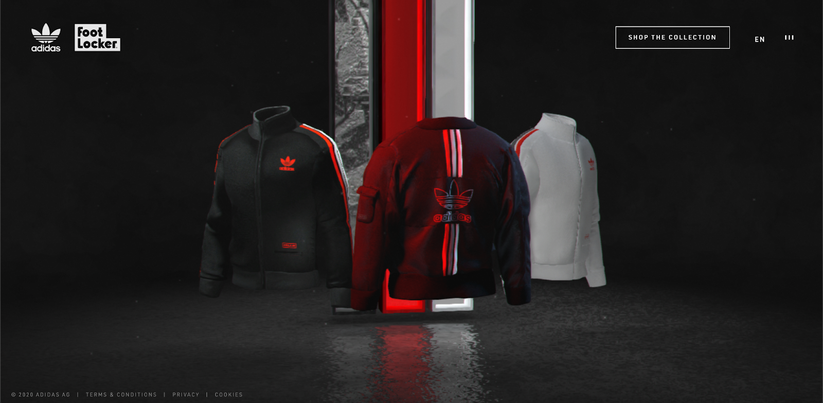
You can select a model with a swipe and then scroll to look at the product from all sides and evaluate its quality. It looks imposing. Adidas, as always, never ceases to amaze!
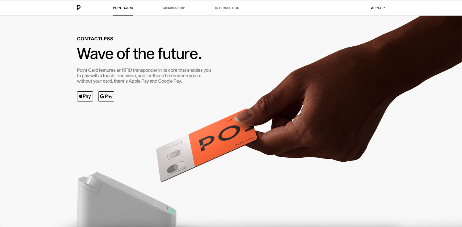
Point
Point is a debit card and reward application issued by a bank of the same name in the United States. Following the link, you will notice how the colors are displayed, how attractive the design of the cards is, and the photo content is well-thought-out. Impressions from interaction with the site are unreal. The flow is smooth and precise, which allows the user to interact with an intuitive website.
2°C EARTH
2°C EARTH is a visual guide to five popular tourist destinations whose natural and cultural heritage is threatened by climate change. The project’s author set out to imagine how the Earth would change due to an increase in global temperature by 2 degrees Celsius and calls on users to think about the consequences of global warming.
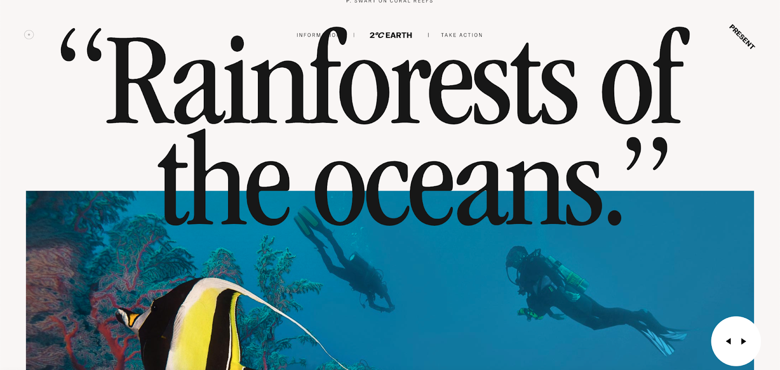
The text and typography deserve special attention. But the main feature, of course, is how the guide switches between the present and future. If you swipe the page to the left, all the photos become distorted, and the titles and text content change, for example:
- Rainforest of the Oceans (present)
- Ghost Cities of the Oceans (future)
Site Survey 2°C EARTH is a volumetric interactive experience. This website deserves to be on a list of inspirational ones!
E-commerce Web Design Study Cases by Dinarys
A well-thought-out user experience and attractive design are critical features of any successful e-commerce store. Regardless of this, you have an uphill battle to increase sales. And how do you ensure a great user experience? Dinarys knows how! We create the best e-commerce solutions, and our projects only confirm this. We would like to present you with two of our successful projects with incredible designs that we are very proud of.
Frou Frou
Frou Frou is an online store that sells cakes. Initially, the client had an offline business and a simple website to present the bakery. However, they wished to add new features to the website and redesign it to be more user-friendly and convenient.
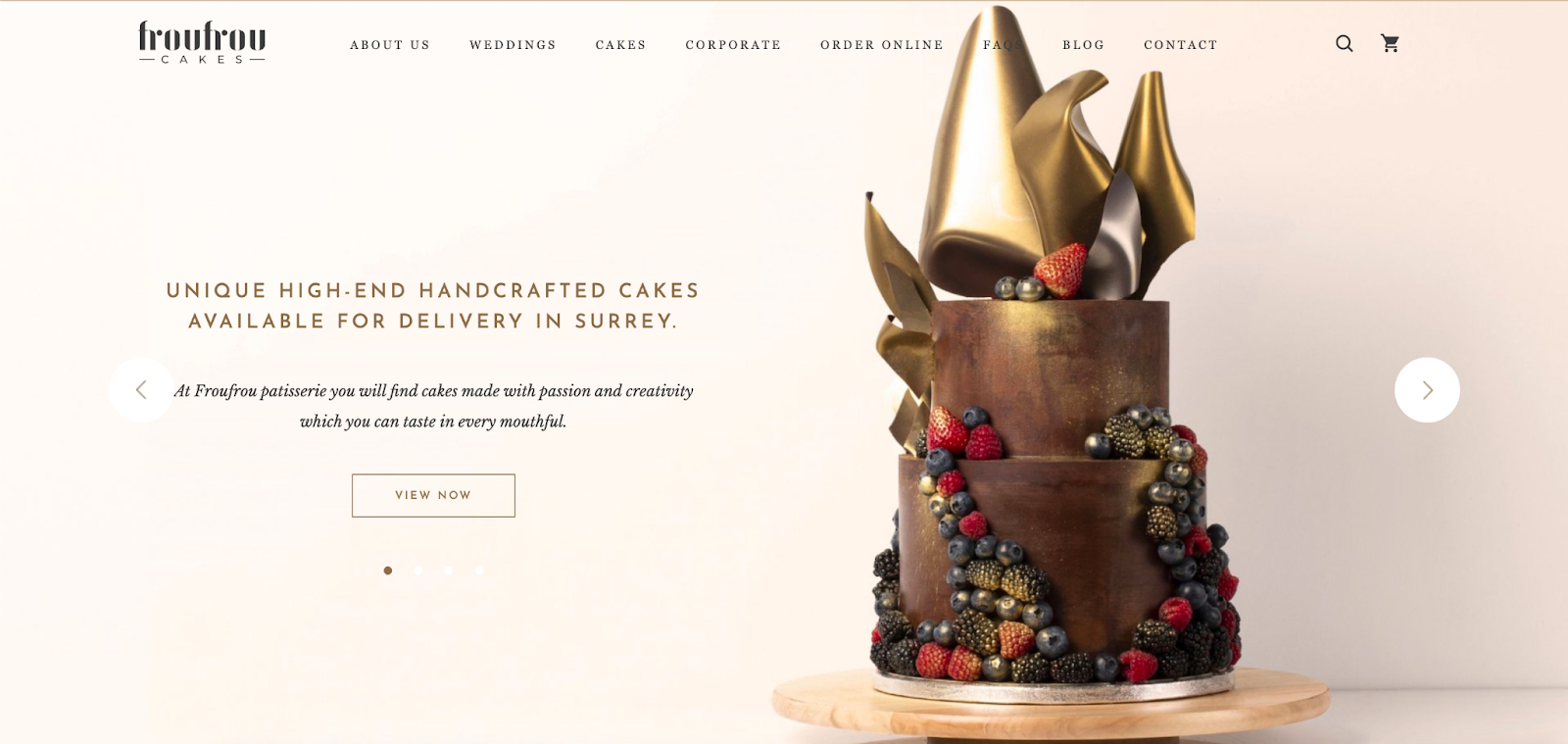
What we did:
- Highlighted the needed basic functionality for the bakery shop.
- Created a new website (as the existing one couldn’t be modified with the required functionality).
- Developed a unique design with brand style and colors.
As a result, the customer received a fully working online store with all the required functionality. We are proud of this project and its “delicious” design. Looks impressive, doesn’t it?
Budu Sushi
Budu Sushi is an Asian restaurant in Odesa, Ukraine, whose owners had a problem with an offline enterprise that generated no income. They wanted to build an online presence and came to us with the idea of creating a fast and straightforward service that would allow users to place orders for food and drinks conveniently. In addition, it was necessary to automate how order data was processed to reduce the load on the call center.
What we did:
- Defined common and necessary functionality for the food delivery website.
- Created a unique and simple design.
- Integrated the system with 1C to process orders from the website.
- Implemented a loyalty program for customers.
- Integrated the franchise function.
- Adopted LiqPay for online payments.
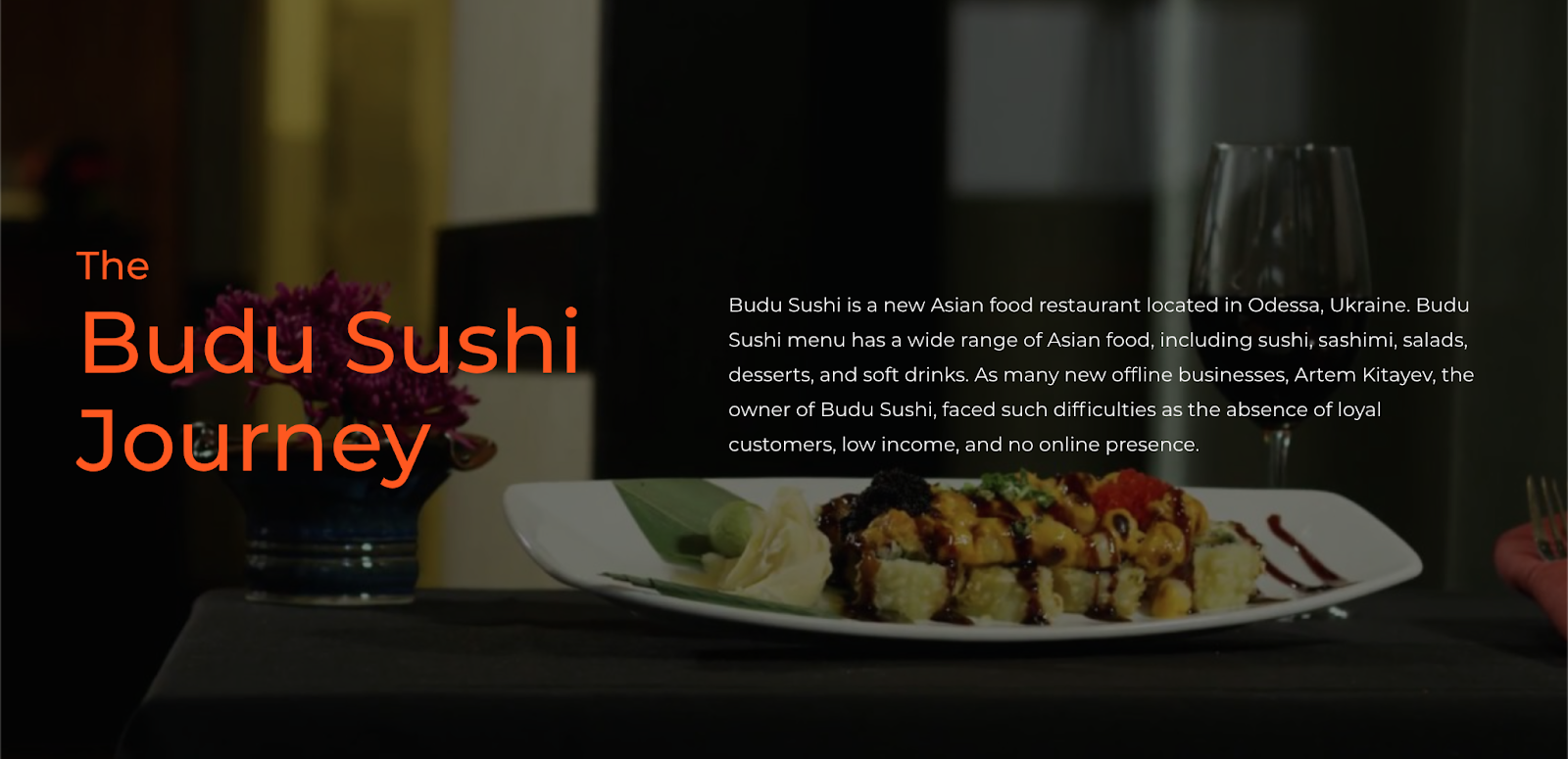
As a result, our team successfully digitalized the offline restaurant business by developing a food-ordering website. We've got an intuitive website based on all user experience standards.
Are You Ready for the Dazzling Changes in Web Design in 2022?
After analyzing all the information from this article, we can conclude that web design is mostly aimed at increasing the website’ potential. This is due to the contemporary trends so that visitors do not have to spend hours on a computer or with a gadget to understand a portal’s interface.
In 2022, designers will be more accurate, as all trends become used with maximum functionality. By tracking and using the best web design trends in 2022 to promote and build websites, Dinarys can create a quality project for you with flexible, user-friendly design and reliable management. So contact us, and let’s discuss your business ideas!
FAQ
The 10-second rule in web design means that it takes up to 10 seconds for website visitors to scan content and decide if they want to explore further. For this reason, website owners should clearly communicate their value proposition within 10 seconds to attract potential clients’ attention, and this is where a proper web design comes in.
Mobile friendliness, page loading speed, and contact information availability are primary elements of a great web design. Users want to use a website from multiple devices, not to wait long until the page loads, and easily access a contact information page when required.
In 2022, dynamic content, graphically visualized data, voice interfaces, and dark mode will remain quite popular web-design tendencies. There will still be the past trends that are still relevant, including lead generation forms, chatbots using AI, virtual reality, minimalism, and the use of 3-D elements in the interface.
When creating web design in 2022, keep in mind that some trends are already on the decline and can only worsen the user experience for your visitors. For example, beware of neomorphism in your design, don’t use extra brightness and contrast, try to avoid endless scrolling, don't apply the parallax effect, and don’t add auto-playing videos and audio to your website.


Lassen Sie Profis Ihre Herausforderung meistern
Unsere zertifizierten Spezialisten finden die optimale Lösung für Ihr Unternehmen.