Content
5 Tips for Magnificent eCommerce Website Design

We’ve all had that moment when we’re desperately walking the aisles of a store, unable to find the right product. It’s frustrating. Visiting an online store with a poor e-commerce website design can do the same thing.
eCommerce UX, or user experience, is extremely important for new and seasoned sites alike.
Lets talk about itHave a project in mind?
In this article, we’ve compiled some e-commerce website design tips and examples of the very best in eCommerce UX. In addition, our own team of Dinarys designers will share their experiences in eCommerce web design.
Increased conversions are the ultimate goal of every online shop owner. To accomplish it, they use multiple tools to attract new visitors and convert them into buyers.
The main advantage brick and mortar stores still have over online shops is that people want to see and touch products because they buy them. That’s the main disadvantage of eCommerce, but a good UX can help overcome it.
Developing a good online store means not only selecting a solid platform, whether it’s free or
Minimalism
Simplicity is one of the e-commerce website design important tips. During the e-commerce website design process, try to avoid overloading visitors with information
A clean, functional design will enable visitors to quickly and easily find what they’re looking for, and that’s one of the biggest services you can provide.
That’s not to say that you can’t put some sizzle or “bling” on the page, depending on your audience. The key is to not lose sight of the page’s true function, which is finding and purchasing products.
First Impression
The first thing to consider when designing your site is the first thing your visitors will see. If your website doesn’t make a great first impression, then you’ll lose prospective buyers. It’s as simple as that.
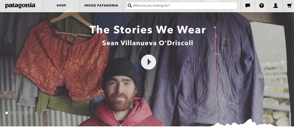
The homepage of your online shop should have something special and attention-grabbing. Outdoor clothing brand Patagonia does a great job of this. Their homepage features a video with stories about people going on outdoor adventures. In other words, Patagonia’s target audience.
Instantly, a new visitor to Patagonia understands exactly what they sell, and who it’s meant for.
The homepage is where your site can put forth your brand and value proposition. Tell your customers how your company is different from your competitors. An eCommerce UX with simple objects and calls to action provide a good first impression.
Collections, Filters, and Comparison Tools
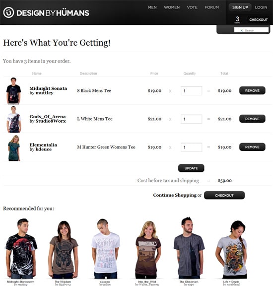
The best eCommerce sites guide shoppers to products they might like. They accomplish this with collections and recommendations, either based on the store’s best sellers, or the individual visitor’s previous activity.
In short, product filters, collections, and comparisons are a must.

Customer Support
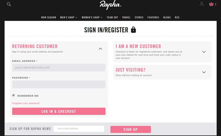
No matter how great your store and products are, eventually a customer will need support. Some stores hide the customer support link in their site footer, or in a side menu. That’s a mistake.
When a customer needs help, they don’t want to scramble all over your site. The quicker they can reach a person who can help, the quicker their problem can be resolved. A problem that’s swiftly taken care of can actually result in improved customer loyalty. A botched solution will lose you a customer for life, and can generate bad word of mouth.
It’s best to make your customer service tab obvious and impossible to miss.
User Experience Post-Purchase
A big part of bringing customers back to your store is how they feel after they buy from you. If they feel like they are valued patrons of your business, and that you care about their satisfaction (don’t you?), then they’re far more likely to come back.
As a couple of small examples, it’s a good idea to include a customer service link in order receipts. If possible, it’s also good to allow order modifications before shipping.
Many companies forget about eCommerce UX after the sale, but that’s when it’s the most essential. If you’d like to learn about how to build a rapport with your customers through email, here’s a great article on that.
“UX for eCommerce is like gas for a car. If you make a wrong choice, your car may be driven for some time, or it can break down immediately. While making a purchase, the visitor should not think about how to locate cart. Ideally, website functionality should be intuitive and drive your visitors to checkout. When visitors face difficulties in using different website elements or interfaces, they will be very likely to lose interest quickly and leave the website.”
Aleksey, Dinarys art director.
What follows are some real-world examples of Dinarys clients who improved their UX, and ultimately, their conversion rates.
Lucidera
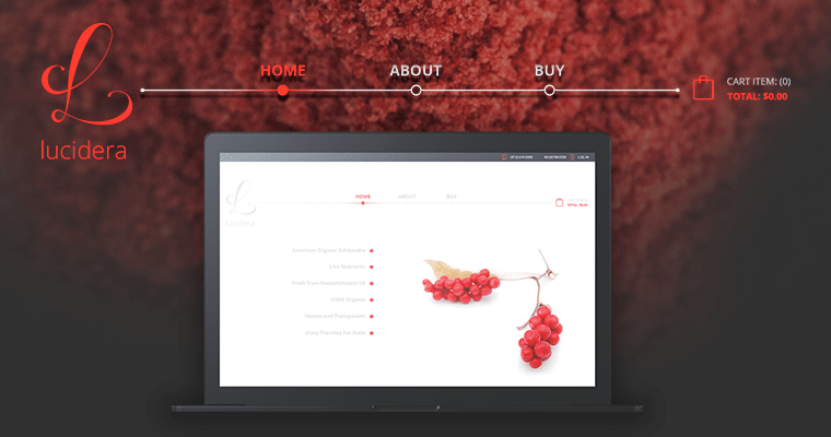
The Lucidera website features clear, user-friendly design on both desktop and mobile. The site has a fully functional shopping cart, well-placed call-to-action elements, and a nearly perfect use of whitespace.
Altaurus
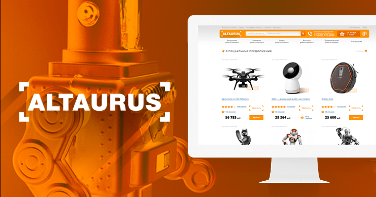
For this project, we developed a new website design that includes special offers, news, product videos, and reviews on the homepage. The goal here was to focus visitors’ attention on the products.
Sisters Market
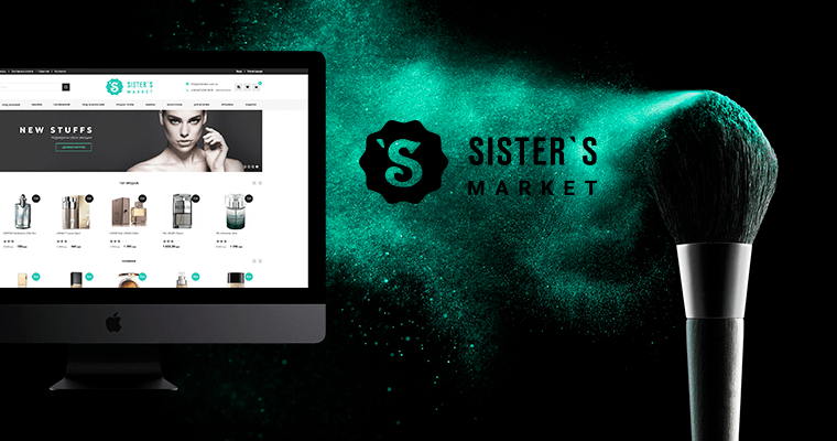
Sisters Market required a more effective UX design, incorporating product spotlights and special offers directly on the homepage.
Well thought-out UX design is the key to a higher conversion rate, and therefore the success of an eCommerce store. At its core, effective eCommerce UX means providing your customers with a fast and simple shopping experience, guiding them through product selection, to checkout, and many happy returns.
Summary
If, after reading the article, you have ideas on how the design of your online store should look like, fill out the form following the link. We will be slaves to help!
Lassen Sie Profis Ihre Herausforderung meistern
Unsere zertifizierten Spezialisten finden die optimale Lösung für Ihr Unternehmen.

