Content
E-Commerce

7 Tips of Ecommerce Checkout Page Optimization for Increase Sales


Online retailers often ignore checkout page optimization when looking for ways to drive sales on their websites. They focus mostly on the e-commerce website design, product photos, and the customer journey. However, this area is also a part of customer journey they should take into account.
We agree that a beautiful e-commerce website design is important since it creates the first impression and engages shoppers to enter the sales funnel.
In terms of e-commerce website development, our team considers easy and convenient checkout process as important as other online shop elements like product page specifications or CTA buttons.
Lets talk about itHave a project in mind?
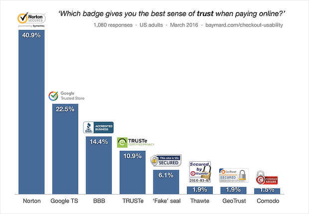
Still, if your online shop is relatively new, not every online shopper will actually make a purchase. For that, 7 out of 10 website visitors will abandon their shopping part. Even now, 20 years after online retail began, e-commerce website visitors are worried about their credit card details and other personal information. To get customers trust, online retailers need to prove that their website is secure.
There are some tricks to making your customers more loyal to your products using checkout page optimization tips.
Related story: How to Integrate a Payment Gateway in Your eCommerce Website
In the article below, we share several tips to optimize your checkout process and reduce abandoned cart rates.
In addition, the team shares the best practices from e-commerce industry leaders that might be helpful to understand how checkout page design influence the customer choice.
What influences a customer to decide not to complete the purchase
- 61% of customers were disappointed by additional costs like fees, taxes and shipping.
- 35% of online shoppers were not ready to create a customer account
- 27% claim that the checkout process was too long and complicated
- 24% wanted to see a cost total of their order but did not receive such experience
- 22% said errors that occurred on the e-commerce website
- 18% said they did not want to provide the online shop with their bank account information
- 16% shipping time was too slow
- 10% were unsatisfied with returning policy
- 8% the website didn`t provide them with preferred payment method
- 5% the website declined their credit card
There is no silver bullet for the perfect checkout process. Nevertheless, our experienced team wants to share some examples that we use for our e-commerce clients to increase their sales.
Reasons you need eCommerce checkout page optimization
Losing customers during the checkout process happens a lot. And this is the main concern for all owners of online shops. From the Baymard Institute, we learn that the average rate of cart abandonment is 69%.
This often happens when customers add items to their shopping cart but don’t make an actual purchase. That way you lose prospective income.
In addition, Baymard said that cart abandonment is a reason for billion dollars of loss in sales for many e-commerce stores. However, there is a solution. We are talking about checkout page optimization that can prevent over $260 billion of that lost revenue potential.
Related story: 11 Best Conversion Rate Optimization Tips for Your Ecommerce Website
Why do you need to minimize your checkout process? Minimizing the process will result in recovering sales and make a huge difference for your online business. Moreover, such optimization will increase sales so you could receive the revenue to scale your business.
In the article below you will find a list of checkout page best practices that will encourage your customers to make a purchase.
Our focus is the checkout page layout and structure. After reading this article, you will know how to make your checkout process more convenient and thus increase profit from your website.
.jpg)
1. Avoid additional costs
Online shoppers hate finding additional costs like taxes and shipment costs when making a checkout from online stores. Moreover, that is a reason for cart abandonment in 60% of cases. To avoid this gap, consider checkout page optimization.
Online shoppers adore free shipping. That is why online retailers use this trick to increase sales. If your business model does not support this option, your online shop should inform customers about the final price. If your website provides shoppers with free shipping, low delivery costs and returns, every online shop page should include this data.
2. The short and simple checkout process
If your checkout process is complicated, it distracts over 28% of potential customers. For that reason, keeping the checkout simple may increase your income. Here are some tips you can use to achieve this goal:
- Address lookup services that automatically find zip codes and addresses
- Autofill form data to use information from password manager or stored in browser
- Saving customer login and password
- If billing and shipping information matches, the website will copy it automatically
One more tip is to have simple requirements toward user password, in another way, it will drive shoppers away. According to Invesp, this tip reduces the abandonment rate from 95% to 28%.
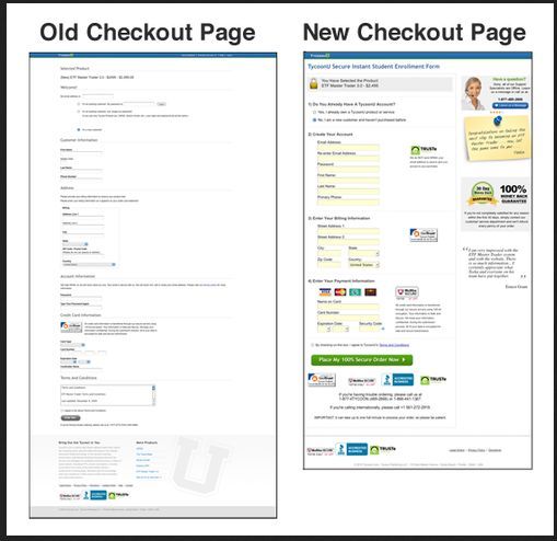
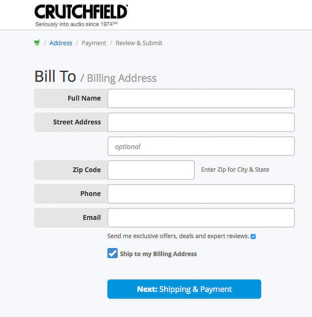
3. Cutting out form fields
One more tip from checkout page optimization tips list is to reduce the number of fields users need to fill before placing the order. Using this tip, you will attract more customers.
You can do it by:
- Using one field for online shopper`s full name and to avoid separate fields for first and last name
- Making shipping address the same as billing address by default
Below you can find a good example of such optimization by Crutchfield.
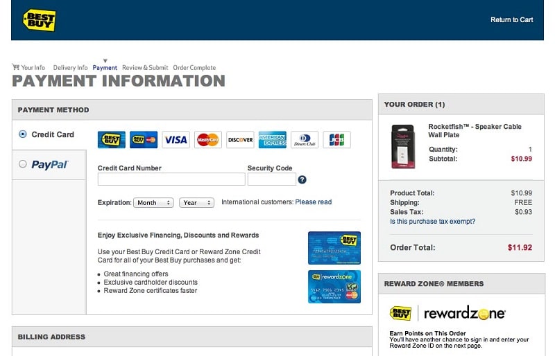
4. Different payment options
Did you know that 8% of customers abandon the checkout because the website does not provide them with the necessary payment option. A declined credit card - is a reason for 4% of shoppers to leave the website.
The solution is to add several payment options to your online shop. According to BigCommerce, the digital payment would triple conversions. Take into account that the most popular payment options are:
- Paypal
- Cash
- Credit cards
- Debit cards
In addition, 14% of customers prefer mobile payment options.
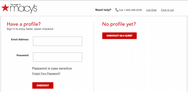
5. Guest Checkout for new customers
The Baymard research shows about 37% of online shop visitors did not complete the checkout because they have to create an account on the website. This is a huge number of potential online shop customers.
We have a simple solution for that: provide the visitors to your website with guest accounts. This will allow your future customers the ability to shop without creating an account.
6. Upsell to increase income
One more tip to increase the conversion rate at the checkout page is to offer them the opportunity to buy more products. We recommend doing it with an in-cart upsell. This option includes:
- Related product section that shows customers related items to what they are going to buy
- Offer an upsell when the customer places an order in the online store
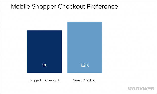
7. Use Mobile-Friendly Design
By 2021, mobile ecommerce sales are expected to account for 54% of total ecommerce sales.
Therefore, in order not to lose sales, you need to optimize the usability of mobile checkouts. To make the checkout page more mobile-friendly:
- Make sure your mobile checkout is working
- Reduce the number of checkout steps
- Use the guest checkout
- Show checkout progress
- Use autocomplete
- Offer mobile payment options
Using these tips, you will improve your online shop conversions and improve customer loyalty.
Below you will find the best e-commerce checkout page examples from industry leaders that might inspire you to redesign your online shop.
Top 6 examples of eCommerce checkout page
In this part of the article, you will see what a good checkout page should look like. We hope these examples will inspire you to make your customer journey more convenient and increase your sales.
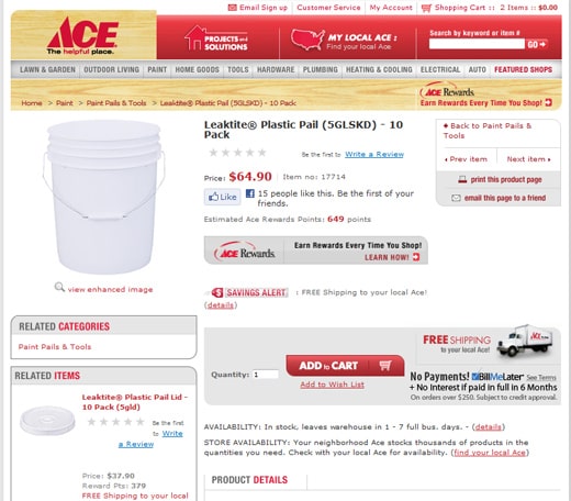
1. ACE
Here we can see how one check-out page could carry out several functions in terms of conversion.
Related story: How to Choose the Best Ecommerce Shopping Cart?
The company checkout page makes customers take action that decreases the abandoned shopping cart rate. The website page contains big images, a section with related items, information about the product and free shipping. All components that are very important for customers since they influence their buying decision.
Also, take a look at social sharing buttons. The website has a loyalty points program. Online shoppers can print the page and even email it to a friend. The company used large Add to Cart buttons so all website visitors can find it.
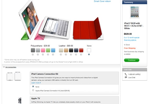
2. Apple
The company provides users with the option to customize items before they purchase.
One of the reasons why people are so obsessed with Apple products is that they have great design and are very simple to use. Above you can see the iPad pre-checkout screen. When the customer is ready to buy the product, they can use a clickable ratio-button to customize such features as the size of memory and wireless carrier you prefer.
Moreover, at the checkout page, the company uses such upsell tops as related accessories and cover for the iPad. You can see the total sum of your order during the check-out process together with such perks as a “continue” button and live chat with the company representative in case of any questions. “In stock” notification and information about free shipping help shoppers during the checkout process.
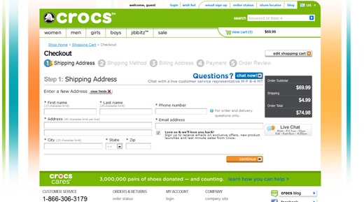
3. Crocs
The online shop of this company guides shoppers through the sales funnel one step at one time.
We all know this company for its unusual shoe design that some people love, while others hate it. But not all know that this company also has a very convenient customer journey on their website. The checkout page includes such perks as live chat, order total and shipping price, so there are no hidden costs. Moreover, the subscription for a newsletter field encourages shoppers to leave their e-mail.
Another benefit of this particular checkout page is that users are informed about the number of steps they go through to make a purchase. Customers can edit their orders and review it one last time before checking out. In case any questions arise, customers can use one of two live chat buttons or a customer service number.
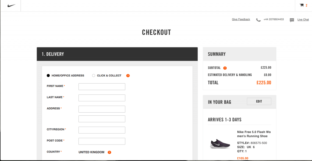
5. Nike
This company demonstrates an action-oriented checkout page that engages website visitors.
Nike online store is a great example of a checkout screen that includes product images, security seals, the total amount of the order, CTA buttons and live chat. In case a shopper missed some information, helpful tools will let them know. Before taking customers to the next checkout page, the customer data is dynamically validated in order to avoid mistakes. Nike online shop wants website visitors to focus on the main goal. We mean on making a purchase. For that, you would not find accessories and related products on the checkout page.
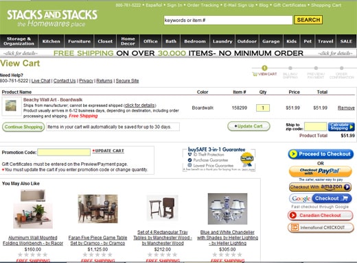
6. Stacks and Stacks
As you can see, the checkout page of this website includes such conversion drivers, as visualization of checkout steps, buyer guarantee, information about the free shipping and promotional code area. Actually, this is a good example of how to keep many elements on one page, since the checkout page also includes live chat, customer service number and return policy.
We hope that these examples will help you to increase sales in your online shop and make your checkout process faster and more convenient. Below you can find even more tips on how to optimize your checkout page on your e-commerce website.
Read also: 5 Tips for Great Ecommerce Web Design
The list of the checkout page best practices
Below you can find the best practices to provide your e-commerce website visitors with a smooth customer journey.
The checkout process should include the minimum number of required steps.
- Make your customers feel secure during the checkout
- Use tools for predictive entry or address lookup
- Multiple payment gateways
- Saving and storing customer information
- Guest checkout for new customers
- Mobile-friendly online shop
Conclusion
The checkout page optimization will help you to reduce the abandoned carts rate and increase your e-commerce website income.
With this in mind, now you understand that the checkout page is one of the most important elements of your online store. Without customers to convert, you will lose the opportunity to grow your business and scale it.
In addition, do not forget about customers’ trust. Even a small error could have a negative impact on the reputation of your brand. To gain their trust you can also post customer feedback.
E-commerce excellence partner for your online shop success
Dinarys is a full-cycle e-commerce agency that helps online retailers increase sales and optimize customer journey. The team if waiting for your request to start working on your existing online shop optimization or to develop an e-commerce website from scratch.


Lassen Sie Profis Ihre Herausforderung meistern
Unsere zertifizierten Spezialisten finden die optimale Lösung für Ihr Unternehmen.