Content
E-Commerce


Checklist for Checkout Page Optimization
Time to read: 30 minutes

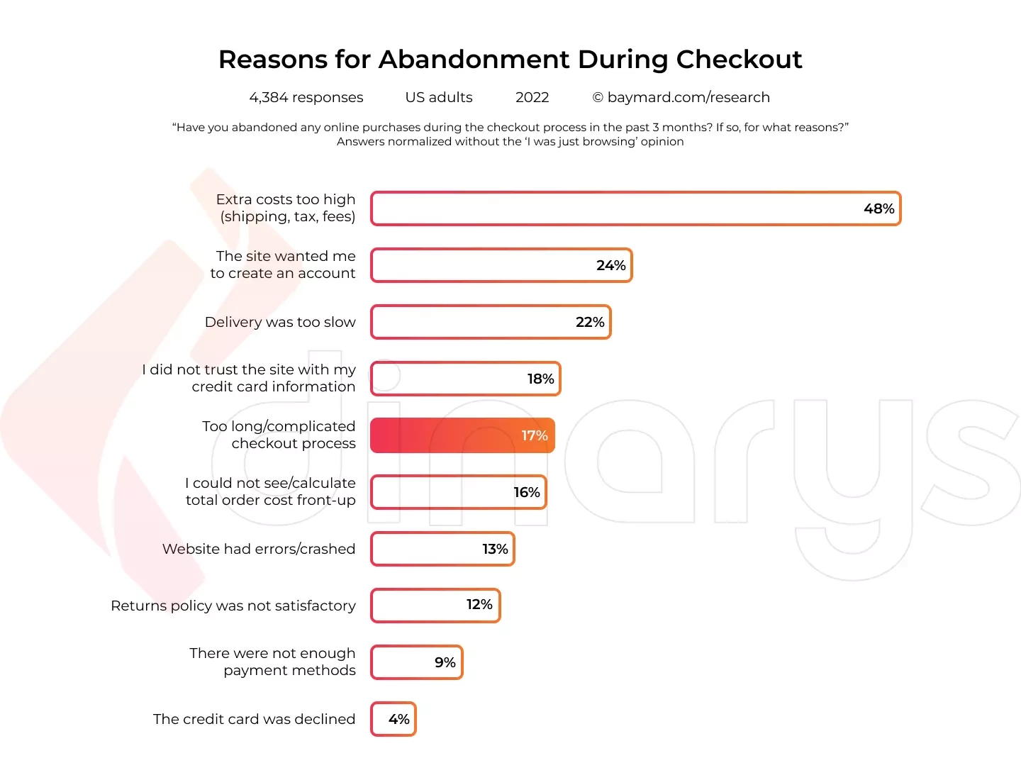
Shopping cart abandonment is becoming increasingly common in e-commerce. When it is time to check out, customers fill their carts with items from the store and then leave. Customers abandon their carts for numerous reasons, and this chart highlights some of the major reasons.
Experts predict that you can increase your conversions by a staggering 35.26% when you implement an efficient, straightforward, and high-performing checkout page.
This article explains the differences between one-page and multi-page checkout and provides a comprehensive checklist with practical tips for building your checkout page correctly. Follow this guide to streamline your customer’s online shopping experience, increase your conversion rate, and decrease checkout abandonment.
One-Page vs. Multi-Page Checkout
As the name indicates, the checkout page is an e-commerce website page that collects customers’ payment and shipping information and allows them to complete their orders. This website page is similar to a department store checkout queue, but it has more hoops for shoppers to jump through to make their purchases.
Businesses most commonly use a multi-page checkout, which requires customers to advance through a few pages before they can check out. Each page gathers different information required to complete the order.
Instead of requiring visitors to complete multiple processes, a one-page checkout displays all the information that customers must provide and the payment and shipping options on a single page.
Understanding the pros and cons of each type of checkout page will make it easier for you to decide which option best suits your situation.
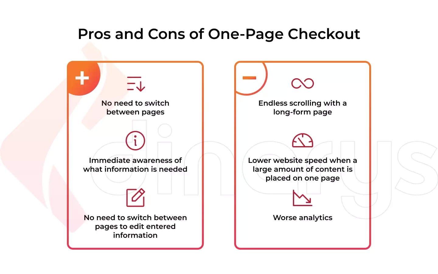
Pros and cons of one-page checkout
One-page checkout provides the following advantages for e-commerce businesses:
- Although the number of form fields to be completed is roughly the same for single-page and multi-page checkout, prospective customers do not need to switch between pages. This shortens the checkout process.
- One-page checkout eliminates uncertainty because online shoppers know immediately what information is needed.
- Customers do not have to switch between pages as required during multi-step checkout because they can edit their information on the single checkout page.
Potential disadvantages of one-page checkout include the following:
- A long-form page can terrify users, making them abandon their shopping carts. Furthermore, endless scrolling can cause clients to become lost or confused during the checkout process.
- Your website’s loading time may increase if you fit a large amount of content on one page. A delayed checkout may make a potential customer look for identical items elsewhere.
- Using one-page checkout makes it a little more difficult to analyze data from your sales funnel. Since all the information is on one page, you cannot determine the precise point at which a consumer leaves the funnel.
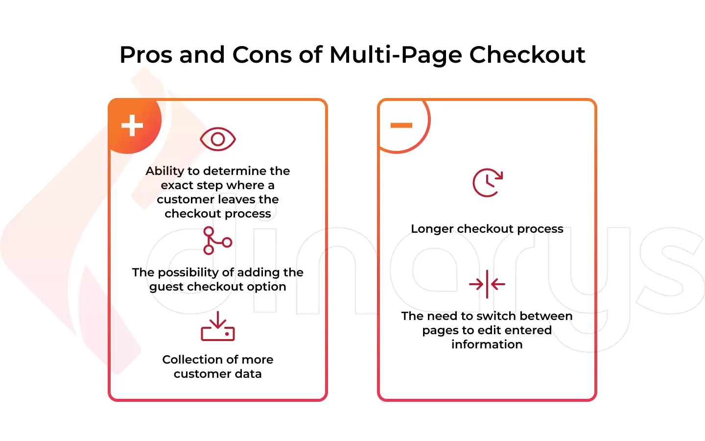
Pros and cons of multi-page checkout
Many online merchants mistakenly believe that single-page checkout is always preferable to multi-step checkout, but that is not completely accurate. Let’s review those situations where multi-page checkout is better than one-page checkout.
- With multi-page checkout, you can pinpoint exactly where your clients leave the checkout process. Perhaps they are unwilling or uncomfortable submitting certain information, or perhaps an element of the process is too perplexing.
- Not every client wants or has time to register an account before checking out. checkout allows you to add a guest checkout option.
- By dividing the checkout procedure into several phases, you may gather crucial customer information, even if a client chooses to leave their shopping cart empty.
Considering the benefits of one-page checkout, multi-page checkout poses the following drawbacks:
- Customers must spend more time on checkout pages with multiple steps. The likelihood of abandonment increases if a user must advance through numerous pages before reaching the finish line.
- From a UX perspective, multi-page checkout is not optimal because a client must switch back and forth between pages to update a single detail.
Best Practices for Checkout Page Optimization
Checkout page optimization can significantly minimize the drawbacks of the checkout page, avoid complexities, and boost your website loading speed. This section provides 23 practical techniques to improve your online checkout and increase conversions.
As an Adobe Solution Partner, Dinarys creates robust, feature-rich custom Magento solutions that suit your business, match your requirements, and exceed your expectations. In this section, we also explain the checkout capabilities of this e-commerce platform.
Lets talk about itHave a project in mind?
1. Provide transparent navigation
If your checkout page is multi-step, it must be clear to customers what will happen after they click the next call-to-action (CTA) button. To prevent customers from becoming lost during the checkout process, provide them with transparent checkout page navigation that explains the next steps.
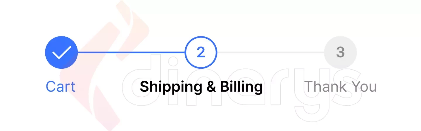
For example, if your checkout page consists of four blocks that include billing, shipping, order information, and payment, display a progress bar at the top of your checkout page that shows each block, so your customers understand where they are in the checkout process.
In addition, you can guide your users directly through CTA buttons, such as “Continue to Shipping Method” or “Continue to Payment.”
2. Use a trust badge
Customers are likelier to trust your company if you use a trust badge or trust seal. Adding a trust badge is a smart idea to reduce hesitancy during the payment process. Since the trust seal business has consented to put its badge on your website, your visitors can rest assured that your page is trustworthy and that any information they provide will be collected by secure third-party service providers.
The most suitable place for a trust badge is the CTA button that directs buyers to the payment gateway. In addition, you should place a trust badge under the “Place Order” button to encourage customers to start the checkout process.
To implement this feature, consider the Magento 2 Trust Badges extension that allows website owners to upload colorful badges they want their customers to view.
3. Avoid making the user start again if an error occurs
If you use multi-step checkout, ensure that all entered user data remains on the checkout page and that customers do not have to restart the checkout process if they must go back one step or if there is an unreliable internet connection.
In Magento Open Source and Adobe Commerce, this functionality does not require additional settings and is available by default.
4. Display a clear order summary before the checkout
The order summary compiles and presents all order data in a single view, from the number of items and their details, such as size and color, to taxes, shipping costs, and discounts.
To ensure that customers fully understand their orders, you must allow them to evaluate them before you accept payment. If possible, make the order data visible throughout the entire checkout process to avoid hidden fees disclosed only at the end of the process.
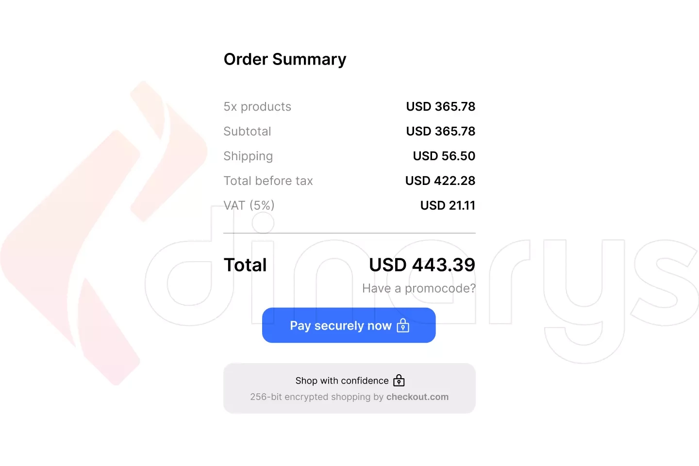
Order summary is an out-of-the-box feature on Magento-based websites, but if needed, you can opt for additional customization.
5. Do not include any outgoing links to the checkout page
Your checkout page should be arranged so that nothing distracts your customers from the final goal of a purchase. Therefore, do not include any outgoing links or clickable logos and footers on your checkout page.
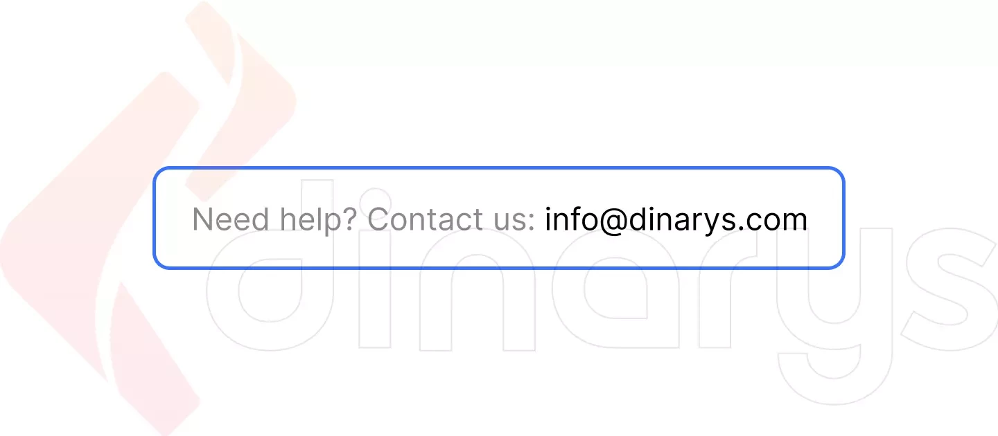
6. Provide an easy way to get in touch with your store’s help center
Your customers should be able to contact your store’s representatives at any time during their e-commerce journey, and checkout is no exception. Make sure that various communication methods, such as live chat, email, or phone, are available on your checkout page so your potential buyers can contact you immediately when they have questions or problems rather than postpone their checkout until a more convenient time.
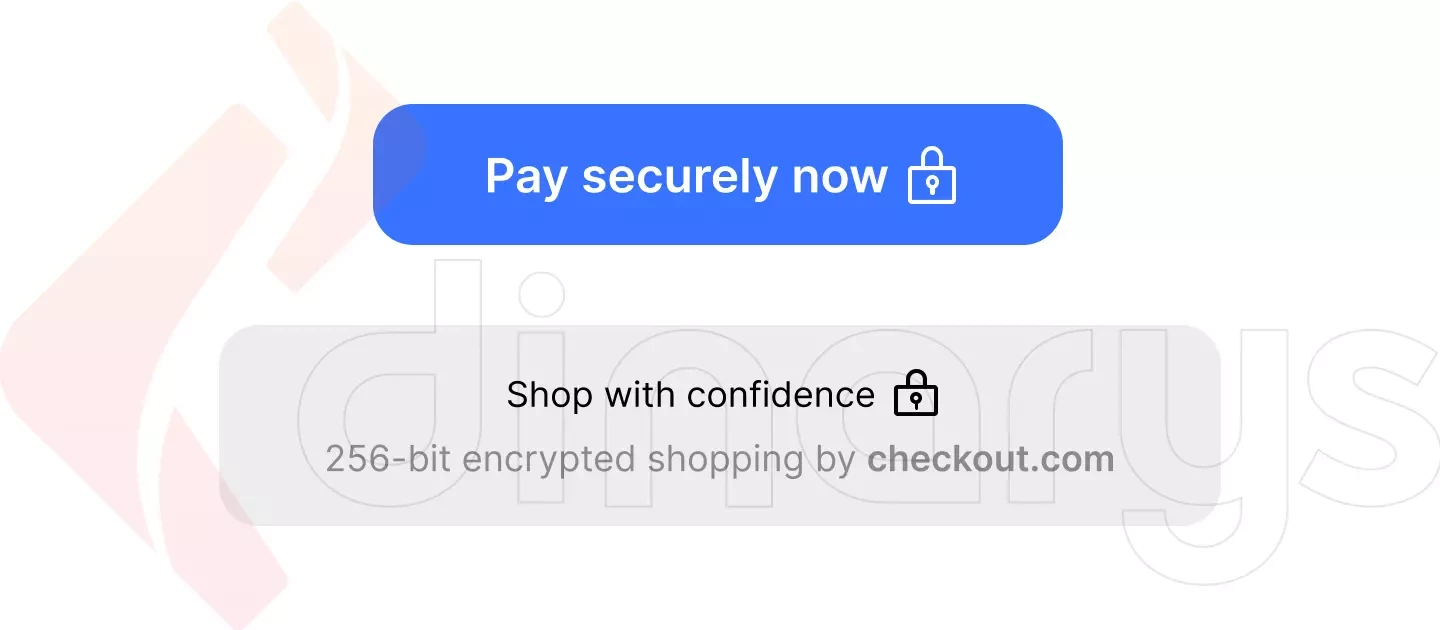
7. Make the main CTA button the most prominent on your checkout page
Your checkout page may have multiple CTA buttons, but the most prominent button should encourage your customers to make a payment. Therefore, design your CTA button so that your customers understand where to go as soon as they complete their checkout form and know their preferred payment and shipping methods.
Whether you choose a customized or ready-made Magento theme, this CTA feature depends on your layout design.
8. Make your privacy policy easy to find
Every credible e-commerce website must have a privacy policy because it promotes trust between a company and its customers. Additionally, it safeguards both parties—the business in terms of potential legal problems and the customers in terms of their personal data.
Clicking the “Pay” button is the most stressful moment for customers. If they hesitate in their decision to make a purchase, the availability of a privacy policy (similar to the effect of a trust badge) will help alleviate the situation and motivate them to proceed with payment.
9. Allow your users to make purchases as guests
Forcing registration frequently disrupts the purchasing process. In fact, 24% of people abandon their online shopping carts for this reason. Once the user decides to make a purchase, the checkout process should be seamless. Reduce the number of clicks and obstacles as much as possible and allow customers to continue as guests to maximize the number of your conversions.
Guest checkout expedites the purchasing process by skipping the needless registration step before completing a purchase. This is effective because it allows customers to enter their email addresses and proceed directly to payment. Customers can begin entering shipping and payment information more quickly, which makes the checkout process less onerous.
Magento Open Source and Adobe Commerce offer this capability as default features.
For additional information, read “Magento Commerce vs. Magento Open Source.”
10. Use urgency triggers
According to Loss Aversion, urgency is a popular psychological strategy that pushes people to act immediately. It relates to the fear of missing out (FOMO), and it is strongly established in our brains. When presented with a limited-time offer, such as a discount, we begin to proactively assess whether we feel comfortable passing on the opportunity or whether the FOMO is too great.
The following video explains the FOMO phenomenon in more detail:
You can successfully incorporate this marketing technique into your checkout process. For instance, you can add a timer to your checkout page and notify customers that their items are reserved for 10 minutes, or you can inform clients that if they complete their orders in 12 minutes, they will be shipped today.
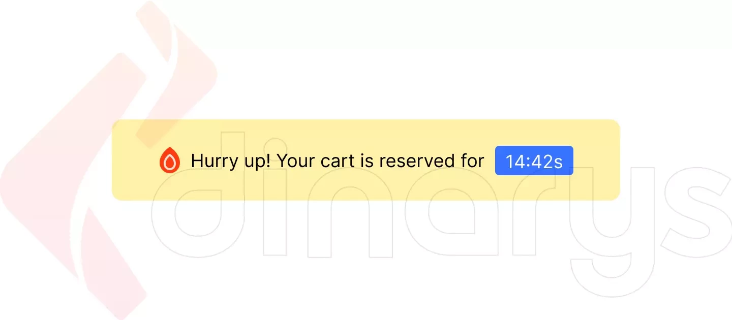
With the Magento Custom Cart & Checkout Messages extension, you can display compelling messages in the cart and on the checkout page, run multiple campaigns with different message types, add CTAs to leverage custom messages, and restrict messages by products, categories, customer groups, and store views.
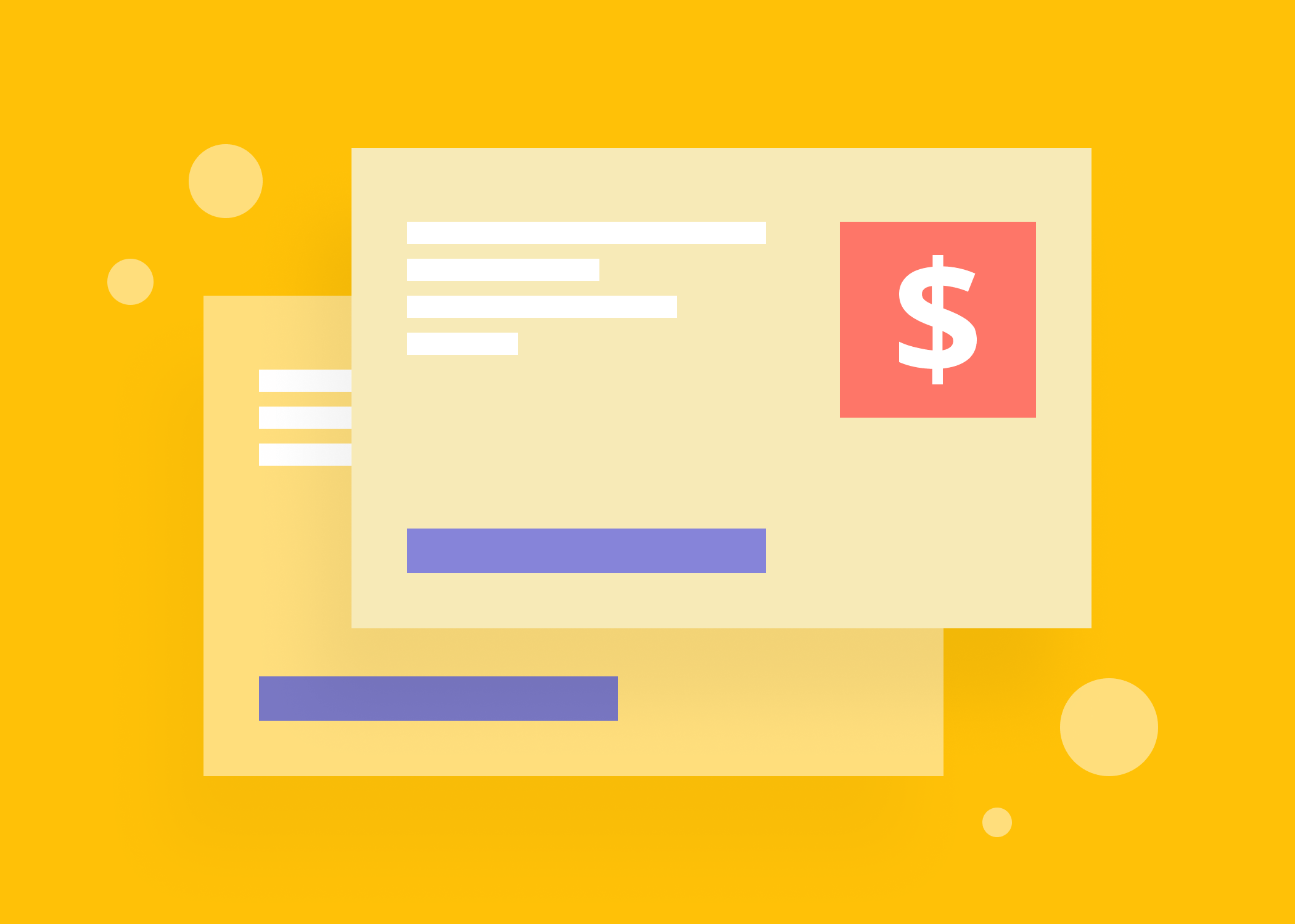
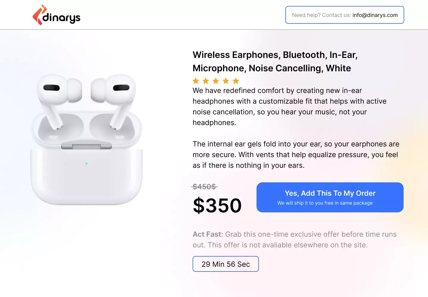
11. Incorporate an upsell step between the checkout and “Thank You” pages
It is common practice to offer additional items at checkout in a physical store. Why not implement this tactic during digital checkout and incorporate an additional upsell step before the “Thank You” page so your clients can add another product to their existing order? Online companies frequently use this step to increase their average order value.
Below we represent the concept of the upsell page from Dinarys’ UX/UI designers.
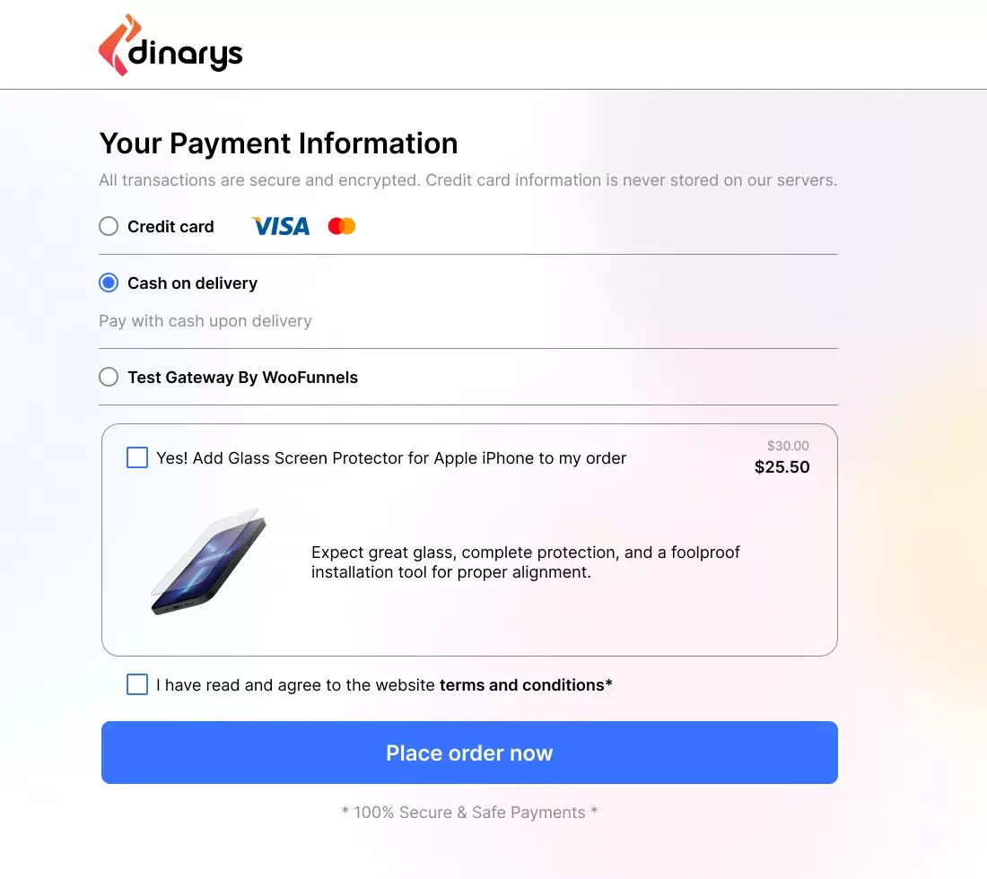
12. Include order bumps on your checkout page
Using an order bump is another way to add an extra product or service during the checkout process. Order bumps help merchants increase their average revenue per purchase by offering clients complementary or supplemental products or services, such as gift wrapping, package insurance, or glass screen protectors if customers purchase mobile phones.
Take a look at our vision of effective order bumps.
13. Do not overcomplicate the password selection process during registration
A difficult and protracted registration process may deter users from using your services, which can result in slower growth, more expensive marketing, and reduced sales. Therefore, every company needs a simple registration and verification process.
If it is not absolutely required, do not mandate complicated passwords. Also, consider adding a password generation option.
14. Simplify the process of password recovery
Statistics show that 58% of users admit to forgetting their passwords frequently. Thus, a password reset procedure is a necessity for any e-commerce business, but creating a successful procedure involves more than just answering security questions. Customers will stop using your website if the password reset process makes their lives more difficult.
A good password reset process reduces the customer’s stress. Resetting a password should take no longer than a minute and should only require information that users feel comfortable providing, such as email addresses. In addition, a password reset should guarantee the security of the customer’s data. Companies should implement barriers to prevent certain issues, such as repeatedly failing login attempts.
Lets talk about itHave a project in mind?
15. Distinguish mandatory and optional fields
Should you mark the mandatory fields in a form, even when most of them are required? This is a common UX question, and some forms may have many markings. However, the short answer to this question is yes.
Markers for all mandatory fields may be repetitious and unsightly and take up too much space. With longer forms, these markers may even seem oppressive, because the forms ask for so much information from the user. Consequently, designers often use one or both of the following tactics:
- Include the following instructions on the forms: “All fields must be completed” or “All fields must be completed unless otherwise specified.”
- Mark the optional fields because forms typically have fewer optional fields.
However, people do not always read the instructions at the top of forms. Furthermore, marking the optional fields requires people to scan the form to determine whether the field is required.
Thus, it is more feasible to mark required fields than optional fields. This can be done in two ways: using an asterisk (whether red or not) and using the word “required.” Magento provides out-of-the-box tools to distinguish your required and optional fields according to the UX/UI canons.
For additional information, read “E-commerce UX Design Tips.”
16. Explain that a mobile phone number is required only for delivery information
Users still have concerns about the security and privacy of their personal information online, which make them reluctant to provide their personal information. These concerns include significant worries about identity theft and less serious issues, such as receiving marketing calls.
During Baymard's extensive usability testing, compulsory but unjustified phone fields directly led to abandonments. This study also indicated that websites that ask for phone numbers can allay the privacy concerns of most users if the websites simply state why the phone numbers are needed and how they will be used.
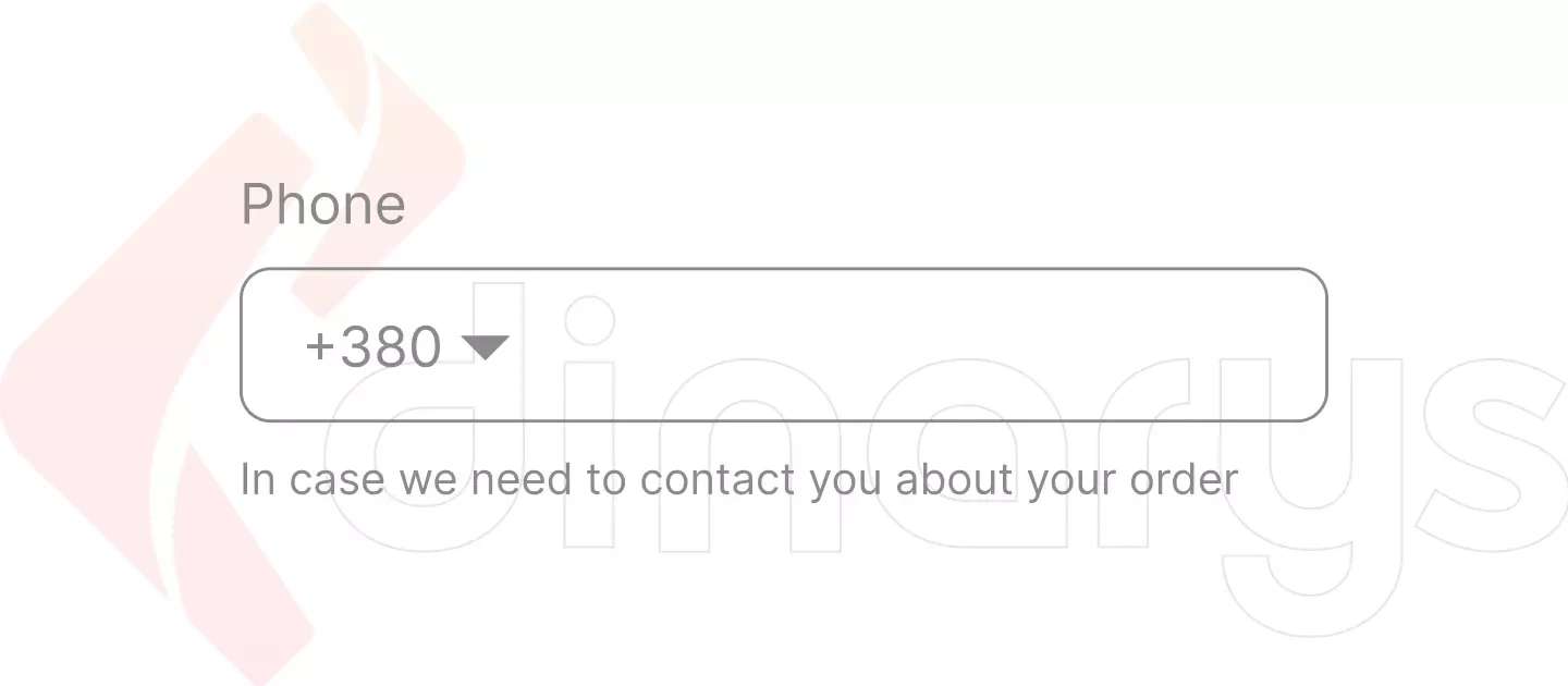
This option is not available in Magento by default, but you can adjust some small customizations.
17. Use a simple layout for the input fields
According to the Baymard’s research previously referenced, consumers scan websites rather than read them. Forms are no different. A single-column layout is the most effective way to arrange fields because users can scan it more quickly than a multi-column layout and complete the form in an average of 15.4 seconds or less.
18. Use the minimum number of input fields needed to complete the purchase
Decreasing the effort of your clients increases the likelihood of conversion, and one aspect of internet purchasing that customers dislike the least is completing forms. Therefore, it is essential to ask users to provide only the information required for efficient order fulfillment. Do not ask the question “How did you hear about us?” or similar nice-to-have questions during the checkout process.
Also, use the auto-complete feature, where available, to streamline the process and minimize any spelling errors. This feature is frequently used in address fields.
19. Request a user’s email first
As mentioned, one of the biggest advantages of multi-page checkout is the ability to collect valuable information about customers, even if they choose to leave their shopping carts empty. Therefore, you should place the email address field first on your checkout form. Fortunately, Magento provides this capability by default. The email addresses will be helpful when you need to launch a shopping cart abandonment recovery campaign and remind users of unpaid items in their carts via email.
20. Clearly state what is wrong with input fields that have been completed incorrectly
Error messages signal to users that they have completed some of the fields incorrectly or that they still have required fields to complete. For error messages to be useful, customers must be able to quickly view, comprehend, and react to them.
When creating error-correction flows, it is important to keep the following principles in mind:
- The error message must be easy to see and comprehend.
- The incorrect field(s) should be easy to find.
You can redirect your users to the fields that still require their attention by displaying the error message next to the field causing the error.
Also, verify the data immediately after it is entered. For example, do not warn users when they click the “Next Step” button if the email does not contain the “at” sign. Instead, when the user enters inaccurate data, display the alert right away.
With Adobe Commerce, you can easily set up these error-correction flows in the most efficient way.
For additional information, read “Why Is It Critical to Upgrade Your Magento Minor Version and How to Do It?”
21. Save the input fields in case an error occurs or the user leaves the checkout page.
One of the most annoying issues users experience online is completing a form, pressing “Submit,” and then seeing an error message after the form is cleared. To avoid this issue, you can easily store the form in the browser’s local storage, where it remains even after the page is reloaded. Thus, even if a submission error occurs or the user leaves the form, it will remain complete. Saving information in this manner is one of the most efficient methods to increase checkout conversion rates.
Running your business on the Magento e-commerce platform ensures that your users will not have to worry about refilling form fields if their sessions are interrupted for some reason.
Lets talk about itHave a project in mind?
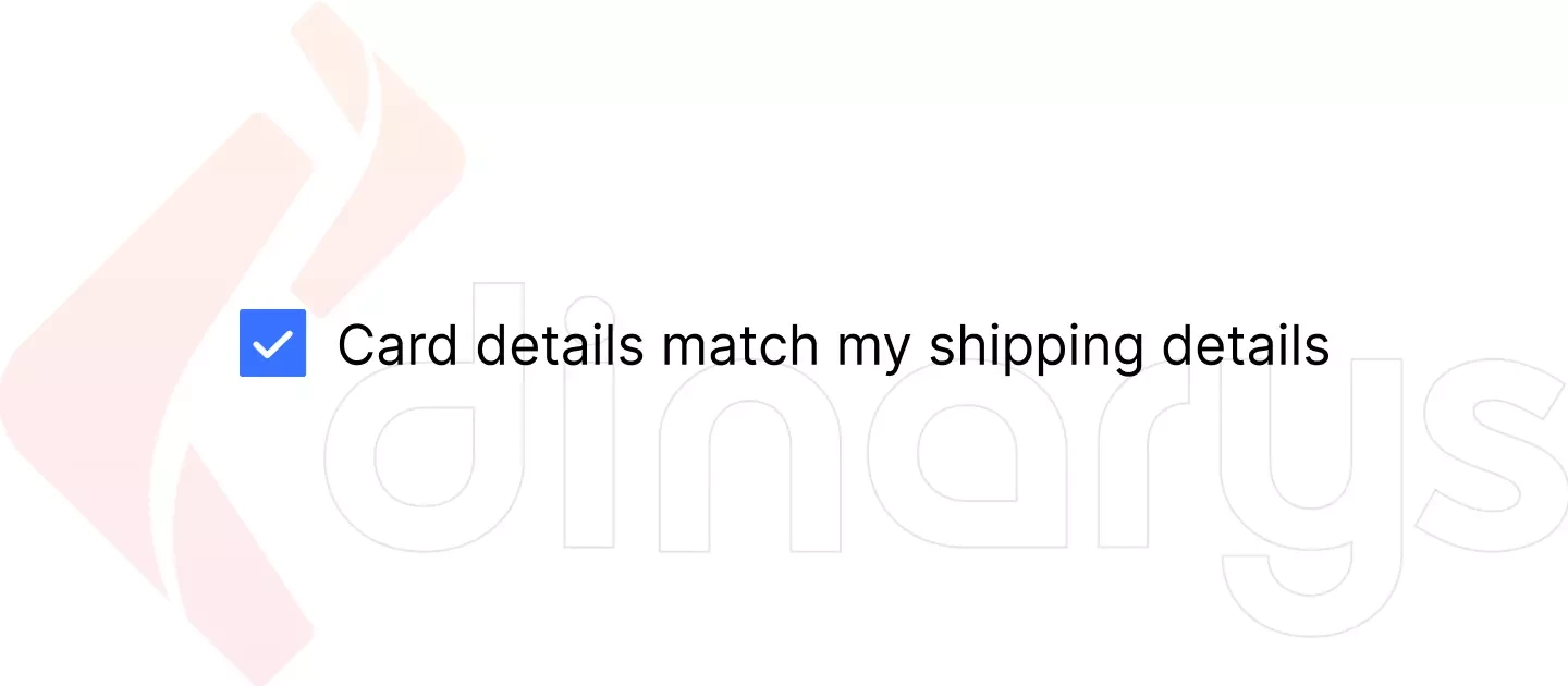
22. Provide an option for users to check whether their billing and shipping addresses are the same
A checkbox should allow users to indicate that their billing and shipping addresses are the same, so they do not have to enter their addresses twice. Magento offers this checkbox feature by default.
23. Display a numeric keyboard on mobile devices for number-only input fields
The Baymard’s usability testing revealed that websites significantly improved their performance when they used numeric keyboards for numeric inputs. Websites with numeric keyboards decreased the number of typos, which resulted in fewer form validation problems and provided a better and easier buying experience for the test subjects using those websites. This keyboard improvement was especially helpful for long number sequences, such as phone and credit card numbers.
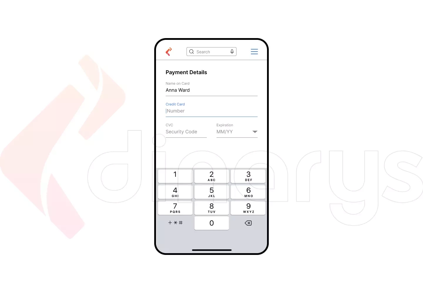
To implement this feature with Magento, you will need additional customizations.
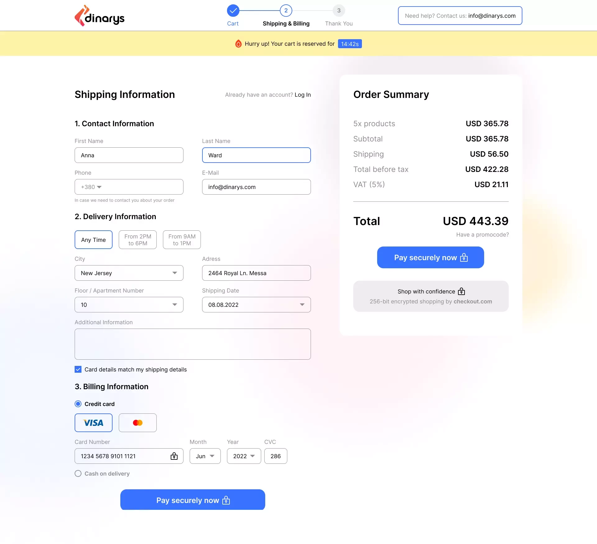
At Dinarys, we have seasoned e-commerce design and development specialists with in-depth expertise in the technologies, approaches, and insights for commercial website creation. The picture below represents our vision of a thoroughly planned, efficient checkout page that incorporates the recommendations we have discussed.
Conclusion
The fundamental ideas behind checkout page optimization should now be clear to you. Although optimizing your checkout page may seem difficult, it is rather simple. You can easily overcome your checkout challenges if you focus on your clients’ preferences and use the checkout tactics mentioned in this article to inspire you.
In addition, consider using the assistance of digital transformation consultants, such as Dinarys. Our Magento design and development agency can create custom e-commerce solutions from scratch and adapt your checkout page to the requirements specific to your industry and business.
Contact us, and we will help you increase your conversions.


Lassen Sie Profis Ihre Herausforderung meistern
Unsere zertifizierten Spezialisten finden die optimale Lösung für Ihr Unternehmen.