Content
E-Commerce
May 08, 2020

How to Create the Best E-commerce Product Page
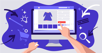
In 2021, the average rate of e-commerce conversion is 2.27% however, you can achieve even better results with optimized product pages in your e-commerce store. Moreover, unlike other pages and individual elements, an e-commerce product page layout is developed to persuade website visitors to make the purchase and to convert them into buyers.
Lets talk about itHave a project in mind?
Showcasing your goods in the most appropriate way is vital, because doing so can increase sales or make potential customers leave your online shop.
In this article, the Dinarys team has prepared a list of the top eleven tips to create the best e-commerce product page for your e-commerce store.
In addition, we have included a list of the five best e-commerce product page examples. We will tell you why they are effective, and how to use such tips in your online shop.
Building an effective e-commerce product page does not involve rocket science. You can use the most effective tips from e-commerce leaders and proven techniques from leading specialists as part of your conversion.
You might also like: Top 9 Essential Features for Custom E-Commerce Websites
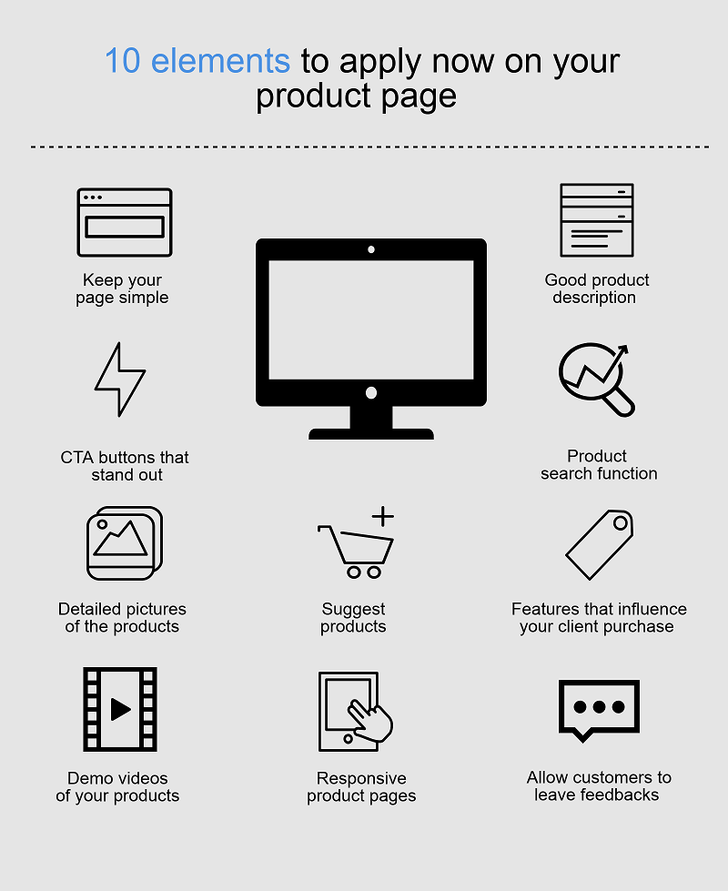
What to Use on Product Pages in an E-commerce Store?
Creating a nice and effective e-commerce product page layout requires more than basic design skills. Let’s explain.
The secret to developing an effective product page for your online shop is to use the right stimulus that may help you engage your target audience and persuade them to perform the actions you want them to.
At first glance, it sounds like a joke; however, this strategy really does work.
According to extensive research, orange-colored elements on a website (like CTA buttons) appeal more to impulsive customers. At the same time, blue-colored CTAs attract shoppers who are budget-conscious.
You might also like: How the E-commerce Business Can Increase Customer Lifetime Value
Using this information, you can pick the necessary color for your CTA buttons depending on the type of buyers you want to attract. You can uncover more insights about color and human behavior by reading this article.
You probably want your catalog to be attractive to your customers. Moreover, the main goal of any e-commerce page is to convince online shop visitors to buy the products. That is why more and more online retailers want to know how to create product pages with high conversion rates.
In the article below, you will find the most effective tips to improve your e-commerce website product pages or to develop great product pages from scratch.
Product images
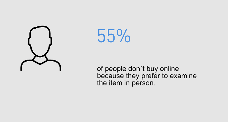
Presentation of goods plays an important role when selling to customers. If you want to increase your chances of making a sale, you should make your goods more desirable and visually appealing. In most cases, items in an online shop appear to be of higher quality than they actually are - so, people want them more.
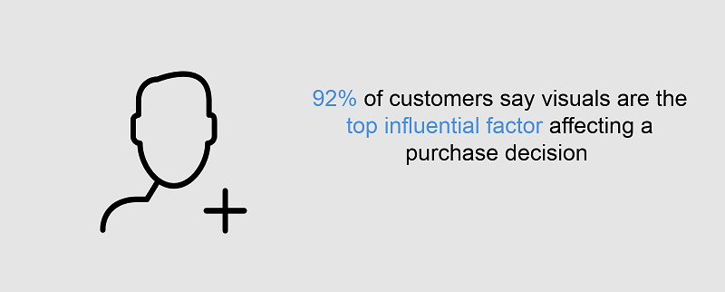
For that reason, 9 out of 10 shoppers say high-quality images and videos directly affect their purchasing decisions.
You might also like: 5 Best Conversion Rate Optimization Tips for Your E-commerce Website
There is a direct correlation between the quality of your item images and your e-commerce website conversions. For this reason, you should always use high-quality images and try to avoid images that are too small and hide all the details, or images that make goods look cheap. You can also invest in custom goods images, which will make your brand unique.
Views of products from all angles
If potential buyers cannot see the item they want from all angles, they will probably decide not to buy it. The solution is to add a web app that provides customers with 360° views of images or to add images showing different angles of online shop items. The more customers know about the item, the better they understand its value.
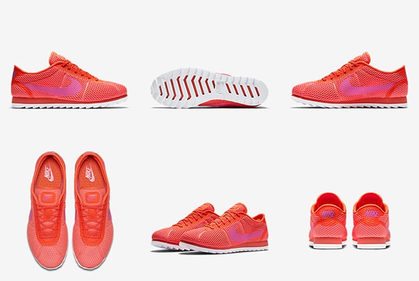
Poweredbysearch.com tells us that online shops that use multiple product views have a 58% increase in sales.
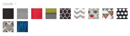
Customers feel very frustrated when trying to make a purchase decision based on a tiny color box.
Instead of only using images of patterns, add images of the items with the patterns.
Displaying different images with item variations will give your customers a clear idea about what they will receive. Use this tip to create the best e-commerce product page.
You might also like: 7 Key Advantages of CRM for E-commerce
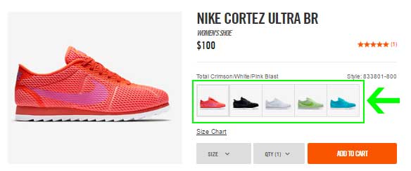
Again, we can see how Nike, an e-commerce leader, does a great job here. The website contains each shoe color option in a small image. If you want to get an idea of how a specific color looks on the shoe, click on the relevant color and you will see the full set of images in that color. This gives shoppers additional confidence and comfort when making a purchase online.
Image zoom
To provide your online shop customers with an idea of the texture of your item, use zoomed and detailed images.
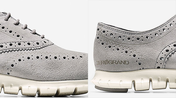
Your product images must give shoppers as much detail as possible. See how Cole Haan uses this feature to shop item textures and details.
Images with context
In some cases, people want to understand how a particular item would look on their body type. The solution here is to use images with context. Post images of how your goods are used in real life, which will allow your prospective customers to imagine themselves using them.
You might also like: Push Notifications vs SMS vs Email for Connecting with Your Customers
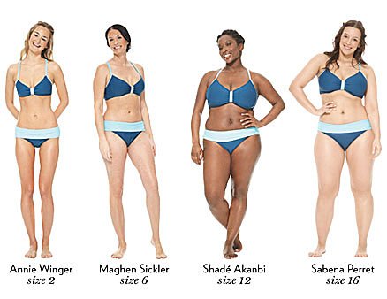
Another idea is to show how a product looks on different models with different shapes and heights. Do not forget to state the heights, measurements, and shapes of each model.
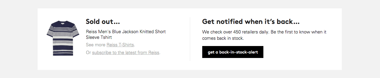
Out-of-stock option
When developing an effective product page, remember to add an out-of-stock button and an in-store stock checker. This might be extremely helpful, especially for multichannel retailers.
Argos is a great example. They went even further and now save customers' preferences.
Another option is to add stock notifications for out-of-stock goods.
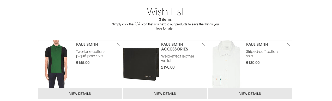
Wishlists
Since shoppers can use multiple devices, online shops should give them the ability to save items. Now, the improved customer journey provides customers with wish lists and favorite items, so shoppers can return to the item they like at a more convenient time.
You might also like: 10 Best Practices for Creating a Successful e-commerce Homepage
This option should provide users with the ability to create lists, name them and publish them.
USPs
If you want to make a good e-commerce product page, remember that this is a perfect place to tell online shoppers about the benefits of buying at your store.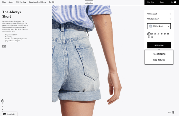
USPs or unique sale propositions are what define your e-commerce website from a crowd of competitors.
Here, you can place information about special offers, return policies, cost of delivery, and even methods of secure payment. This is the best stage of the sales funnel to inform customers about such things, unlike the checkout page. To make information look short and snappy, you can use iconography.
Sizing
All online shoppers want to understand measurement and sizing information for your goods. This includes sizing, measurement comparisons, and even how-to measure guides.
You can use third-party software to make the customer journey even smoother.
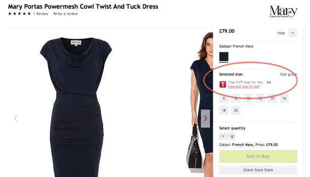
Let’s look at how House Of Fraser uses True Fit. This app helps to build a size profile based on customer preferences and purchase history.
Cross sales
To make your product page even more effective and increase sales, it is vital to add cross-sell and up-sell sections. To start, you can use Amazon’s style with the “People Also Like” feature, and show prospective customers what people have purchased who were searching for the same item.
Cross-selling is a way to increase sales for certain products. It will help you promote associated goods like batteries, for example. Another option to make your customers buy more is through up-selling. For instance, you can offer your website visitors the option to spend $10 extra to get more volume or quantity of the same items.

This tip is very popular in the fashion industry. Online shops offer users to buy the whole outfit the model is wearing. In fact, outfit planners have become more and more popular among online shops. This web app helps shoppers to piece together the whole outfit to see how it looks.

See how Feel Unique provides customers with repeat purchases services. This helps shoppers receive goods on a timely cycle that suits them.
Now let’s put this into practice. Below we will show you examples you should keep up with when designing an e-commerce product page layout.
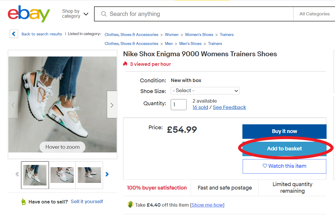
Call to action
Use a prominent call to action. When listing the most important elements on e-commerce product pages, the call to action (CTA) button should be right there.
It could be an “add to cart” button, a “buy now” button, or something else. It should be easily recognizable and make the visitor take action.
Lets talk about itHave a project in mind?
It is important to choose the right color for this button, taking into account the cultural characteristics of your target audience. When choosing a color, keep two things in mind:
- Does this color evoke the emotions you hope for in your target audience?
- How much does this contrast with the color scheme of the rest of the page?
Ideally, you want your call to action to stand out and grab the attention of your customers.
When choosing your text, keep in mind that certain words mean different things in different countries. For example, watch eBay change the CTA text on their US and UK websites to suit local tastes:
eBay UK page
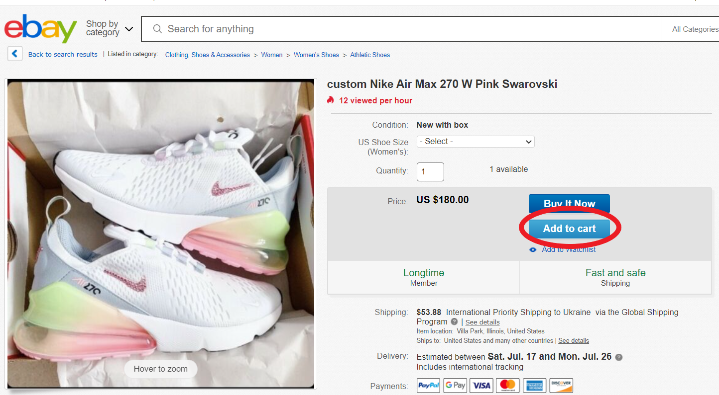
eBay US page
Top 5 Examples of Product Pages for E-commerce Stores
Here are the e-commerce product page best practices from online commerce leaders. If you are looking for inspiration for your future online retail website, or if you are thinking about online shop redesign, these examples will give you a clear vision of how to build an e-commerce product page with high conversion.
Also read:How Much Do A Website Redesign Cost
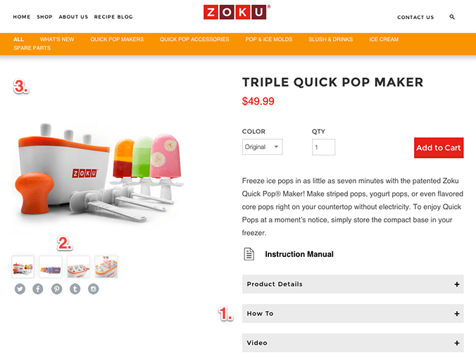
1. Zoku Home
Zoku is popular among customers and known for beautiful houseware. The first product by this company, the Quick Pop Maker, proves that creativity is the driver of their items.
On their products page, the company used dropdown tabs. This solution helps to add additional information about the goods and encourage customers to stay on one page, instead of sending them to another page.
The main product description contains the most appropriate information. However, if visitors want to find out more, they can click on the drop-down menu.
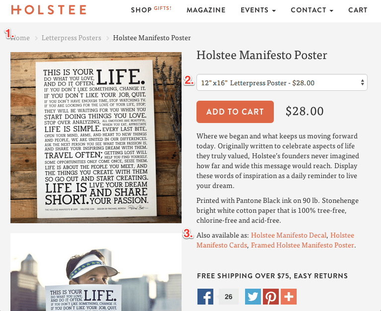
2. Holstee
Holstee is a company that helps us remember the most important things in our lives by inspiring events and goods.
For product pages, they decided to use the popular breadcrumb solution. This helps online shop visitors navigate the website: for instance, by going back to the product catalog. Moreover, this is an effective solution to help with bounce rates.
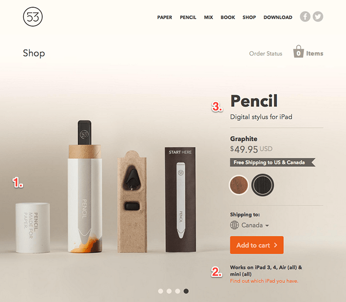
3. FiftyThree
This company develops meaningful staff for creative people. Now, they also offer online shoppers simple and innovative products such as pens and paper.
Apple made beautiful packaging a trend in the modern world. That is why customers expect it - and, moreover, FiftyThree keeps up with this trend. Prospective customers adore presentations during the unboxing experience, which is why the company decided to make such a video for the Pencil.
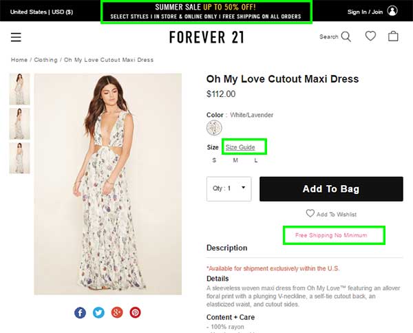
4. Forever 21
This company found a great solution for most online shoppers’ concerns: current proportions, size guides, and shipping costs.
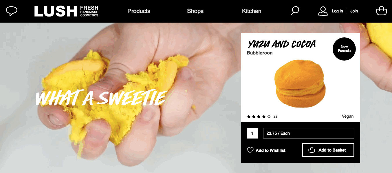
5. Lush
A good GIF is always inspiring for online shoppers. The Lush company knows how to use and combine rich media content and descriptive content. In addition, they use a strong CTA and social proof to increase sales and nail it.
Lets talk about itHave a project in mind?
Creating a Perfect E-commerce Product page: Final Thoughts
Unfortunately, there is no silver bullet for the unified product page for an e-commerce store. Different product page layouts and content will suit different industries and companies. All the ideas - both theoretical and practical - should be an inspiration for you for creating the perfect e-commerce product page. You can combine them and test what will work for your online business.
We hope that this article gave you a complete understanding of how to build an e-commerce product page - and how you can make your next project stand out.
When you’re ready to get started, don’t hesitate to contact the Dinarys team. We are award-winning e-commerce specialists with extensive expertise in developing online shops from scratch and making existing websites more effective.
We solve many common issues in online shops and know how to provide your customers with a smooth experience. Our design team develops human-centric UI/UX for websites, online shops, and mobile apps.
If you want to enter the world of mobile commerce, Dinarys can help you create a responsive design and mobile application that will increase your sales and customer engagement. Just fill in our contact form. We will contact you ASAP to discuss your future projects.
Let professionals meet your challenge
Our certified specialists will find the most optimal solution for your business.